Photoshop: Mac or Windows – Which is Better?

Many times people ask them that which one is better for Photoshop – MacBook or Windows? They know that I have used Photoshop for 2 years on my MacBook and around 3 years on Windows. Although, I did not use the Windows for 3 continuous years. I used it for 2 years before the MacBook and then from the past 1 year till today. If you’re thinking that I switched from MacBook to Windows because I think Photoshop is better for Windows than macOS then you are wrong. Or maybe not.  😆

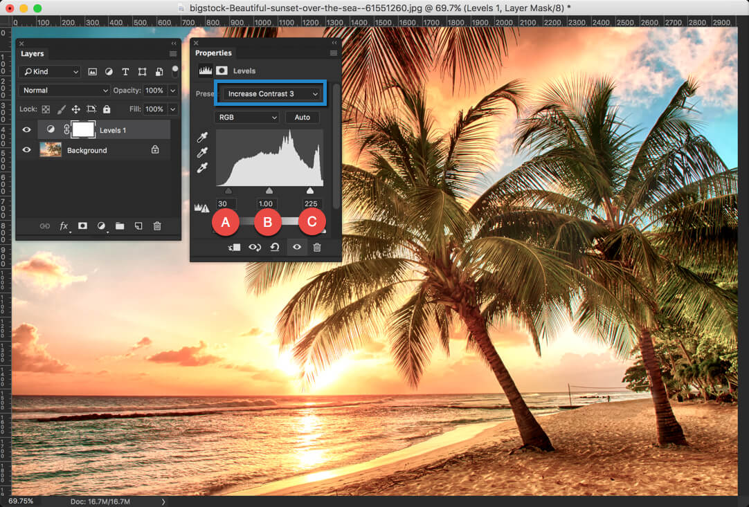
Related: How to Optimize the Performance of Photoshop

The reason I switched to Windows that I do a lot of other stuff for my other businesses and Windows integrate better with my requirements. I still have my MacBook in my drawer and I can use it whenever I want.

Before I proceed, I would like to tell you the configurations of my current windows PC and MacBook Pro 2015 with retina display.

Dell LaptopMacBook Pro 2015
Screen1920 x 1080 pixels2560 x 1600 pixels (winner)
ProcessorIntel i7 (winner)Intel i5
RAM8 GB8 GB
Graphics Memory4 GB (winner)1 GB
Hard Drive1 TB SATA256 GB SSD (winner)
Price$1099 (cheaper)$1299

This is all a software requires to run. You might be wondering that my Dell has 1 TB space then why did it lose against my MacBook’s 256 GB. The reason is that my Dell has SATA hard drive and MacBook has SSD. The SSD drives are much faster than SATA drives. If you want to test, then test the speed of iMac 2013 with iMac 2015. Both desktops are almost same except that iMac 2015 has SSD, but iMac 2015 takes 1/3rd of time to boot up when compared to iMac 2013. This is the power of SSD drive.

If you want to know the recommended system requirements for Photoshop, head over to the Adobe’s site. The link will open in a new tab.

Let me give you my experience with the Help of a Table:

I learned Photoshop on Windows so Windows stay close to my heart. This does not mean that I will be biased towards Windows. The reason I went for MacBook two years later because I saw almost all the Photoshop users use macOS and I want to try that out also. #Curiosity

WindowsMacBook Pro
StartupI honestly feel that Photoshop takes a lot more time to startupI used three different versions of Photoshop and all of them loaded within 5-6 seconds. I must say that 5-6 is good amount of time given that Photoshop is quite a big software
SpeedI don’t see a big difference in speed when compared with MacBook.But some calculation intensive functions like refine edge tool, liquify tool takes a bit more on MacBook. But it’ll be 2-3 seconds more, not 30-40 seconds.
TouchpadNone of Window’s laptop has force touchpad technology which is a big loss.MacBook force touchpad works seamlessly with Photoshop. The ability to click anywhere on the touchpad is the best thing that anyone can have.
Zooming in and Moving an ImageI include this point because this is a vital part. We all zoom in a lot in Photoshop and Windows work smoothly with zoomed in imagesMacBook lags a bit when you zoom in and move your image. The movement is not smooth which is not designer-friendly.
FeaturesBoth Windows and MacBook have equal featuresBoth Windows and MacBook have equal features
Keyboard ShortcutsWindows has “windows” button which MacBook does not have. This button does not do any task in PhotoshopMacBook has “Command” and “Control” button. They both work in Photoshop. So, MacBook has one extra button that windows don’t have and Adobe utilized it for keyboard shortcuts. This is why you have more keyboard shortcuts available on a MacBook.
StabilityWhole world knows that Windows is less stable than macOS and Photoshop cannot escape. In the past one year, my computer got hanged 7 times when I was using Photoshop. Thanks to the Auto Save feature in Photoshop not all of my work got lostMy MacBook never ever got frozen in 2 years. Cheers, Apple!
PricePhotoshop subscription remains same for both OS but machine price varies. Windows laptops are a lot cheaper and you can get one at $200.MacBook is notoriously expensive and everyone cannot afford it. If you go for a 15″ model, you can buy a small car at that price.
Photoshop PluginsThere are a variety of Photoshop plugins for Windows but lesser when compared to macOSAlmost, all plugin manufacturers know that majority of their potential customers use MacBook. So, they generally first launch their plugin for MacBook owners and then for Windows. The smaller firms which don’t have the budget to create a plugin for both OS, satisfies themselves with a plugin for MacBook owners only.

Final Verdict

Back in the 1980s, computers were quite expensive and only rich people could afford them for personal use. When Microsoft first developed Windows, they said that it’s an OS for people who want to use computers in their homes.  Still today, Windows want you to use your PC and a personal computer. Yes, there are few versions which target enterprises, but deep-down windows are meant for personal use.

macOS is also made for day to day use but Apple focuses a lot on creativity. If you see Apple adverts or its website, you will see at least a split-second scene where a designer is designing something on his MacBook, iPad, iMac, etc. Therefore, designers like macOS more and they go for MacBook.

Although Adobe never says that they give preference to one OS more than others, but I personally feel that Adobe support macOS more than windows. You can see that almost all the Adobe tutorials, help guides, or videos are made on macOS. I don’t remember that I saw them using Windows. Even in webinars, they use Apple’s products.

If you ask my opinion that if I must choose one OS, I would choose macOS. I don’t know the main reason but I feel more connected with Photoshop on my MacBook.

I am using Windows nowadays because TrickyPhotoshop is not all of my company, it is one of my company. In my other companies, I need to do a lot more on my laptop (Photoshop does not count here) and windows work better.

How to Crop an Image in a Circle in Photoshop

Nowadays, we are seeing that a lot of apps are asking for circular images for profile pictures. If they’re user-friendly, they crop an image in a circle by themselves. Otherwise, you need to crop an image in a circle in Photoshop and upload to the app. The good thing is that it takes less than a minute in Photoshop to crop an image. The bad thing is that you need to open Photoshop and do the work. 😞

Related: Not a while ago I wrote a tutorial on Crop tool in Photoshop where I explained the entire cropping process. The link will open in a new tab.

Before I proceed, I want to show you the final picture where an image of a guy is cropped in a circle.

So let’s start the tutorial.

Video

If you like watching videos, here’s the video tutorial for you.

Step 1: Draw a Circle with the Marquee Tool

Grab an Elliptical Marquee tool from the tool panel or press Shift+M again and again until it comes.

Sidebar: I have written a tutorial on Elliptical Marquee tool in Photoshop. If you need to learn more on Elliptical Marquee Tool in Photoshop, head over there. The link will open in a new tab.

Step 2: Draw a Circular Selection

Hold down the Shift key and draw a selection around the face. The Shift key will make sure that the selection always stays circular. If you’re using Rectangular Marquee tool, holding down the Shift key will keep the selection square.

Right now, you don’t need to worry about the center of the circle. We’ll adjust it in the next step.

Step 3: Adjust the Center of the Selection

Now move your mouse to the inside of the circle. You will notice that the cursor changes. This shows that you can move your selection.

Now place the circle in a place which suits you. The area inside the circle will be the area which remains once the cropping is done.

Step 4: Copy the Selection to a New Layer

Now we’re going to copy the selected area to a new layer.

Press Ctrl+J/Cmd+J to duplicate the selection to a new layer. Open the Layer Panel by pressing F7 and you will see a new layer.

Hide the “Background Layer” by clicking on the button that is highlighted with the red rectangle. Once it is done, all the image is gone except the selected area and you will see the background which is shown above. This kind of Photoshop background tells that there’s actually no background present in the image. The area is transparent.

Step 5: Crop an Image in a Circle in Photoshop

After this, we are going to trim all the transparent pixels so that the selection stays. This is the most important step in this tutorial of crop an image in a circle in Photoshop.

Go to Image>Trim and choose Transparent Pixels. Press OK.


Once it is done, Photoshop will crop every single thing except the face.

Step 6: Don’t Save it in JPG

If you don’t want the background, don’t save it in JPG. JPG doesn’t support transparency and adds white background automatically. Save in PNG as PNG supports the transparent background.

Go to File>Save As or press Ctrl+Shift+S/Cmd+Shift+S and choose the format as PNG and save. That’s it. This is how you crop an image in a circle in Photoshop.

Top 7 Adobe Photoshop Courses Online

I know that you want to learn Photoshop to show off to your friends or earn some side income. You may also want to become a graphic designer or an artist. Or, perhaps, you want photography and want to take your photos to the next level. In all the cases, you need to learn Photoshop. But Photoshop is not as easy as opening Microsoft Word where you need to open the software and start typing. When I first had a look at Photoshop interface back in 2012, believe me, I had no idea where should I go to even open an image. I know that many of you are in the same place and have no idea where to go. This is why I writing this article to list the top 7 Adobe Photoshop courses online.

Related: I have also written an article on top books to learn Photoshop.

I tried to gather all the courses that are free but almost all of them are not worthy of your time. This is why I needed to include paid courses. I have used an algorithm to rank the courses which are based on below factors:

1: Free or Paid
2: Rating
3: Viewership
4: Quality

All of the above factors have been given some weight and the result is the weighted average of all the factors. The one with the highest average goes to the top of the list of top Adobe Photoshop courses online.

So, let’s start with the last one.

7: Photoshop CC One-on-One

Price: Paid

This is the one of the most elaborative online course on Photoshop CC that explains all the aspects of Photoshop (at least most of them). The downside is that it’s too elaborative. The course is of around 16 hours and I know that you can get to know Photoshop in a 5-6 hours course.

If you’re a subscriber of Lynda then this course is free for you. Otherwise, you need to subscribe to Lynda at the cost of $25/- month. Try to complete the course in one month and cancel the subscription. So, basically, the tutorial comes at a price of $25.

[mk_button corner_style=”rounded” size=”x-large” icon=”mk-moon-tv” url=”https://www.lynda.com/course-tutorials/Photoshop-CC-2017-One-One-Fundamentals/497776-2.html” target=”_blank” align=”center”]Watch[/mk_button]

6: Mastering Adobe Photoshop CC

Price: Paid

The positive side is that the tutorial is updated with Photoshop CC 2017 (the latest version when I am writing this article). The downside is that the tutorial is not that much interactive. The second downside is that this course comes at a standalone price. Unlike Lynda, there’s no subscription model where you subscribe and get to watch all the courses for no extra cost.

You must also know that I don’t like long courses much. The same goes for this one. It’s 13.5 hours long. 😢

[mk_button corner_style=”rounded” size=”x-large” icon=”mk-moon-tv” url=”https://www.udemy.com/adobe-photoshop-cc/” target=”_blank” align=”center”]Watch[/mk_button]

5: Photoshop CC 2015: Essential Training

Price: Paid

The course would have been in the top position in the list of top 7 Adobe Photoshop courses online but lacked at its recency. The course was made back in 2015 although almost all of the concepts still hold true. For all the readers who are very new to Photoshop, I must tell you that Adobe launches a new version of Photoshop every year but each new version has subtle changes and an addition of 3-4 new features. So, even if you use Photoshop 2017, you can use the concepts of Photoshop 2015.

The best thing about this course is that it’s made by one of the world’s most renowned Photoshop expert – Julienne Kost (no wonder this is one of the most watched Photoshop course on Lynda) 😮

[mk_button corner_style=”rounded” size=”x-large” icon=”mk-moon-tv” url=”https://www.lynda.com/Photoshop-tutorials/Photoshop-CC-Essential-Training-2015/372339-2.html” target=”_blank” align=”center”]Watch[/mk_button]

4: Photoshop Beginners Mastery: From Zero to Hero in Photoshop

Price: Paid

The best thing about this tutorial is that the lecturer kept it short. He didn’t pour all the information is one course. The result is that people don’t lose interest. The tutorial is only 2.5 hours long.

[mk_button corner_style=”rounded” size=”x-large” icon=”mk-moon-tv” url=”https://www.udemy.com/getting-started-in-photoshop/” target=”_blank” align=”center”]Watch[/mk_button]

Related: I have also written an article on top magazines to subscribe for Photoshop.

3: Photoshop Course Online by Good Creative Academy

Price: Free

Here comes a free course. The course is not as much as interactive as the ones listed previously. But the fact that its free means it’s accessible to everyone and this is what puts it in the third place in the list of top 7 Adobe Photoshop courses online.

The course is of 41 videos and explains almost all the things that a beginner needs to know.

[mk_button corner_style=”rounded” size=”x-large” icon=”mk-moon-tv” url=”https://www.youtube.com/watch?v=-Rkabbx9w5A&list=PLf0N3CF2JlRx7o9oVObgk4y5X6WBF_g21″ target=”_blank” align=”center”]Watch[/mk_button]

2: Photoshop CC 2017 Essential Training: The Basics

Price: Paid

Here’s the latest masterpiece by Julianne Kost, the one I was talking about. Ah, did I mention that Fast Company has put her on the list of 100 Most Creative Person in the planet?

This course would’ve been in the first place in the list of top 7 Adobe Photoshop courses online if only it was free. But the weights that I gave to free vs. paid has put it in the second position.

[mk_button corner_style=”rounded” size=”x-large” icon=”mk-moon-tv” url=”https://www.lynda.com/Photoshop-tutorials/Photoshop-CC-2017-Essential-Training-Basics/519289-2.html” target=”_blank” align=”center”]Watch[/mk_button]

1: The Complete Beginners Guide to Adobe Photoshop by TastyTuts

Price: Free

This collection of 34 videos is all you need to have to learn the basics of Photoshop. Being free of cost means that you have to watch it without paying a single penny from your pocket.

[mk_button corner_style=”rounded” size=”x-large” icon=”mk-moon-tv” url=”https://www.youtube.com/watch?v=sF_jSrBhdlg&list=PLYfCBK8IplO6v0QjCj-TSrFUXnRV0WxfE” target=”_blank” align=”center”]Watch[/mk_button]

This is all that I have.

If you have come across a course that you think is awesome but not present on the above list, let me know in the comment section below. I’ll review it. If it’s passed, I’ll add it to the list.

PSD vs. PSB: What are the Differences Between PSD and PSB?

Google is filled with PSD vs. PSB and I know that you have heard a lot that Photoshop supports two file format in which it stores all the information like layer, tone, color etc. but you should prefer to save it with PSD, not with PSB. If this is the case, then why is there a PSB format? This question also bugged me for few days and then I googled it out to do some research. I have gathered enough information and I am going to aggregate all the relevant differences between PSD and PSB file in this article.

Last month I posted an article on keyboard shortcuts of Photoshop which has become quite a hit. If you want, you can have a look at it. Here’s the article of Photoshop Keyboard shortcuts.

What is the Full-form of PSD and PSB?

PSD stands for Photoshop Document

PSB stands for Photoshop Big file or Photoshop Bloated file. There is no evidence present, at least I could not found, of being the correct one.

What is the Difference Between PSD and PSB? It’s PSD vs. PSB

I am sure that you will have some rough idea of the difference between them by reading the full-form of those two.

PSD is a universally accepted format to store a Photoshop file. Many software and websites are able to read a PSD file. An example is that when you save a PSD file on your windows or macOS, both OS are able to show you the preview of the file. This means that they can read the file without having any need of Photoshop.

There are many websites which can also read PSD format. Last month I uploaded a PSD file to my Dropbox account and I was amazed that Dropbox was able to show me the preview of the file. Although I was not able to edit the file which I totally understand.

Every cool thing comes with a limitation. The limitation of PSD file is that you cannot save big Photoshop files in PSD format. For a big file, you need to go with PSB.

What are the Capacities of PSD and PSB?

A PSD file can save a file only up 30,000 x 30,000 pixels in size which is already a huge size. Given that only a few DSLRs have 36 MP camera and the resolution is 7360 x 4912 pixels, I don’t think that your image will cross 30,000 x 30,000 pixels.

If we do some calculation, 30,000 multiplied by 30,000 is 900,000,000 pixels. So, your camera will need to higher than 900 Megapixels (900 million pixels) if you unwillingly want to go with a PSB file. In other words, if you have a camera that is lower than 900 MP, you can go with PSD file.

Yes, PSB supports file which has more than 30k x 30k pixels. But, there will always be an upper cap, right? The upper cap of a PSB file is 300k x 300k pixels. So, unless you have a camera of 90000 MP or 90 Gigapixel, you can use a PSB file.

I have also heard that a PSB file is more stable than a PSD file if the file size crosses 2 GB mark but I am not sure on this. I enlarged a photo and the saved it with a PSD file with a size of 2.7 GB but Photoshop was quite stable with the file also. Yes, it was lagging a bit but that’s OK. I don’t have a super computer. My machine runs with an i5 processor, has 4 GB graphic memory and 8 GB RAM.

I know a little more on how Photoshop process a PSD and PSB file but that’s not relevant. I have written all the relevant information regarding the difference. But you like a curious then you can refer this article by Adobe.

If you know anything regarding this difference and like to share with the fellow Photoshop folks, write it down in the comment.

Have a nice day!

Day 25 – Adjustment Layers in Photoshop – Solid Color, Gradient, Pattern, Brightness, Levels, Curves, and Exposure

Hey guys, welcome to another tutorial on 30 Days to Learn Photoshop series. Last time I showed you how to use adjustment layers in Photoshop but I didn’t show you all of them. We’re covering those in today’s tutorial.

Before we begin, I’d like to recall the adjustment layers that we discussed last time. They were Solid Color, Gradient, Pattern, Brightness, Level, Curves, and Exposure. Today, we’ll be learning Vibrance, Hue and Saturation, Color Balance, Black and White, Photo Filter, Color Lookup, and Invert. We’re leaving other things because you’re never going to use them.

So let’s begin and start revising few things.

WHAT’S ADJUSTMENT LAYER IN PHOTOSHOP?

The Adjustment Layers in Photoshop are a group of some useful, non-destructive image editing tools that add color and tonal adjustments to your image. Did you read the word “non-destructive”? Yeah, all of the changes will be done without harming the original image. Means that you can go back to any point in time without any loss. It’s like a Time Machine in macOS and Win7 backup in Windows.


WHERE ARE ADJUSTMENT LAYERS LOCATED IN PHOTOSHOP?

Adjustment layers are located at the bottom of layer panel (press F7 to open).

All the things that you’d use daily are present here. Be it Brightness, Color Balance, Photo Filter, Gradient, or even Invert are present here.

Now that you know what and where of the Adjustment layer, let’s explore it. I am going to explain each layer in a two separate tutorial this is the second tutorial (here’s the first one). In the tutorial, I’ll cover Solid Color, Gradient, Pattern, Brightness, Levels, Curves, and Exposure. The rest of the things will be covered in the next tutorial.

What is Vibrance in Photoshop?

Vibrance slider lets your picture more or less vivid. So, if you think that your image looks pale and you want to increase the color, you can use this slider. Below is the image where I added the color.

In the adjustment panel, you’ll also see another slider which is named as Saturation. If you play with that slider, you’ll see that both of them increases or decreases color.

If so, then why did Adobe provide two sliders when they work similarly?

Actually, they don’t. They both do the same job and do it differently. If you pull both sliders one by one all the way to the right, you’ll see that saturation adds more color. Vibrance only manipulates the pixel which is pale. It doesn’t touch pixels which are already saturated. This results in a balance of color. On the other hand, Saturation doesn’t discriminate. It increases the saturation of all the pixels by the same amount.

What is Hue and Saturation in Photoshop?

Hue – you’ve heard this term first on day 23 when we were discussing Camera Raw in Photoshop.

Hue changes the color of the entire image. It basically changes the hue of the image. In the below image, I have changed the hue to +42 and the hue of my photo is changed.

Saturation does exactly what we discussed in the previous section. It increases or decreases the saturation level.

Lightness does what it’s named after. It increases or decreases the lightness. Almost all the time it messes up the photo so I never use the Lightness slider.

One cool trick – if you want all the picture to be of the same color, you can use the “Colorize” checkbox. You may want to increase the saturation otherwise your photo will be of grayscale.

What is Color Balance in Photoshop?

You see tints on almost all the photos that are taken by your phone. Most of those are yellow tint and some have a blue tint. You want to remove those tints but you don’t know how. This is where Color Balance comes into the picture.

Color Balance layer corrects the color of your photos.

In the above image, I removed yellow tint and photo is looking better. This is how it was looking before.

Can you see the difference? The first photo is looking much better than the second photo.

In Color Balance adjustment layer, there are three tones – Shadows, Midtones, and Highlights. Whatever is dark in your photo is considered as shadow and whatever is light in the photo is considered as a highlight. Everything in between is considered as midtones.

In the above image, the sun and sunrays are highlights, the tree leaves and tree shadows are shadows, and the rest of things are midtones.

While correcting your color, you need to make sure that you select the proper tone. If the sun is having blue tint than you need to select highlights tone and make the changes.

What is Black and White Adjustment Layer in Photoshop?

As the name suggests, this tool lets you convert your image to black and white.

You’ll see 6 sliders. These sliders let you modify your photo appearance.

For example, if you drag the red slider to the right, the pixels which are having red color will become brighter. The opposite will happen if you drag it to the left.

A rule of thumb: To save some time, I click on the “Auto” button and then tweak the sliders. This saves me a few minutes.

What is Photo Filter in Photoshop?

I understand that Color Balance is hard to use and a bit time-consuming. You are wondering if there’s any another alternative to remove the tint in photos. Well, there is, and Adobe calls it Photo Filter.

There was a huge yellow tint in the image. After using a blue filter, most of the yellow tint is now gone. I understand the photo is slightly moved towards blue but my main aim is to show you that it can be done.

Apart from fixing tints, you can also use Photo Filter to give nice effects to your images. To choose the filter, click on the drop-down menu to choose presets or you can choose your own color by clicking on the colored square. It’s always appreciated if you turn on “Preserve Luminosity” every time. This keeps the highlights of the image bright.

What is Color Lookup in Photoshop?

Now the next thing we’re getting into is Color Lookup. You can consider as filters that you get on Instagram. It’s pretty straight-forward. Just open the Color Lookup and choose which lookup you like.

You can also create your own filter but let’s not get into that for now.

What is Invert in Photoshop?

Now the next thing that we have is Invert. It’s pretty much straightforward and you already know what it means. It simply inverts the color. If you are born in the 1990s or before, you can consider it a negative copy of the image.

The keyboard shortcut of invert is Cmd/Ctrl + I.

And that’s it!

We have not completed the adjustment layers in Photoshop. Check out what’s happening with Photoshop in TrickyPhotoshop.

Photoshop: Place an Image in Text

Hey guys, How are you? We’re going to learn how to place an image in a text in Photoshop. Isn’t it amazing? Summer is approaching and all those beaches are now more beautiful than ever. So I thought why not take Hawai in this picture?

Last time I wrote a tutorial on Adjustment Tools in Photoshop.

This is a simple tutorial.

I am going to show you the image before I proceed.

Final

Isn’t is looking beautiful? See all the shiny emboss and green color.

Let’s create it.

Step 1: Type the Text

Open the image and grab the Text tool.

Start writing the text you want. I am going to write “Aloha”. I am using “Lato” font.

1.jpg

Decrease the Fill to 0%. Now the text should disappear.

2.jpg

Step 2: Add Layer Styling

Click on the FX icon and choose Bevel and Emboss.

3.jpg

Below are my settings. Personally, I like Pillow Emboss the most and by choosing 438% as depth, I make sure that I get sharp emboss.

4.jpg

This is what the image should look like.

5.jpg

Step 3: Fill the Outer Color.

I am choosing a shade of green (#00a651) to be filled with my outer color.

Create a new layer and fill it with Green.

6.jpg

We’re selecting the text now. Hold down Cmd/Ctrl and click on the icon of text layer.

7.jpg

This should select the text.

8.jpg

Create a layer mask and then immediately press Cmd+I/Ctrl+I. 

9.jpg

And now your image should look like this.

10.jpg

That’s all for today.

See you again next week.

Day 24 – Adjustment Layers in Photoshop – Solid Color, Gradient, Pattern, Brightness, Levels, Curves, and Exposure

Hey, folks! How was your weekend? Pretty exciting, huh? Mine was also. I hope that you also followed my last tutorial on Camera RAW. Why not? It was an amazing tutorial. I explained everything about Camera RAW. Today, we’re going to learn Adjustments Layers in Photoshop.

To apply tweaks like brightness, exposure, contrast, saturation, or etc. you don’t need to open Camera RAW every time. Photoshop gives you a nice and clean way to change it on the go. All of this can be done with the help of adjustment layers.

So, let’s begin with the most basic question.

What’s Adjustment Layer in Photoshop?

The Adjustment Layers in Photoshop are a group of some useful, non-destructive image editing tools that add color and tonal adjustments to your image. Did you read the word “non-destructive”? Yeah, all of the changes will be done without harming the original image. Means that you can go back to any point of time without any loss. It’s like a Time Machine in macOS and Win7 backup in Windows.

Where are Adjustment Layers Located in Photoshop?

Adjustment layers are located at the bottom of layer panel (press F7 to open).

1.jpg

All the things that you’d use daily are present here. Be it Brightness, Color Balance, Photo Filter, Gradient, or even Invert are present here.

Now that you what and where of the Adjustment layer, let’s explore it. I am going to explain each layer in a two separate tutorial. In the tutorial, I’ll cover Solid Color, Gradient, Pattern, Brightness, Levels, Curves, and Exposure. The rest of the things will be covered in the next tutorial.

What is Solid Color in Photoshop?

Solid color fills the image with one color and you get to decide the color.

Go to Solid Color and choose the color you like and press OK. I chose a shade of Blue.

2.jpg

You see that the entire image is filled with the color that you chose.

You think that what the hell. Why would I fill my entire image with a color? Hold on! You can do some artistic effects. If simply change the Blend Mode to color, I get Blue tint. Isn’t it looking nice? I know it doesn’t but don’t be rude and say yes… haha…

3.jpg

What is Gradient in Photoshop?

This adjustment layer works exactly similar to the Gradient Tool that we learned a while ago. So, I am not going to much details on this. Click on it and you’ll figure out how to use it.

4.jpg

What is Pattern in Photoshop?

This option lets you fill your image with the patterns of your choice. The pattern will fill the entire image.

5.jpg

Like Solid Color, you can play with Blend Modes this time also. I chose Color Burn this time.

6.jpg

What is Brightness and Contrast in Photoshop?

I am damn sure that I don’t need to explain these two. You did tweak these two when you edited your first digital photo around 10 years.

Ummm… Still, I’ll explain you.

  • Brightness brightens or dims the image
  • Contrast increase the difference between the whites and blacks of the image

7.jpg

What is Levels in Photoshop?

This is a bit tough to explain. There is one slider with three control points named as A, B, and C in the below image.

A: Drag it to the right to increase the black
B: Drag it to the right to increase contrast and drag it to the left to decrease contrast
C: Drag it to the left to increase white

8.jpg

To make things simpler, Photoshop provides presets also which are highlighted with a blue rectangle. You may want to use it.

What is Curves in Photoshop?

If you see the graph, the y-axis is divided into 4 parts. Each part represents a region. Upper parts demonstrate the light and lower parts demonstrate the shadow.

9.jpg

  1. Highlight: It affects only the upper regions
  2. Light: It mainly affects the upper two regions but slightly affects lower two regions as well
  3. Darks: It mainly affects lower two regions but slightly affects upper two regions as well
  4. Shadows: It only affects lower two regions

What is Exposure in Photoshop?

The Exposure slider is probably the least mystically named of the control sliders and unsurprisingly it allows you to adjust the exposure of your photo. Dragging to the right will lighten an image while dragging to the left darkens it.

10.jpg

The Offset slider isn’t obviously named, but this control has the greatest influence over the dark tones of photos. Sliding it to the right will lighten shadow areas, but you should take care as you’ll quickly see that images can start to look washed out as this is adjusted in this direction. Sliding to the left will darken your shadow areas and if you overdo this, you will start to see some unnatural color shifts occurring.

The Gamma slider has the greatest effect over the mid-tone range of your images, though the direction that you adjust the slider is counter-intuitive. To darken the image, you need to slide it to the right and vice-versa to lighten it.

This is all for today. I hope that you enjoyed the tutorial.
Check out the other tutorials from 30 Days to Learn Photoshop series.

DAY 23 – THE CAMERA RAW FILTER IN PHOTOSHOP: PART 2

Welcome back, folks! Today, we’re going on more details in Camera RAW in Photoshop. This tutorial in the continuation of my past tutorial on Camera RAW in Photoshop – Part I. Last time, I covered Basic, Tone Curve, and Detail tabs. In this tutorial, I’ll cover HSL, Split Toning, Lens Correction, and Camera Calibration.

You’re not going to use the tabs frequently that we’re going to learn today. Whenever I open Camera RAW, I use Basic and Noise 70% of the time and rest of the tabs 30% of the time.

So, let’s begin with the tutorial.

1.jpg

Step 1: HSL and Grayscale in Camera RAW

HSL stands for Hue, Saturation, and Luminance. I think that there is no real estate available in Photoshop interface so Adobe decided to go with the short form.

In this tab, you can change the Hue, Saturation, and Luminance of an image or convert an image to Grayscale (Black and White).

First off, I’ll show you how to convert an image to Grayscale. All you need to do is to click on “Convert to Grayscale”.

2.jpg

Now that you know how to convert an image to Grayscale in Camera RAW, time to learn HSL. If you look at the below screenshot, you’ll find three tabs which are Hue, Saturation, and Luminance.

3.jpg

Let’s understand each of them one by one.

  1. Hue: Hue is the color in your image. It changes your color. Look at the first slider which is Red. If you drag all the way to left, all red present in your image will become Pink. If you drag is all the way to the right, the red in your image will convert to Orange.
  2. Saturation: Saturation is the intensity, or richness, of that color. Switch to the second tab. Now if you drag the Red to the left, the Red will become gray. If you drag the Red to the right, it’ll become more saturated any may be unpleasing to the eyes.
  3. Luminance: Luminance controls the brightness value. Switch to the third tab. If you drag it to the left, Red will get darker and then to Black. If you slide it to the right, Red to turn lighter and then to White.

Step 2: Split Toning in Camera RAW

Split Toning is the easiest way to give a very colorful effect to your photos.

Split toning involves tinting the shadows of an image in one color and the highlights in another color. Although mostly applied to black and white images, this method can quite successfully be used on color images.

In the image, I kept the image colored and applied Split Toning.

4.jpg

It has three sections which are Highlights, Balance, and Shadows.

In the Highlights section, if you change the Hue slider, the highlights of the image will have a hue of that color.

The same goes with the Shadows slider.

Note: You must drag the Saturation first at least to 10 before you slide the Hue slider. This is because, if Saturation is 0 then you won’t see any difference if you drag the Hue slider.

In the Balance slider, you can set the balance between highlights and shadows. I have set it to 35% which means that whatever is less than 35% brighter than the absolute mid point, will be considered as the highlight.

Step 3: Lens Correction in Camera RAW

This tab is used to correct all the defects that a lens add.

5.jpg

Let me explain each slider one by one.

  1. Distortion Amount: Even lenses worth of $2,000 distorts the image. They make the image blobbed in the middle which disturbs the lining of the images. Use this slider to remove the blobbiness.
  2. Defringe: In some images, you see either a purple or green line around the edges of things in your image. Generally, these lines are noticeable only when you zoom in the image. This defringe slider helps you to remove it.
  3. Vignette: You already know what a vignette it. It’s the black or white circular shape which fades into its background without a definite border. You can either add or remove vignette using this slider. Drag it to the right to remove and drag it to the left to add.

Step 4: Effects in Camera RAW

Adobe named this panel as Effects but I personally don’t believe that you can create any nice looking effects from this panel.

6

First is Dehaze. It does what its name suggests. This slider helps to remove or add the haze in the image. Photoshop is not a magical tool so let’s not expect any magical return when using this slider. 🙂

Grain adds grain in the images. You may want to use it if you’re a wedding photographer. Most wedding photographers intentionally add grains to make the images beautiful.

You are wondering that why is Vignette also here even if you saw it in the previous panel. Both will give the same result as long as your image is not cropped. I’d like you to do a task. Close Camera RAW and crop an image. While cropping, make sure that you don’t turn on “Delete Cropped Pixels”. Once done, again open Camera RAW and try the two sliders. You’ll see the different results. I leave it to you to figure out why did you see different results.

Step 5: Camera Calibration in Camera RAW

In this tab, you can define the process in Camera RAW.

7.jpg

The process version is the Camera Raw technology that Photoshop uses to adjust and render photos. The latest version in 2012.

This is the place where you calibrate the RGB (Red, Green, and Blue) of the image. You probably don’t want to change it because it is really tough for a beginner’s eyes to detect the miscalibration in R, G, and B.

That’s all, folks!

Let’s meet next week. Make sure you watch other tutorials on 30 Days to Learn Photoshop series.

Day 22 – The Camera Raw Filter in Photoshop: Part 1

Hey guys, welcome to my another tutorial from 30 Days to Learn Photoshop series. Today, we’ll be discussing the Camera Raw in Photoshop. Last time I discussed Shape tool in Photoshop and with that tutorial, there’s nothing else required from the tool panel for a beginner.

I remember when Camera Raw was not present as a filter in Photoshop. In fact, it was not at all present in Photoshop. It was a standalone plugin for which users need to pay extra amount. Then Adobe merged it with Lightroom, and then with Photoshop.

The Camera RAW engine is basically made to process RAW photos but, nowadays, most of us use to process any type of photos. In Camera RAW, you can play with the basic look and feel of the image like basic settings, curve, details, split toning, and so on. Until you’re a hardcore photographer, that’s all you want to do with the photos.

Without further ado, let’s get started with the tutorial.

What is Camera RAW in Photoshop?

Camera RAW is a plugin (yes, plugin!) that comes in Adobe Photoshop and Adobe After Effects. It’s a processor to perform small and basic tasks efficiently to save the time of photographers.

Where in Camera RAW located in Photoshop?

You can find them in Filter menu. Go to Filter>Camera RAW Filter. Alternatively, you can press Cmd+Shift+A/Ctrl+Shift+A to activate it.

1.jpg

Camera RAW Window

Below is what Camera RAW window looks like.

2.jpg

I have numbered the 5 components of Camera RAW.

  1. Preview: It is the preview of the image. Whatever changes you make, Photoshop is going to preview it here.
  2. Histogram: If you like the image to be balanced, you can check it here. Right now, the Histogram says that the image is bit overexposed.
  3. Tabs: Here you can switch between the settings that are tabbed together according to their functionality.
  4. Settings: Here you can see the sliders to alter the image.
  5. Options: If you have ever used Lightroom, these icons will look similar to you. The icons present here will help you with white balance, color picker, the addition of gradient, red eye removal, spot removal, etc.

Now, let’s start with the sliders that Adobe calls as basic.

3.jpg

White Balance:

The name pretty much explains itself. This slider helps you correct the white balance of your photos. If you’re editing a JPG, PNG, or basically any format that is not RAW, you’ll see 3 types of predefined settings – As Shot, Auto, Custom.

As Shot – This resets the white balance to the default
Auto – Photoshop will determine what’s the correct white balance should be which is 99% of the time is wrong
Custom – If you play with the below two sliders, Temperature, and Tint, even by a little, White Balance will change to Custom. This tells the photographers that Photoshop is having a custom white balance

If by any chance you get to edit a RAW photo, you’ll get 6 additional formats:

  • Daylight
  • Cloudy
  • Shade (my favorite)
  • Tungsten
  • Fluorescent
  • Flash

Temperature: It sets the temperature of the image. If you drag it to the right, the image will look warm and gives a perception that it was shot on a hot day or in the presence of the sun. If you drag it to the left, the image will look cold and gives a perception that it was shot at the time when the sun was not present.

Tint: It helps you to give the artistic effect and further correct the white balance by changing the hue.

All Photographer’s Choice

Below 6 sliders are the one that photographers use in almost all image. If we remove them from all of the photo editing apps then Instagram and Snapchat will go bankrupt.

Exposure: It sets the exposure of the photo i.e. brighter and dimmer. Even by increasing by 0.05, the image gets visibly brighter.

I get asked a lot of times that what is the difference between Exposure and Brightness. The correct answer is this:

Exposure shifts all levels which are highlights, mid-tones, and shadows. In fact, it scales all levels by a constant multiplying factor. For instance, to push exposure +1EV means doubling all levels in the linear domain (a different factor in the gamma domain).But Brightness is not just a mid tone control since it affects the entire image again.

The difference of Exposure vs Brightness is that the later preserves the highlights while Exposure will blow them. In chance, Brightness makes us loose contrast in the highlights and can lead to some hue changes (not clearly perceivable).

Contrast: Even if you say that you don’t know what it is, I won’t believe you. Even a 1st class student knows what it does.

It helps to create a balance between highlights and shadows by altering the mid-tones.

Highlights: It changes the highlight portion of the image. I use it a lot to bring back the overexposed sky. It doesn’t work as good as with JPGs as it works with RAWs.

Shadow: Just opposite of highlights. This helps you to brighten the darker areas of your image. If you drag it to the left, it’ll make them even darker.

Whites: This slider plays with the white points of the image which is global. If you lower it, you’ll notice that the image gets dark.

Blacks: Just as Whites, this plays with the Black points of the image.

Detail + Saturation

Clarity: It sharpens the image or makes an image less blurry. The effect is drastic and you many not want to drag the slider to the extreme right. Otherwise, the image will look grungy.

As a rule of thumb, I never increase the clarity of most of the images by more than 10%.

Vibrance: If you drag it to the right, you’ll get a more vibrant picture.

Saturation: If you drag it to the right, you’ll get a more saturated picture.

Difference between Vibrance and Saturation
Just like exposure and brightness, another very common question is the difference between vibrance and saturation. If you play with the vibrance slider, it’ll affect only those pixels of the image which are not saturated. For example, a pixel which is saturated red will not be affected by this slider, unlike a pixel which is pale red.

On the other hand, Saturation doesn’t discriminate pixels, it simply saturates them.

Now switch to the next tab.

Tonal Curve

4.jpg

It is almost similar to the Curves that we see in the Image>Adjustment menu.

If you see the graph, the y-axis is divided into 4 parts. Each part represents a region. Upper parts demonstrate the light and lower parts demonstrate the shadow.

Highlight: It affects only the upper regions

Light: It mainly affects the upper two regions but slightly affects lower two regions as well

Darks: It mainly affects lower two regions but slightly affects upper two regions as well

Shadows: It only affects lower two regions

Now switch to the next tab.

Detail

5.jpg

This is where the noise reduction and sharpness come into the picture.

Here I am going to explain only three sliders which are Amount in Sharpening, and Luminance and Color in Noise Reduction. Other sliders are for advanced users and if I explain those, I need to use certain terms which you are not used to.

Sharpening>Amount: This sharpens the image.

You may ask a question that what is the difference between Clarity and Sharpening.

Sharpening works on the edges of light and dark pixels. The algorithm is build to look at lines of pixels in your photo and to lighten the pixels next to light lines, and darken pixels next to dark lines, thus creating a better definition along these edges.

Clarity on the other hand adds contrast to the mid-tones of the photo. The results is in the details of the textures.

Noise Reduction>Luminance: This reduces the noise. Sometimes, you see that there are a lot of grains present in an image. This sliders helps you to reduce them.

This slider works flawlessly with Skin softening as well.

Noise Reduction>Colors: Generally noise are white dots but in some cases, you’ll see blue and red dots i.e. colored noises. This slider helps you to reduce it.

It’s always recommended to zoom in to 100% or even more when you play with these sliders because changes are subtle and you may notice the difference if you’re zoomed out. Even Photoshop also displays this notification at the bottom.

That’s all folks for today. We’ll cover more of them in the next tutorial.

Let’s meet again next week. Here’s the part 2.

Day 21: Photoshop: Shape Tool – Your Guide

Hello, guys! Welcome to my another tutorial from 30 Days to Learn Photoshop series. Today, I’ll be showing you what is Shape Tool in Photoshop. Last time I wrote a tutorial on Text Tool in Photoshop which is a must read tutorial because of two things. First being that it’s the only way to add vector text in your images. Second being that we’re going to use Text Tool in this tutorial also.

Before we begin, let me show you the final image. I just added a rounded rectangle and used the text tool.

So, let’s begin with the tutorial.

Step 1: Grab Rounded Rectangle Tool

The first thing that you need to do is to grab the Rounded Rectangle Tool.

If you hover over the Shapes in the toolbar, you’ll see 6 tools to draw shapes. You can use the combination of them to create some creative designs. The first thing that you need to do is to grab the Rounded Rectangle Tool. You can also do it by pressing Shift+U again and again until it comes.

Step 2: Choose the Background Color and Border Color

Time to choose the background color and color of the border. I am going to choose #00BFF3 as my background color and #000000 (white) as my border color.

You can do it with the help of Option bar. Background color can be chosen with the help of Fill and border color can be chosen with the help of Stroke. The numerical value next to the Stroke is the width of the border.

Now, draw the shape.


Note – If you don’t want to choose either background or border or even both, you can turn it off.

Simply, click on the color that is highlighted with the blue color and click on the no-fill button which is highlighted with red color. Do the same with the stroke to turn it off.


Step 3: Write Text

Now, we’re going to write the text. Grab the text tool from the Tool Panel or pressing Shift+T again and again until it comes. You may want to refer to my tutorial on Text Tool in Photoshop to understand the tool better.


Pages: 1 2