What is Histogram in Lightroom – A Simple Guide

If you are new to photography or photo editing, there may have been times when you were editing a photo and decided to bring down the highlights slider as they were completely blown out in some areas. While doing so, you realized that even though the image looks better than before, you’re not sure if you should continue to work on it. Where should you stop to make sure that the image looks… normal? or you may wonder what is histogram in Lightroom.

What is Histogram?

What if there was a way that Lightroom could show you that you have extremely overexposed areas in your image that need to be adjusted or an indicator that could tell you that the shadows (or highlights) aren’t clipping anymore so you can stop moving the slider?
Well, Lightroom does have such a tool and it’s called a histogram. In simple words, a histogram is a graph on which every single pixel of the image has been plotted. Being familiar with a histogram helps you edit images in a way that you don’t lose any details in it.

Where Is Histogram Located in Lightroom?

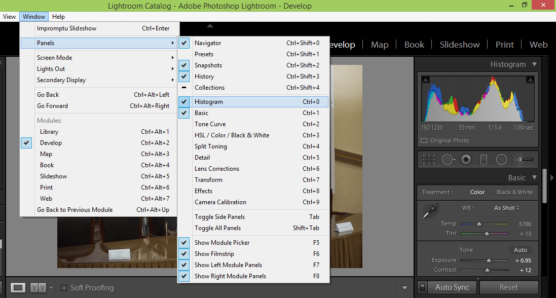
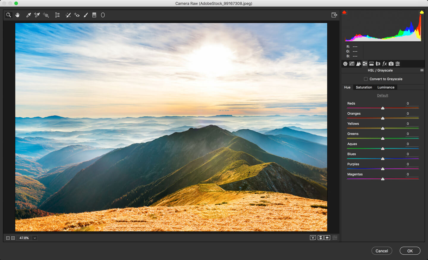
The histogram can be found in both the library and develop modules at the top of the panels on the right. The version in the develop module is more interactive than the one in the library module because it lets you adjust your images directly from the histogram and also shows you any clipped pixels that the image might have. If you open Lightroom and cannot see the histogram for some reason, you can view it by going to Window> Panels> Histogram or by pressing Ctrl+O/Cmd+O.

What Does Histogram in Lightroom Show?

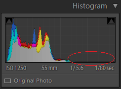
The histogram is a graph of all the pixels in your image and typically, the pixels are spread over the whole width of the histogram where the left side shows the shadows and the area on the right shows the highlights. So, if the histogram is concentrated in the middle with barely any pixels on the far right or left, it means that it has hardly any strong highlights or shadows and mostly contains mid-tones resulting in a dull image with low contrast.

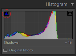
The histogram also show if you have any clipped pixels; clipping is the loss of detail in pixels which means the shadow is so dark that it has no detail and is completely black or the highlight is so bright that it is completely white.

Right above the histogram, there is a triangle in a small square on the left, which is the shadow clipping indicator while the triangle on the right indicates highlight clipping. Whenever you have any clipping in either the shadows or highlights, the respective indicator becomes white. Then, you can either click on the indicator or hover your mouse pointer over it and it will show you the clipped pixels in the image.

Is There a Right Histogram?

There are no perfect right or wrong histograms and it all depends on the kind of picture that you’re working with. Typically, if your histogram has a gap on either the left or right side, it means that most of the pixels in your image are either white/highlights or blacks/shadows. In this case, you may check for clipping and adjust it but you can’t say that it is a bad picture or that the picture has problems just because most of the pixels are concentrated on one side.

Let’s say that you have taken a picture of a black dog in front of a black gate. If you look at the histogram, most of the pixels will be on the left with a gap on the right. You don’t really need to worry about fixing it because that’s just how the image is and it is not a wrong histogram. All you need to do is make sure that the image is exposed correctly and that there aren’t a lot of pixels getting clipped; adjust for that (and for the contrast if you want) and you’ll be good to go.

Moreover, you might not need to adjust every single pixel for clipping if it’s not feasible. Again, it all depends on the kind of picture and where the clipping is occurring. So, for example, if your subject is a little boy and most of the frame is occupied by him with only a tiny area of the background getting clipped, you don’t need to sacrifice on the quality of the editing of the boy’s face just to save those few irrelevant clipped pixels. In the end, it’s up to you to decide whether you want to adjust the pixels or leave them as they are, depending on the image.

Using the Histogram Directly to Adjust Photos

The histogram is divided into five different sections which correspond to either one of the following characteristics of the image: blacks, shadows, exposure, highlights and whites. Normally, the area right below the histogram displays information about your image but if you hover your mouse pointer over it, this information will be replaced by the name of the section depending on where the pointer is hovering. The slider corresponding to that section will also be highlighted in the Basic panel. Moreover, the mouse pointer will turn into a two-directional arrowhead indicating that you can move it either way by clicking.


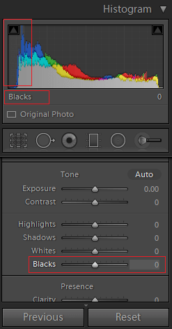
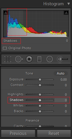
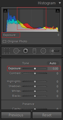
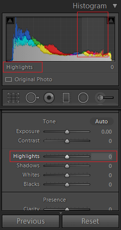
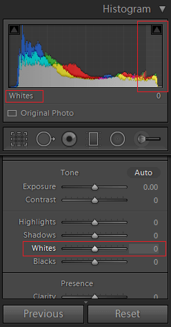
There are two ways to adjust any of the five characteristics; you can either use the sliders, or you can click on the section on the histogram and move the mouse left or right to change the values. If you’re using the histogram to adjust your photos, you will notice that as you move the mouse, the slider corresponding to the section also moves. So, in short, you are just moving the sliders directly from the histogram instead of scrolling down and moving them.
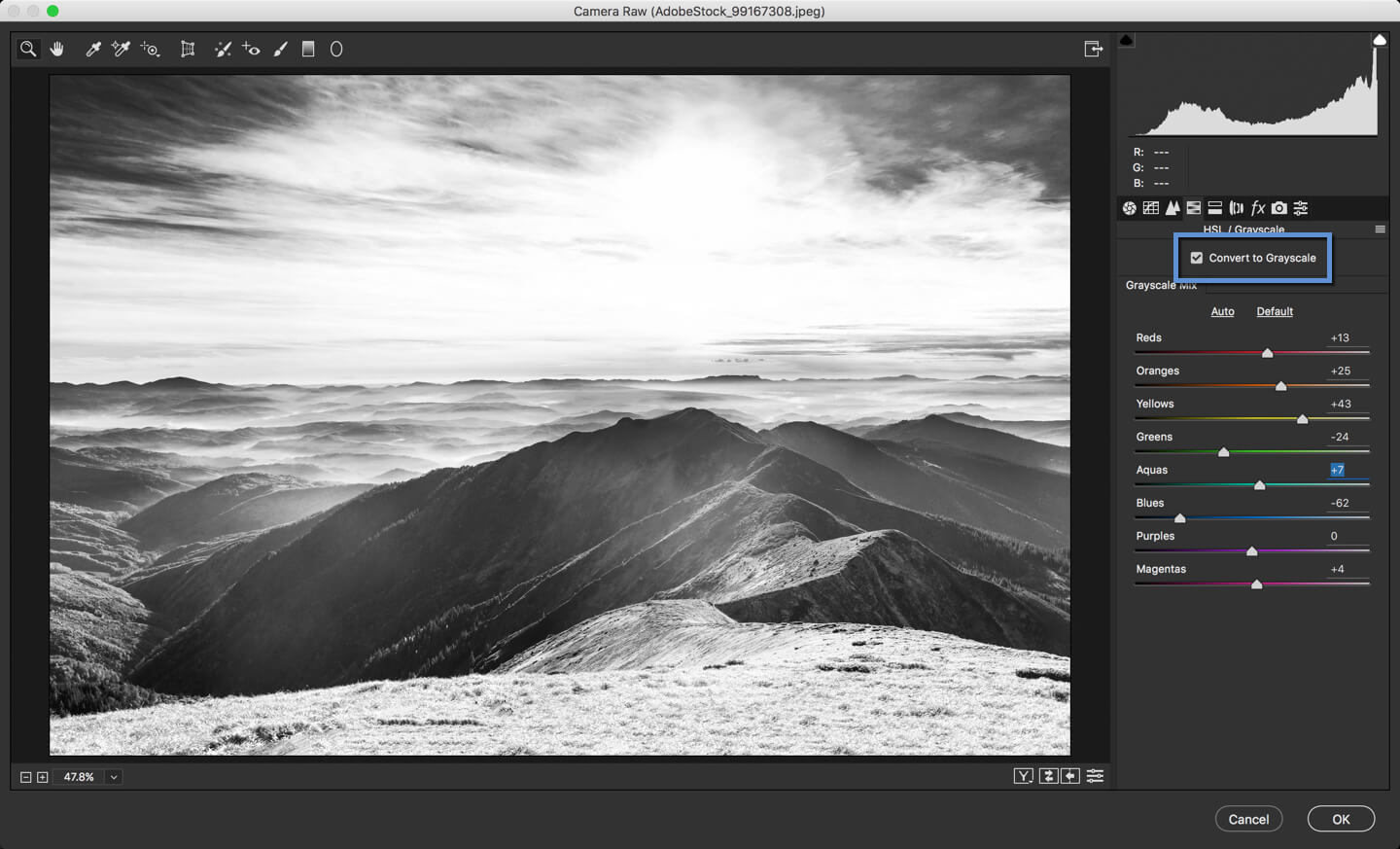
Color Histograms

If you’re working with a colored photograph, there will be parts in your histogram with various colors. These correspond to the red, green and blue channels of your image. So, there is a red histogram, then on top of it is a green histogram, and over it is the blue histogram. The other colors that you see are the overlapping of two colored channels. Then, there is a gray histogram right at the front which is like an average or a composite of all the channels. These colored histograms have pixels of the respective color plotted on it.

Moreover, you’ll notice that sometimes the highlight and shadow indicators above the histogram also turn into different colors which shows that there is clipping only in that specific channel. For example, if the shadow clipping indicator has turned blue, it means that there is clipping in the shadows but only in the blue channel.

To Sum It Up…

The histogram has many uses; it is a graph that tells you whether your image majorly consists of highlights, shadows or mid-tones. You can also use it to see if the image is well-balanced or if it has high or low contrast. It is most commonly used to check if you have any clipped pixels in your image and it helps you decide if you need to make adjustments to your photographs or correct any problems with it. If you are someone who regularly edits images, familiarity with the histogram and knowing how to read it can be extremely helpful in identifying problems and making quick fixes to your photographs.

DAY 23 – THE CAMERA RAW FILTER IN PHOTOSHOP: PART 2

Welcome back, folks! Today, we’re going on more details in Camera RAW in Photoshop. This tutorial in the continuation of my past tutorial on Camera RAW in Photoshop – Part I. Last time, I covered Basic, Tone Curve, and Detail tabs. In this tutorial, I’ll cover HSL, Split Toning, Lens Correction, and Camera Calibration.

You’re not going to use the tabs frequently that we’re going to learn today. Whenever I open Camera RAW, I use Basic and Noise 70% of the time and rest of the tabs 30% of the time.

So, let’s begin with the tutorial.

1.jpg

Step 1: HSL and Grayscale in Camera RAW

HSL stands for Hue, Saturation, and Luminance. I think that there is no real estate available in Photoshop interface so Adobe decided to go with the short form.

In this tab, you can change the Hue, Saturation, and Luminance of an image or convert an image to Grayscale (Black and White).

First off, I’ll show you how to convert an image to Grayscale. All you need to do is to click on “Convert to Grayscale”.

2.jpg

Now that you know how to convert an image to Grayscale in Camera RAW, time to learn HSL. If you look at the below screenshot, you’ll find three tabs which are Hue, Saturation, and Luminance.

3.jpg

Let’s understand each of them one by one.

  1. Hue: Hue is the color in your image. It changes your color. Look at the first slider which is Red. If you drag all the way to left, all red present in your image will become Pink. If you drag is all the way to the right, the red in your image will convert to Orange.
  2. Saturation: Saturation is the intensity, or richness, of that color. Switch to the second tab. Now if you drag the Red to the left, the Red will become gray. If you drag the Red to the right, it’ll become more saturated any may be unpleasing to the eyes.
  3. Luminance: Luminance controls the brightness value. Switch to the third tab. If you drag it to the left, Red will get darker and then to Black. If you slide it to the right, Red to turn lighter and then to White.

Step 2: Split Toning in Camera RAW

Split Toning is the easiest way to give a very colorful effect to your photos.

Split toning involves tinting the shadows of an image in one color and the highlights in another color. Although mostly applied to black and white images, this method can quite successfully be used on color images.

In the image, I kept the image colored and applied Split Toning.

4.jpg

It has three sections which are Highlights, Balance, and Shadows.

In the Highlights section, if you change the Hue slider, the highlights of the image will have a hue of that color.

The same goes with the Shadows slider.

Note: You must drag the Saturation first at least to 10 before you slide the Hue slider. This is because, if Saturation is 0 then you won’t see any difference if you drag the Hue slider.

In the Balance slider, you can set the balance between highlights and shadows. I have set it to 35% which means that whatever is less than 35% brighter than the absolute mid point, will be considered as the highlight.

Step 3: Lens Correction in Camera RAW

This tab is used to correct all the defects that a lens add.

5.jpg

Let me explain each slider one by one.

  1. Distortion Amount: Even lenses worth of $2,000 distorts the image. They make the image blobbed in the middle which disturbs the lining of the images. Use this slider to remove the blobbiness.
  2. Defringe: In some images, you see either a purple or green line around the edges of things in your image. Generally, these lines are noticeable only when you zoom in the image. This defringe slider helps you to remove it.
  3. Vignette: You already know what a vignette it. It’s the black or white circular shape which fades into its background without a definite border. You can either add or remove vignette using this slider. Drag it to the right to remove and drag it to the left to add.

Step 4: Effects in Camera RAW

Adobe named this panel as Effects but I personally don’t believe that you can create any nice looking effects from this panel.

6

First is Dehaze. It does what its name suggests. This slider helps to remove or add the haze in the image. Photoshop is not a magical tool so let’s not expect any magical return when using this slider. 🙂

Grain adds grain in the images. You may want to use it if you’re a wedding photographer. Most wedding photographers intentionally add grains to make the images beautiful.

You are wondering that why is Vignette also here even if you saw it in the previous panel. Both will give the same result as long as your image is not cropped. I’d like you to do a task. Close Camera RAW and crop an image. While cropping, make sure that you don’t turn on “Delete Cropped Pixels”. Once done, again open Camera RAW and try the two sliders. You’ll see the different results. I leave it to you to figure out why did you see different results.

Step 5: Camera Calibration in Camera RAW

In this tab, you can define the process in Camera RAW.

7.jpg

The process version is the Camera Raw technology that Photoshop uses to adjust and render photos. The latest version in 2012.

This is the place where you calibrate the RGB (Red, Green, and Blue) of the image. You probably don’t want to change it because it is really tough for a beginner’s eyes to detect the miscalibration in R, G, and B.

That’s all, folks!

Let’s meet next week. Make sure you watch other tutorials on 30 Days to Learn Photoshop series.

How to Apply Selective Adjustments in Lightroom

A Post-production workflow can be complex, if we want to do the job to a professional standard, making it essential to move past the basic elements offered by software like Lightroom, if we intend to excel as professional designers.

But how can we introduce more elements to each image for a custom look, beyond using sliders? Advanced features in form of tools, such as Graduated Filter, Radial Filter and Adjustment Brush, come to the rescue, provided by Lightroom to dedicated users who know what they want. With the help of them, we do selective adjustments in Lightroom.

Let’s explore in detail every single option designed for selective adjustments in Lightroom, and enjoy the many things they can give us through the process.

Graduated Filter Tool

Prior to talking about the Graduated Filter tool in detail, let’s picture ourselves in a post-production scenario, where we need to bring out more detail in a picture that looks similar to the image below.

01_selective

Notice the two main elements in the scene (the subject and the background) and define the area where you want the adjustment to be applied, as well as the parameters needed.

02_selective

For instance, I may decide that this subject requires a bit more Clarity in order to make the model appear closer to the camera, and that I should increase Contrast a little bit – but I don’t need those adjustments to be applied to every single area of my scene. This is where the Graduated Filter tool comes in handy.

By selecting the Graduated Filter tool, you will be applying changes to a selected rectangular area, which will have a fading effect near the edges of the area where it is applied, making it blend neatly with the elements around the adjusted area.

Select the adjustments you want to apply to your image, and click then at one point while dragging with the mouse at another point. That will create an application area, which you will notice, if you enable ‘Show Selected Mask Overlay’, is likely to affect the area to the left of the selection you made as well.

03_selective

After hitting ‘Done’, you can view the adjustments you applied, and if you need to correct any parameter, simply select the tool again, click on the tiny gray button that shows up on the main Develop area, and correct the parameters shown in the slider area.

You can use the Before/After mode to compare the changes applied to the image.

04_selective

Radial Filter tool

This tool works in a very similar way to its ‘brother’, the Graduated Filter tool, although you have much more control over the selection made, and the applied changes won’t affect the selected area, but rather everything else that is not included in your selection.

05_selective

Of course, these settings can be changed, if you go to the bottom of the tool panel and hit ‘Invert Mask’.

06_selective

The Radial Filter tool is likely to become a part of your post-production routine by giving you the liberty of adjusting nearly every single aspect of your image, while discarding everything else that does not needed to be adjusted.

The effects made with this tool are often soft, since you will have exact control over which area you want the parameters to cover, rather than setting an overall value.

Adjustment Brush tool

And what if you need even more freedom to adjust your image? What if I tell you that you can just click on tiny selected areas and apply changes, exactly like you do it inside Photoshop?

07_selective

The Adjustment Brush tool is intended for extremely specific purposes, such as bringing detail/giving tint/correcting values of tiny, hard to reach areas where precision is a must.

This tool is often overlooked by users, who consider it useful only for ‘beauty jobs’, but the Adjustment Brush tool can do much more. With the right set of presets, you can simulate sunlight in your post-production project!

08_selective

As you can see, the sky is the limit with these advanced features. Designers work hard in order to provide quality products for these kinds of features, such as brush presets, but the truth is that brushes can work with the previously mentioned tools as well, making your post-production experience much broader.

The only thing Lightroom will demand from you is that you practice to be able to use such advanced retouching tools; but in the end, the effort will be worth it, as you take the first steps on the path of professional photography.