How Adobe Photoshop Has Changed the History of Photography

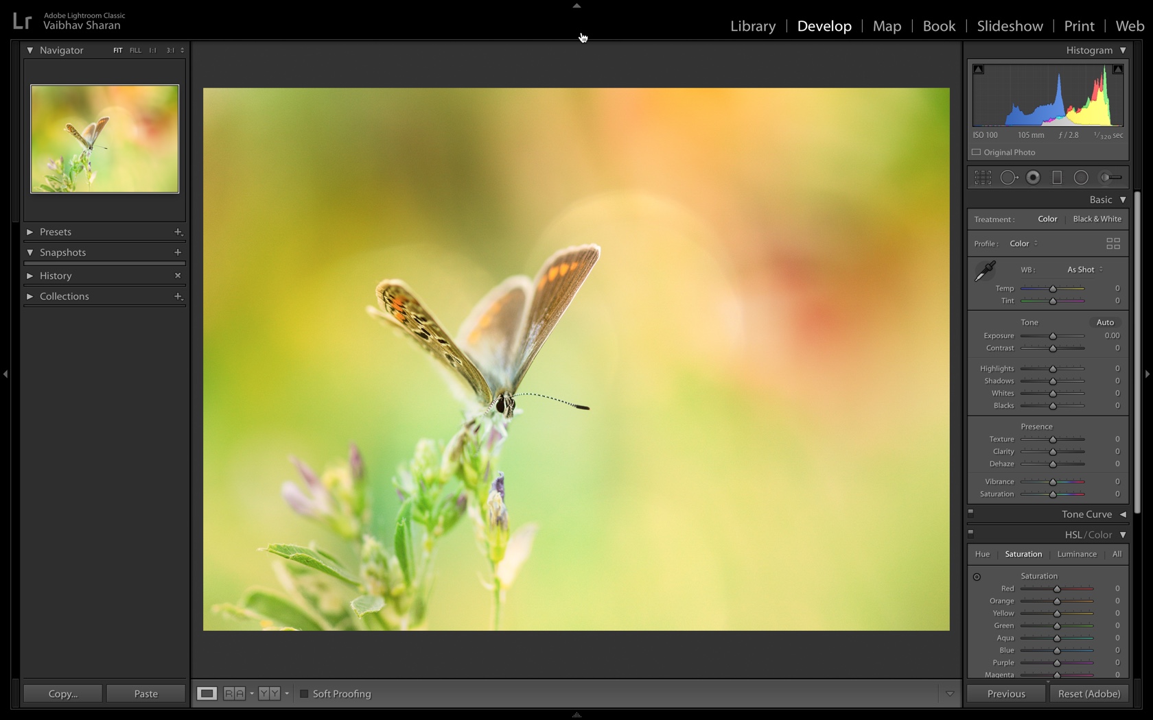
It is apparent that Photoshop has changed the history of digital photography and its practice. Before this software, there was extreme patience needed for going into digital photography. To capture something remarkable a camera had to be carried around everywhere. This changed instantaneously with the invention of Photoshop. If you come across an enticing image today, you will be in awe of it but your second thought is always, “This has to be photo-shopped.”

In 2019 Photoshop turned 31. There is a lot to be noted about its influence on the world of photography. It has not only changed the game but also how we view the world. Digital artists and manipulators know how to take a regular snapshot and transform it into something wholly diverse and extraordinary.

Before Digital Photo Manipulation

Several centuries of hard work has led to enhancing the effects of photography. These changes are now considered to be an art form.

Once the notion was made public, photo manipulation came to be used quite widely by artists and photographers. The trick that most photographers used in the early days was the use of dual exposure to combine different negatives into one and give the photograph a touch of humor.

The alterations done were obvious and even funny, which gave rise to typecast such as the two-headed man.

According to today’s standard, this is a pretty rudimentary use of manipulation but the speed with which this novel system was used gained a lot of popularity. Photo manipulation soon became broadly used in architectural mapping, concept design, marketing, and even simple photography.

The commercial sector made a fortune out of this equipment, making several products in advertisements and infomercials look better than they were.

The Start of Photoshop

Photoshop was released in the 1980s. It soon became the primary image processing software to go into photography. The initial versions were quite mediocre compared to today. There were only basic filters and image modifications, and no layer support. There was still some substantial flexibility when associated with traditional photo development that took place in the dark rooms.

Soon enough, Photoshop offered creators, illustrators, and photojournalists the instrument of choice to make their mark. Besides photography adjustment and manipulation, the importance of Photoshop is both hands-on and historical.

Its growth and use have changed the way we see the world and it has helped edit and familiarize millions of different photography techniques around the globe. It opened people’s minds for more and enabled the introduction of renewed outlooks and inventive expressions.

A New Perspective

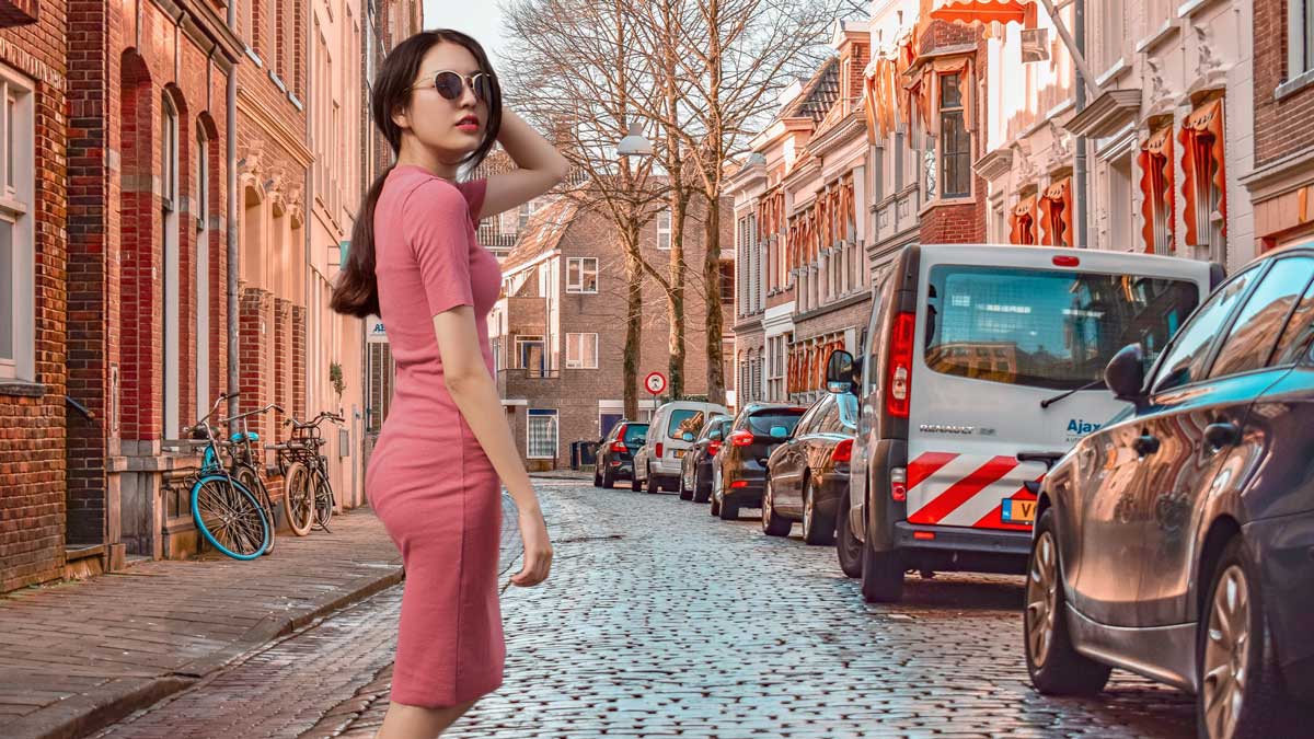
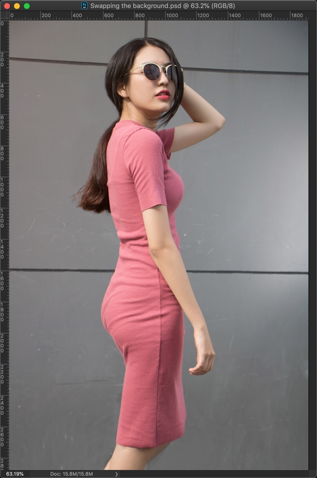
Photo-shopped images can disrupt reality and the way we see it. Whether it alters aspects of people, places, or things, there is a certain amount of creativity and time that goes into these changes. You get a new perspective of the world.

Before Photoshop, digital photo manipulation relied heavily on expensive machinery and skillful production staff. Photoshop has lifted this heavy workload and excessive limitations and has brought about many significant changes in conventional photography.

Photographs are not just documentations of our environment. They allow artists to express their perceptions of life. With Photoshop, this vision can be molded to fit a photographer’s specific taste the message they want to send into the world.

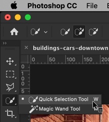
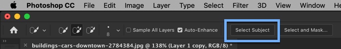
Here are some ways Photoshop has changed aspects of photography.

The Appearance of Models

Hollywood stars and fashion models do not look like real people anymore. When you see their heavily altered faces in magazines, their skin and curves are perfect in every way. This leads us to believe that beauty equals perfection.

Photoshop has led beauty to become an unrealistic goal, and while we cannot blame the software for this dynamic social issue, it has contributed a large amount.

A person’s appearance can be changed drastically through Photoshop to reach an unattainable standard of beauty. This can range from lengthening necks and legs to cutting out ribcages even, or raising cheekbones, filling in hair and changing skin color.

Media Images

Whenever you look at an extraordinary image your first reaction is, “Wow, this is amazing!”

However, the perfection of the image makes you wonder how accurate it is when compared to real life. “Must have been photo-shopped!” is what most people say now. The perception of media images has been molded by the use of Photoshop by using colors and editing to make graphics more beautiful and worth seeing.

The issue with media organizations all over the world doing this is that there are no overall criteria for how much news photos can be edited. Every editorial office has a different perspective but most of them opt to do as much as possible, which changes photography culture entirely.

Advertisements

The advertising industry has been completely changed due to image manipulation. Looking through a magazine means coming across dozens of photo-shopped ads.

This means that companies that used to run text ads and hire photographers to take good quality photos have an easy way out. For example, if corporations need someone to design a logo they can now just pay someone to make their ad on a Mac or PC. Photoshop has offered the advertising business more booming business with half of the workload than before.

Social Media

Since the complete takeover of social media, Photoshop has found a new avenue for change. Viral content, such as memes, has become a general source of entertainment. Photoshop is used to curate these pictures and animation videos.

There are hashtags and websites all about Photoshop fails and disasters and examples of the images and videos produced. Pop culture has taken in the software and become intricately laced with it over the years.
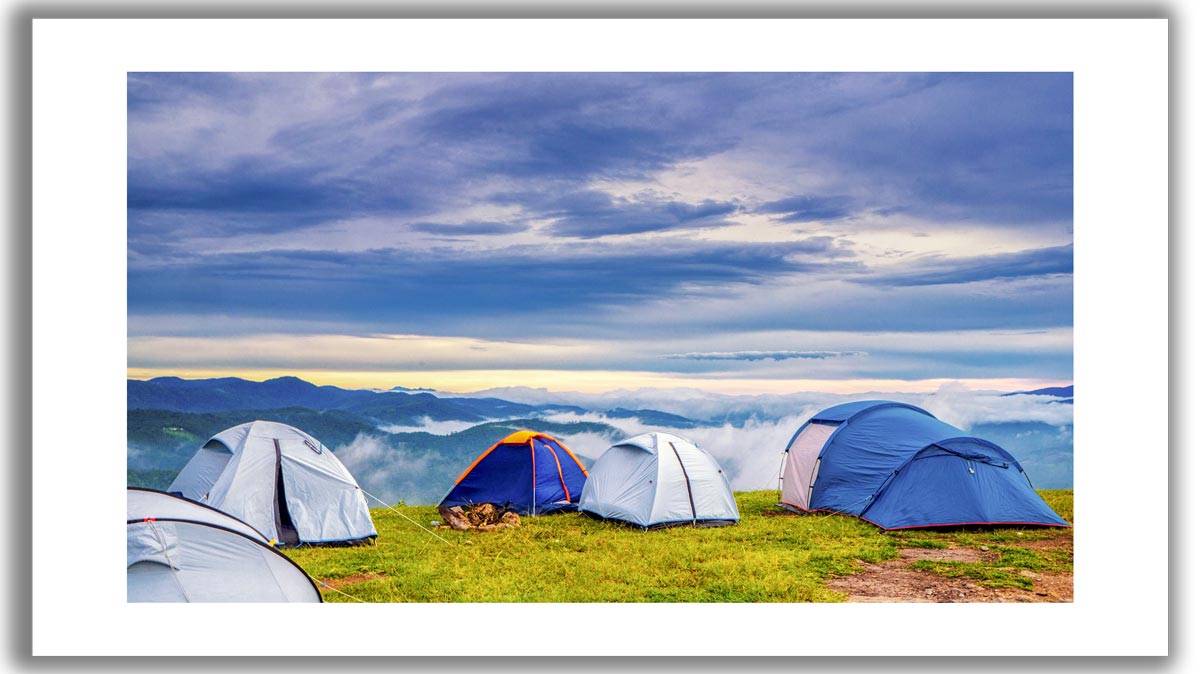
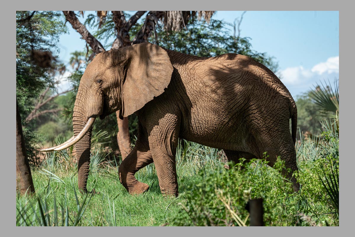
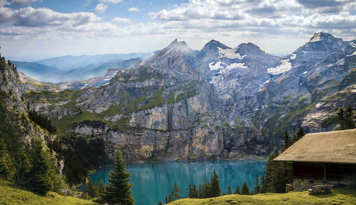
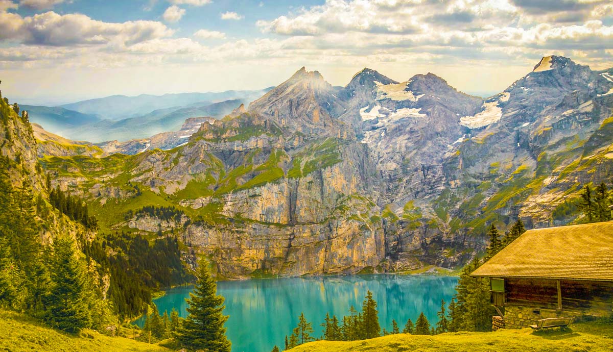
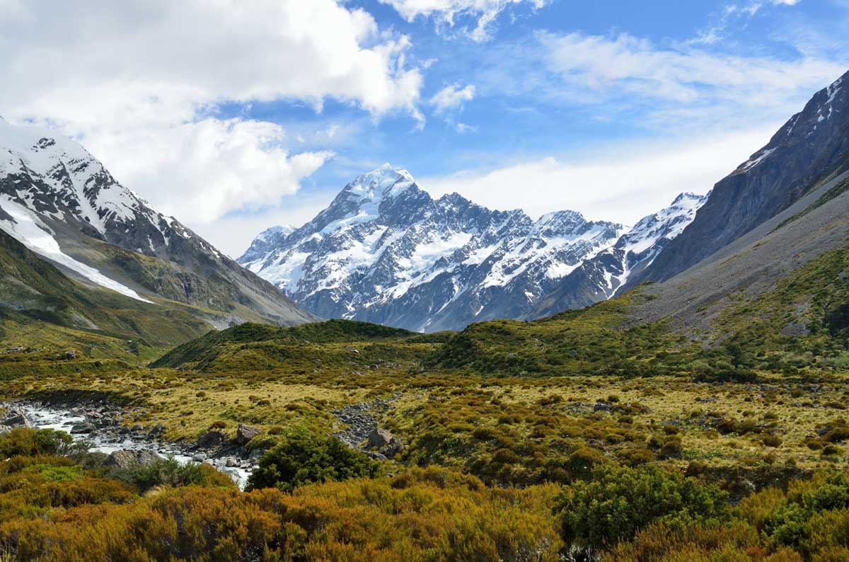
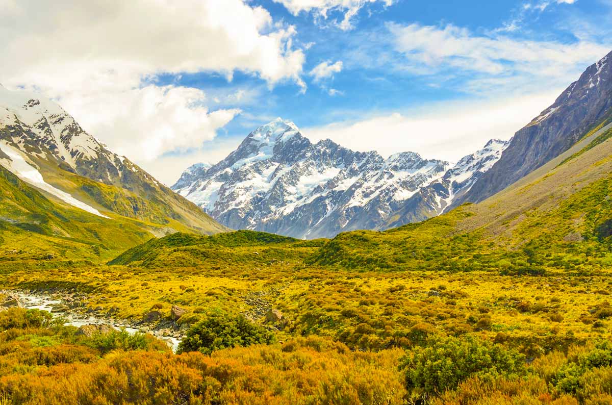
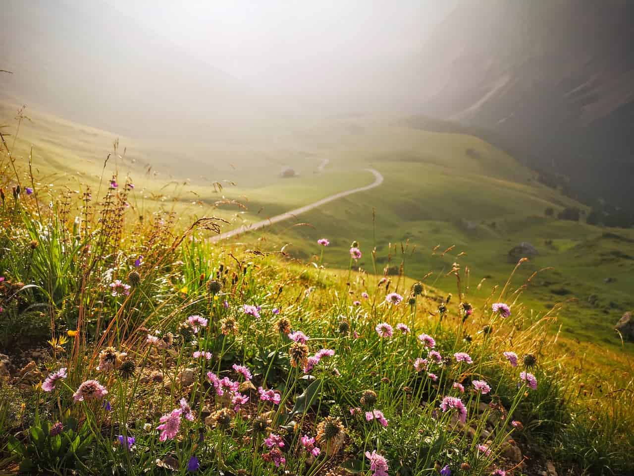
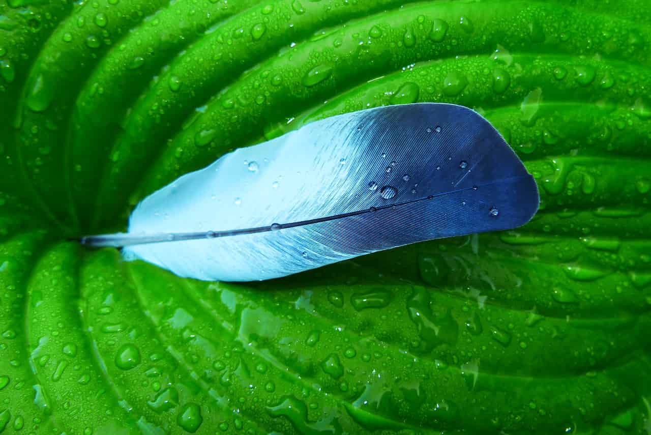
Natural Landscapes

Watching channels like Planet Earth on the Discovery Channel has changed the way you look at natural landscapes of the world even. Yes, there are many beautiful places all around the planet with some wild and fascinating looking creatures.

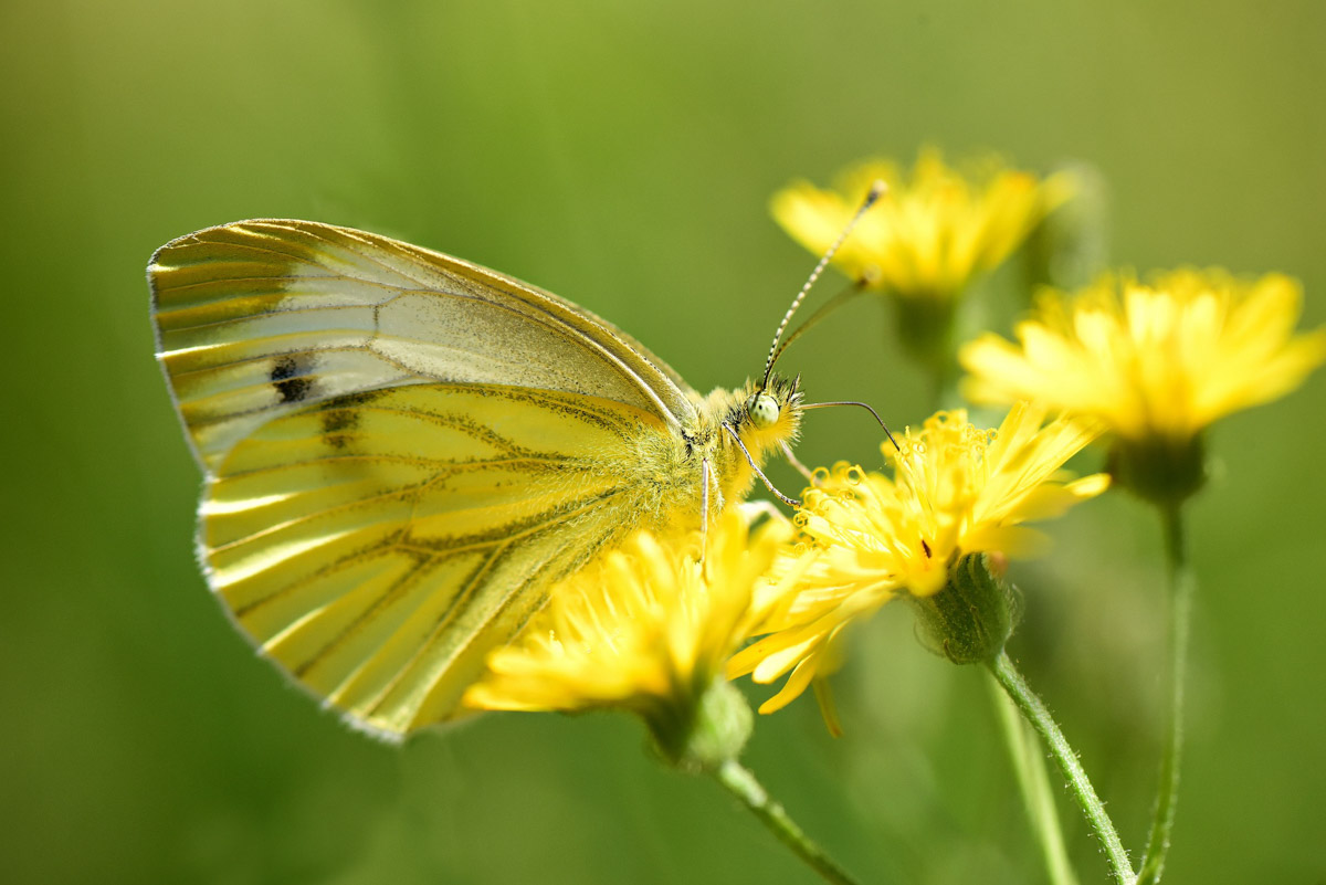
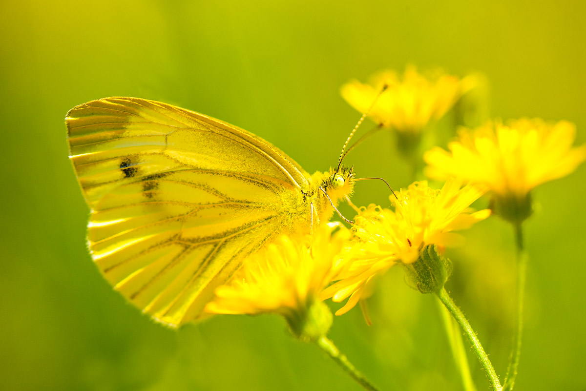
However, Photoshop has allowed artists to get even more creative with nature. Photography features new species and landscapes that are not even real and may never exist.

Author

Sarah Jay works are a freelance content writer for Logonado Design Australia. She feels passionate about topics such as graphics, logos, and illustrations. Whether you want to learn how to design a logo or what the new trends in graphic illustrations are, she has probably written about it. In her free time, Sarah Jay likes to travel and read fiction books.

How to remove white space from a photo in Photoshop?

I know that you can crop a photo. But, why waste so much time when you can remove white space from a photo in Photoshop with just 1 click?

Today, we’ll see how can you quickly remove the white space from a photo. You can also remove other colored spaces like gray, black, green, and so on. This is going to be a very short tutorial.

Before we proceed, let me show you the before and after photo.

Before

I added a shadow so that you can see the white space against the white background of this site.

Before.jpg

After

After.jpg

Thank you Pixabay for this photo.

Step 1: Open the photo in Photoshop

Go to File > Open or press Cmd + O / Ctrl + O to open the file.

1.jpg

Choose the photo and press Open.

2.jpg

Here’s the photo.

You can easily see that there’s a white space that is covering the photo. This is what we are going to remove.

3.jpg

Step 2: Remove the white space from a photo in Photoshop

Time to remove the white space in Photoshop. We are going to do it with Trim.

Go to Image > Trim.

4.jpg

The Trim box will open. This box shows you what Photoshop is going to do with your photo.

Select the “Top Left Pixel Color”. Choose all four checkboxes in “Trim Away”. Press OK.

In my photo, the top-left pixel color is white. Because “Top Left Pixel Color” is selected, Photoshop will remove all the white color that is present across the edges of the photo.

5.jpg

Note: Photoshop will not delete the colors that are inside the photo. It will only trim away the edges of the photo.

Here’s the photo.

After

Let’s take one more example.

This photo has a gray space.

6.jpg

I am again going to do the same thing. I’ll go to Image > Trim, choose the radio buttons and checkboxes that I chose in step 2, and press OK.

Here’s the final photo.

7.jpg

This is how you change the background in Photoshop

I get a lot of requests to change the background in Photoshop when people approach to hire me. I tell them that I can do it in $10 and they just need to send me the photos. So, after receiving overwhelming number of requests, I decided to write a tutorial by myself on how to change the background in Photoshop.

Difficulty: Moderate
Time required for a first time doer: 15-20 mins (for a beginner)
Total steps: 4
Tools used: Magic Wand Tool, Camera RAW filter, Color Balance Adjustment layer, and Select and Mask

This is going to be a big tutorial. If you want, you can hire me to change the background to you. I can do it in $9.99. Just mail me the photos at hello@tricky-photoshop.com.

Before we proceed, I want to show you the before and after.

Before

Before.jpg

After

After.jpg

Thanks Pexels for these beautiful photos.

Step 1: Finding the correct background

The first thing that you need to do is to find the correct and beautiful background. There are many sites where you can find beautiful backgrounds.

Some of them are

You don’t need to even sign to download the free photos.

Step 2: Make a selection in Photoshop

Open your photo in Photoshop.

1.jpg

Grab the Quick Selection Tool from the tool panel.

2.jpg

Click on “Select Subject”. Photoshop will used its artificial intelligence to select the most important subject in the photo. In this case, the most important subject will be the photo of you.

3.jpg

See how beautifully Photoshop has selected the person in my photo.

4.jpg

If you can’t fingure out how to do it, I can do it in $9.99. Just mail me the photos at hello@tricky-photoshop.com.

Step 2: Refine the selection

The selection is not perfect. Take a look next to her hair. It’s not properly selected. We’re going to fix that.

Go to Select > Select and Mask.

5.jpg

Grab the Refine Edge brush from the tool panel.

6.jpg

Keep the center of the brush on the hair and perimeter outside the hair. Brush on the hair. See the below GIF.

7.gif

Here’s my version.

8.jpg

Check the right panel. Most of the sliders here are not required. But, if you want then you can copy these. Change “Output To” to New Layer with Layer Mask. Press OK.

9.jpg

This is how your photo would look.

10.jpg

We’re now again going to select the photo. Hold down Cmd/Ctrl and click on the layer mask.

11.jpg

This will select you. Copy yourself by pressing Cmd + C / Ctrl + C.

12.jpg

If you can’t fingure out how to do it, I can do it in $9.99. Just mail me the photos at hello@tricky-photoshop.com.

Step 3: Put the person on a new background

Open the background.

13.jpg

Paste yourself by pressing Cmd + V / Ctrl + V. Photoshop will paste the photo at the center but the photo won’t be aligned.

14.jpg

We’re going to align the photo using the Free Transfrom tool. Grab these handle bars and align the photo. Press Return/Enter when done.

15.jpg

This is how my photo looks now.

16.jpg

If you can’t fingure out how to do it, I can do it in $9.99. Just mail me the photos at hello@tricky-photoshop.com.

Step 4: Fix the colors for better blending

The backgorund is kind of reddish when compared to the girl. Also, the background is a bit dim also.

We’re going to fix it.

First fix the redness.

Go to Layer > New Adjustment Layer > Color Balance

17.jpg

Change the Tone to Shadow and turn on Clipping Mask.

18.jpg

Increase the redness to 10.

19.jpg

Change the Tone to Midtones and increase the red to 9.

20.jpg

Change the Tone to Highlights and increase the Red to 6.

21.jpg

Time to fix the lightness.

Go to Layer > New Adjustment Layer > Levels

22.jpg

Decrease the Outpul level to 245 and turn on the Clipping Mask.

23.jpg

This is how the photo would look now.

24

If you can’t fingure out how to do it, I can do it in $9.99. Just mail me the photos at hello@tricky-photoshop.com.

Download FREE Sepia Effect Lightroom Preset

Here is the preset that you’ve been looking for. This preset will create a sepia effect in Lightroom.

If you’re looking for a tutorial to create a sepia effect, here’s the tutorial to create a sepia effect in Lightroom.

Download the preset to create a paint effect in Lightroom. Yes, no email id is required.

Download for FREE


Download for FREE

[Preset Included] How to create a Sepia effect in Lightroom

Creating a sepia effect in Lightroom does not only mean to drag the Temp slider. You also need to take care of the Shadows, Highlights, Contrast, and HSL. I am going to show you exactly the same. Let’s see how to create a sepia effect in Lightroom.

This is going to be a short tutorial. Almost all Lightroom tutorials are the short one you only play with sliders.

Oh yes, if you want to download the preset, I have it here for you. No sign up is required.

Download Lightroom Sepia preset

This link will scroll you to the bottom of the tutorial. If it doesn’t, scroll to the bottom. You can see more Lightroom presets here.

Let’s see the before and after.

Before

Before.jpg

After

After

Let’s begin.

Step 1: Increase the temp

This is the first step and the most important one. Sepia effect basically means that your photo should have a yellowish tint.

  • Increase the temp slider to +20.

1.jpg

This will add a yellowish effect to your photo. This is not everything. We need to do a lot more things.

2.jpg

Step 2: Adjust the tone

Time to adjust the tone.

The goal is to make the shadows bright and dim the highlights. Also, increase the colors in the photo.

  • Decrease the Highlights to -40
  • Increase the Shadows to +90
  • Increase the vibrance to +63

3.jpg

This will make the photo brighter.

5.jpg

Go to the HSL panel.

I am asked by some of you that they don’t see the Hue, Saturation, and Luminance tab. This is because you’re in the “Color” panel. Click on the “HSL” in the title and you’ll see them.

  • Increase the saturation of the Yellow color to +90

4.jpg

This will slightly increase the yellowness in your photo.

6.jpg

Step 3: Adjust the split toning to create a sepia effect in Lightroom

The shadow is already having the sepia tint. We need to give the highlights a sepia tint.

Go to the Split Toning panel.

  • Increase the Hue to 60
  • Increase the Saturation to 10

7.jpg

Your photo should look like this.

After

Download the Lightroom sepia preset

As I promised at the starting of this tutorial, here’s your preset.

Download Lightroom Sepia preset

Background color of e-commerce photos – The Ultimate Guide

We edit thousands of photos daily. White remains the most preferred color for the background but the trend is now changing. Light gray is now emerging but there’s a catch. Let’s see what this guide for the background color of e-commerce photos bring to you.

The ultimate guide for the background color of e-commerce photos

You are thinking that why is background important. Don’t you?

Here’s a fact.

50% of online shoppers think that product photos are more important than product information, reviews, and ratings. Shopify

Your background can make your photo more appealing or can do the opposite.

1. Types of the background color of e-commerce photos

There are mainly three types of background

  1. Lifestyle background – The products are shot in a way that it shows the usage of them. It’s good to build an emotional connection with the product.
  2. Product only – The photos are shot against a neutral color background. It increases the conversion rate.
  3. Pattern background – The background is a pattern. It’s a good option for those who don’t want to have a neutral background.

2. Lifestyle background for e-commerce photos

Let’s see one example

1.jpg

Take a look at the above screenshot. It’s of Dainty Jewells. I think that Charity, founder of Dainty Jewells, like potential customers to build a connection with the dresses.

The main purpose of liefstyle photos is to show where and how to use your products.

Photos with lifestyle background do this.

Its product page also has only lifestyle photos. I could not find any photo with a solid or neutral background.

2.jpg

Lifestyle photos don’t perform well in terms of conversion rate.

Take a look at the above screenshot of Joinery. Aren’t the photos looking beautiful? But, are the photos converting well? I doubt so.

6.png

At first glance, I got confused that what is the actual product they’re selling. Was it the chair or the rug in the first photo? I don’t know and I won’t bother clicking on the photo to find out. Also, the title of the product is written in such a small font that my eyes won’t naturally go there.

Sometimes, lifestyle photos confuse the potential buyers because the customers can’t figure out the actual product in the photo. It further decreases the conversion rate.

According to us, the best way to show lifestyle photos is after showing the product only photo. Here’s an example.

3.jpg

This backpack is on Rom Outdoor. The site is showing the lifestyle photos after showing the product only photos.

It’s also good to add a few lifestyle snaps to your product page, helping to to boost emotional engagement.

3. Product only backgrounds for e-commerce photos

Here you show the product against a neutral background like white color, gray color, or any other color.

These photos describe your product at a glance and are best suited for your catalog and product pages. Their job is to nurture page visitors towards making a purchase.

When consumers view a product page, they are looking for proof of quality and value. A neutral background provides this proof and value.

There are mainly three colors which most of the e-commerce stores owners are using nowadays

  • White color
  • Light gray color
  • Pastel colors

You should make sure that your product covers 85% of the photo in the photos having a neutral color background.

3.1 White color background

Have a look at Amazon. All photos have a white background.

There’s a reason Amazon uses only the white background. The reason is that the white color background gives the highest conversion rate. Amazon invests millions on research and if they’re still using white background means that research supports this color.

4.jpg

But, there’s a change in trend.

Although white color background converts a lot better than other backgrounds but white color backgrounds fails to build an emotional relationship between your products and potential buyers.

3.2 Light gray background

You put a shade of gray in the background.

Here’s a lookbook of Sarah Pacini. Can you see the shade of gray in the background?

5.jpg

The gray background does not give as high conversion rate as the white background.

Gray background adds premiumness to the photos. It does not have a high conversion rate like white backgrounds but it adds an emotional connection with the potential buyers. Your existing buyers are more likely to purchase from you again.

This is what we also advice.

You know that we edit e-commerce photos. We also advise our clients to use a light gray background (usually #eeeeee) for their photos.

3.3 Pastel background

Pastel colors are pale colors that soothe eyes. Here’s a Wikipedia article on pastel color.

Take a look at the screenshot of Flaire Junkie.

8.jpg

Pastel colors are very eye-catchy. Maybe because they soothe the eyes.

Pastel colors tend to work good with colorful dresses. It also works good with fancy items like colorful phones, cloths. iPhone red also has a red pastel background on apple.com.

4. Pattern background for e-commerce photos

You show a pattern in the background.

Here’s a screenshot of a page on Oh Polly.

7.jpg

The photo has neither a neutral background nor a lifestyle background.

The conversion rate of pattern background is between the lifestyle background and neutral color background.

The choice of pattern plays a crucial role in the perception of the product in the potential buyers’ minds.

Black color signifies luxury and this dress has a black pattern background. The photo is also edited in such a way that it signifies the luxuriousness of the dress. But, the dress costs only 40 pounds. Guess what? It’s cheap.

The buyer will think that it’s a luxury dress but costs only 40 pounds. She won’t think twice before making the purchase.

How to Write a Great Bio Page for Your Photography Website

As a photographer, you have all sorts of skills behind the lens, but you’re still going to have to turn your hand to other things.

Writing copy may or may not come naturally to you, so let’s take a look at the basics you need to know to write a great bio page.

Why do you need a bio page?

Bio pages are just as important in the world of photography as they are anywhere, and in a lot of cases, they can really clinch the deal.

mountain-4387827_1280-min.jpg

When someone’s hiring you to take their wedding photos, for example, they want to know they’ve found someone that will put them at ease. If you have a bio that’s welcoming, personable, and easy to connect with, people are going to want to do business with you.

This is what a bio page is for, and it’s why you cannot afford to go another day without one.

Introduce yourself by painting a picture of who you are

The first thing you need to do is introduce yourself. If people don’t know who you are they’ll find it hard to connect with the rest of what you have to say.

savoy-3860933_1280-min.jpg

You’re a photographer after all, so if there’s not a picture of you looking creative near the top of your bio, it’s going to feel a little strange.

Find something that matches the tone of the writing you’re aiming to produce, and then combine it with a friendly opening. This isn’t the part where you want to pitch for work, so introduce yourself, and nothing more.

Tell the reader what you do

With the introductions over and done within a few lines, you can turn your attention to your expertise.

dom-4404207_1280-min

You’re providing a service, so don’t assume that people will know exactly what areas of photography you specialize in. Be explicit, be clear, and most of all make it plain that you’re flexible and adaptable.

These are the things people look for most with a photographer, especially if they haven’t hired one before and will be making up a part of what they want as they go along.

Talk about where you work, and why

You cover a particular area, or you shoot a particular type of shot, so talk about it. This doesn’t mean that you have to limit yourself to these types of jobs for the rest of your career, far from it.

ape-4398922_1280-min

But what it does do is give the reader an idea of whether you’re someone they can realistically hire.

There are also some photographers who aren’t available for hire. They spend all of their time on the shoot and then sell collections afterward. If that’s what you do, make sure people know.

Remember to make a point of your experience

There are so many different web copy errors out there, but one of the most egregious is forgetting to sell yourself.

You’re someone who has spent a lifetime behind the lens, so make sure people know they’re hiring an expert. It’s not boastful to say you’ve been doing it all your life; it’s actually rather reassuring.

You want to set the reader at ease, and there’s no better way to do that than by making it crystal clear you know exactly what you’re talking about.

Describe why you got into photography with plenty of passion

Photography is a creative art, and half the time people are hiring you because of the way you approach your medium.

the-feather-of-a-bird-4395771_1280-min.jpg

It’s about making people know you care about the end result just as much as they do. You’re not someone who goes through the motions and emails in the prints.

You’re a creative with a passion for capturing those fleeting moments which can define a life well-lived.

Be passionate and creative with the way you describe how you got into photography and it will make the world of difference to the quality of your bio.

How do you run your business?

Another one of the common mistakes is to make no mention of how you run your business. Of course, this is a bio, so there’s not all that much space for the specifics and logistics, but you still need to mention them.

Perhaps you do engagement shoots to get people ready for their weddings, maybe you only do seasonal shoots in certain parts of the country; just drop in a few little pieces of information to get people thinking about how they can use your services.

End with a great call to action that hooks the reader

If you want to hook the reader, you need to end with a call to action. It’s a bio page, after all, so you can’t go directly to the hard sell otherwise it will just make the rest of your copy feel insincere.

gerbera-4346124_1280-min

The secret is to talk about how excited you are to work with the reader. This will convey your passion for your art, whilst at the same time giving them a gentle nudge that you are open for business.

Make sure you check the spelling and grammar

Ask the professional writers out there what drives them mad and they’ll tell you it’s a great piece of copy that no one has spellchecked.

It’s an indication that you’re not quite on it when it comes to that all-important attention to detail, and you’ll lose more than your fair share of customers as a result of it.

Make sure you check your work, sleep on it, and check it all over again. That way you can sleep with the peace of mind that you’ve given your bio your best effort.

Find a tone of voice that fits your personality

Lastly, put a lot of thought into the tone of voice you want to use. If you make the bio feel overly corporate and rigid then it will read like just another generic LinkedIn page.

You’re a creative person, so let a little bit of your personality shine through. Not only is it far more original and unique, but it’ll also help you stand out from all the other photography sites out there.

Final Thoughts

Now that you’ve heard all about how to create the bio of your dreams, all that’s left is to start putting pen to paper.

Take your time, don’t try and force it when you have writer’s block, and embrace it when the words really start to flow.

Before you know it you’ll have an irresistible piece of copy that tells browsers everything they need to know. Just what you need to grow your business by sharing a little bit about yourself.

How to create Transparent Text in Photoshop?

Adding your contact details as a transparent text is the best way to add watermark in your photos. Viewers can see your details and at the same time, your contact details are not blocking anything. In this tutorial, I am going to show you how to create transparent text in Photoshop.

This is going to be a short tutorial. We’re not going to use any adjustment layers but just layer styles.

Before we go ahead, I want to show you the after and before photos. Here’s a very beautiful photo of Praca do Comercio that is present in Lisbon, Portugal.

This photo is by Frank Nurnburger and present on Pixabay. Nice work, Frank!

After

Final.jpg

Before

Initial.jpg

Let’s start the tutorial.

Step 1: Write the text

Grab the Text tool from the tool panel.

1.jpg

Change the font to the one you want to use. I am going to choose League Spartan (one of my favorite fonts 😀).

2.jpg

Write the text.

3.jpg

Step 2: Adjust the position of the text

Go to Edit > Free Transform or press Cmd + T / Ctrl + T to activate the Free Transform tool.

4.jpg

Drag and drop the text to your desired position. Press Return/Enter to deactivate the Free Transform tool.

5.jpg

Step 3: Make the text transparent in Photoshop

Go to Window > Layers to activate the layer panel.

Make the “Fill” 0%.

6.jpg

This will make the text transparent.

7.jpg

Step 4: Add some style using Layer Style

Click on the fx button that is present at the bottom of the layer panel. It’s the second icon from the left. Choose Bevel and Emboss.

8.jpg

Adjust the setting in the option. I am going to go with the below settings. You can tweak these settings. This will give an emboss like effect to the text.

9.jpg

Click on Outer Glow and adjust the settings. This will make your text glow.

10.jpg

Click on Drop shadow. This will add a shadow to the text.

11.jpg

And this is how you make a text transparent in Photoshop.

What should be the size of e-commerce photos?

This is a debatable topic. There’s no exact guide for us to follow. But, the rule of thumb is that each photo should be lesser than 100Kb.

Google says that high page loading time decreases sales. Sites loading between 1 to 3 secs have 32% higher bounce rate than the sites which load under 1 minute.

Shoppers are really having no time nowadays.

image13.png

Do you see the increase in bounce rate?

Understand the effect of high bounce rate

Bounce rate means the number of people come to your site and doesn’t do anything (no link click, no button click, nothing) and leave your site divided by the total number of people who come to your site.

Case 1: Site loading speed is 3 secs

Suppose your current bounce rate is 20%. You get 1,000 visitors every month and with 20% bounce rate means 200 people leave your site straight away. Now, only 800 people are left to buy your product.

Case 2: Site loading speed is 5 secs

Now, your bounce rate will be increased by 90%. So,  90% of 200 is 180. Which means that total people who’ll leave your site are now 480.

Out of 1,000 visitors you get, 480 straight away leave your site.

Damn!

Now only 520 are left to buy your product.

How photos affect the loading speed and bounce rate?

Photos are a lot heavier than text.

In 1 KB of text, you can put 1,024 characters. Can 1 KB of the photo has this many characters? No.

Photos are heavier so they take time to load and page loading time increases.

Page loading time increases which increase the bounce rate.

So, there’s a direct relation between the size of the photos and bounce rate. Heavier the photo, higher the bounce rate.

But why are product photos necessary?

75% of Online Shoppers Rely on Product Photos When Deciding on a Potential Purchase. Source

Do you see it? I don’t think that I need to explain to you anymore.

One more.

Good Visual Content is 40% More Likely to Get Shared on Your Social Accounts. Source

What is the ideal size of the e-commerce photos?

My company and I edit e-commerce photos (yes, we make your e-commerce photos better by editing them).

From my experience, you should not worry if the total size of the photo is less than 100KB. You also need to make sure that your photo is looking equally beautiful even if it’s only 100KB.

But why 100KB?

Typically, a product has 5 photos. If each photo is 100KB then the total size would be 500KB.

Average net connection speed in the US is 2.33MB per second so loading 500Kb will take less than 0.3 sec. [Source]

The speed also varies by the cities. Kansas City has the fastest net and the average downloading speed there is 19.8MB. [Source]

How can you make photos lesser than 100KB in size?

The answer is “Export As” in Photoshop.

I use this feature all the time. I simply go to File > Export > Export As

2.jpg

I decrease the quality to 50% and dimension to 800 pixels wide.

This normally make the photo only 40-60KB in size which I consider a perfect size.

3.jpg

3 ways to remove colorcast in Lightroom

I am like you. The first thing I do in my photos is to remove the colorcast or tint. Adobe also knows that most of the photographers prefer to remove colorcast in Lightroom first and then play with other sliders. Maybe that’s why it has put White Balance slider at the top.

Today, I am going to show you the 3 ways to remove colorcast in Lightroom. Colorcast and tint are the same things. This tutorial will stay relevant to you if you want to remove tint in Lightroom.

I will remove the color cast using 3 different ways. In the end, I’ll show you which one gives the best result.

Related: Remove colorcast in Photoshop

(Fastest) Method 1: Remove colorcast in Lightroom using White Balance dropdown preset

Open the photo in the Lightroom.

1.jpg

Click on the dropdown that is next to WB.

2.jpg

Choose “Auto”.

3.jpg

Here’s the final photo.

Final Auto WB.jpg

Here’s the before photo.

Raw.jpg

Method 2: Remove color colorcast in Lightroom using the Eyedropper tool

Click on the Eyedropper tool left to the WB.

4.jpg

You need to choose the area that should be white but appearing yellow or blue because of the colorcast.

I am going to this leaf. I know that it should not be white but this leaf’s color is very close to white.

5.png

As soon as you put the eyedropper tool on it, Lightroom will show you the average colors. Click on it.

6.jpg

Here’s the final photo.

Final Eyedropper Tool.jpg

Here’s the initial photo.

Raw

Method 3: Remove color colorcast in Lightroom manually

This is the most powerful method but requires the most amount of time.

You’ll be playing this these two sliders.

7.jpg

You see that my original photo has a yellow colorcast. The invert of yellow is blue. So, to cancel out yellow, I need to add blur color.

I’m dragging my slider to the left. My photo has already started looking better.

8.jpg

The next thing I’ll do is to drag the Tint slider to the white to add more magenta.

9.jpg

This is the final photo.

Final Manual.jpg

Conclusion

  • Method 1 (Auto White Balance) – the easiest and the fastest. Doesn’t give the best result every time
  • Method 2 (Eyedropper tool) – Gives a good result but you need to have something in the photo which’s color is white or very close to white.
  • Method 3 (Manual) – Time-consuming but gives the result that you like. You need to have an eye that can see at which point the colorcast is removed perfectly.

Here are all three photos again.

Original

Raw

Method 1 (Auto White Balance)

Final Auto WB

Method 2 (Eyedropper tool)

Final Eyedropper Tool

Method 3 (Manual)

Final Manual.jpg