I wrote a similar tutorial back in 2012 (yes, 6 years ago). Today, I received an email that the tutorial is looking old. The screenshots I provided were only 600 pixels wide which was enough for the screens that we used to use six years ago. But, they aren’t enough now. So, here I am writing a new tutorial on how to create a sunset effect in Photoshop.
Before we go, I want to show you the final and initial photo.
Final
Initial
So, let’s begin. It’s only two steps tutorial
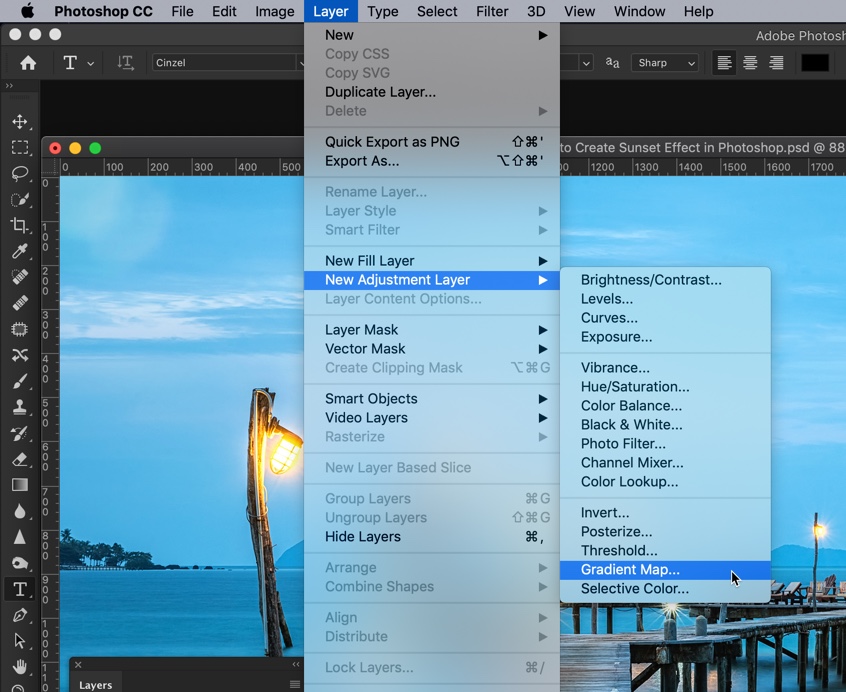
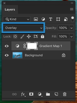
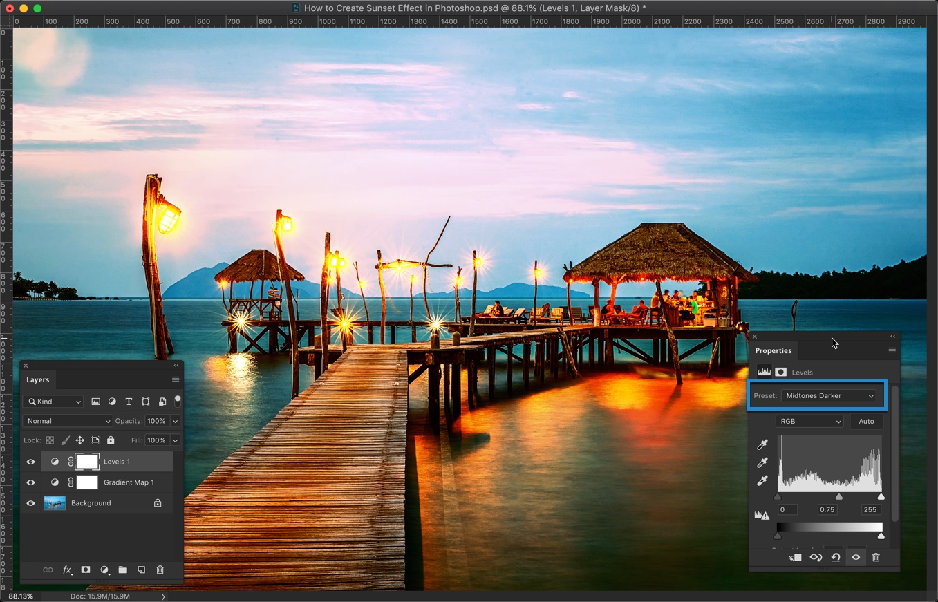
Step 1 – Apply the Gradient Map
Go to Layer > New Adjustment Layer > Gradient Map
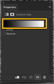
In the Property panel, click on the color box. If the property panel does not open by default, manually open it by going to Window > Properties.
Gradient Editor should be opened now.
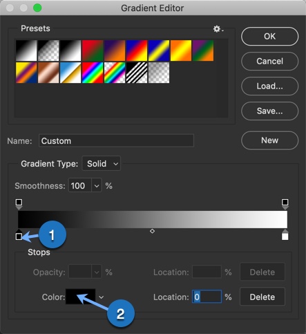
In the gradient editor, first, click on the bottom left handlebar (1) that I have shown below. Then click on the color (2).
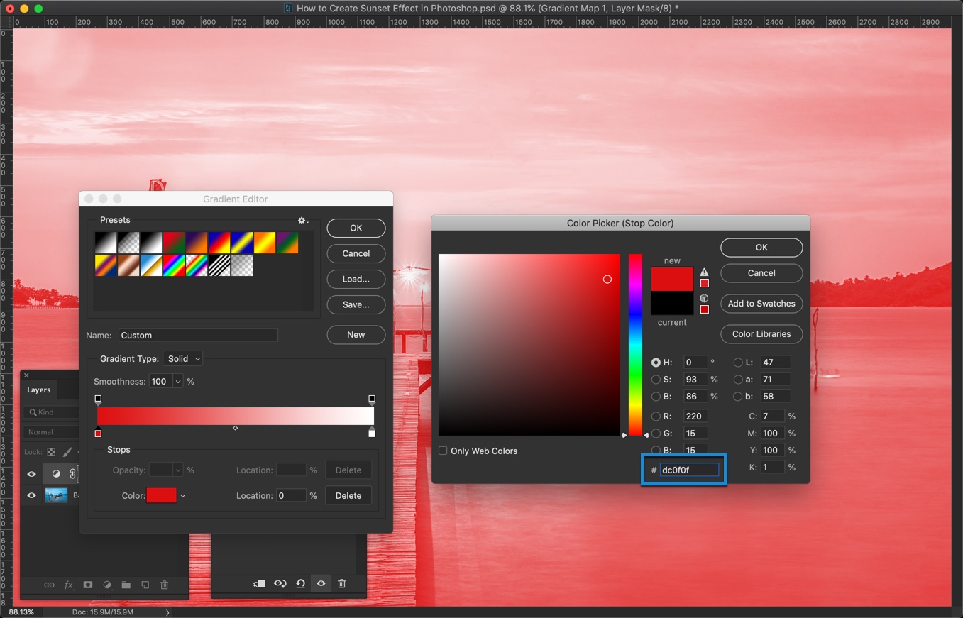
In the HEX value, write #dc0f0f. Press OK.
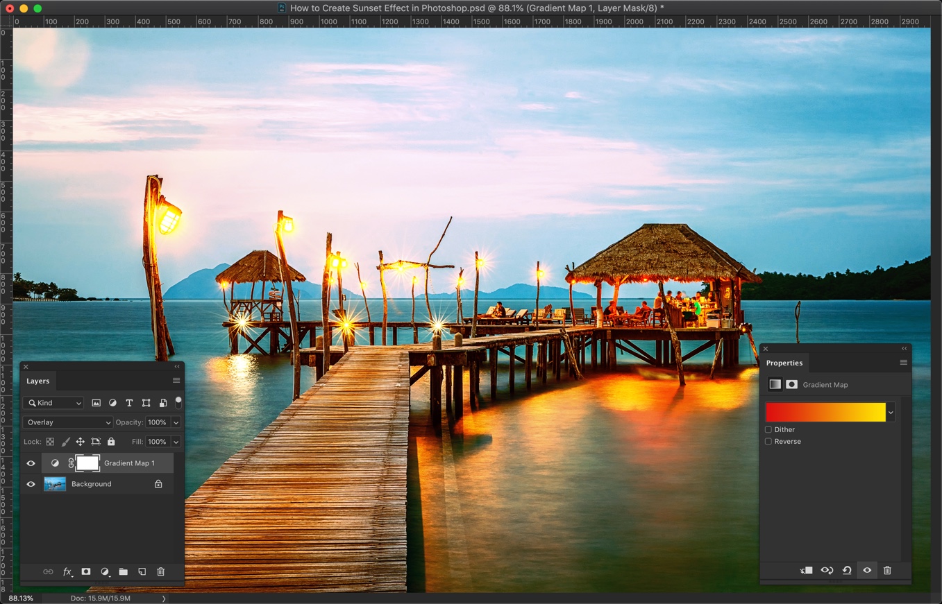
This will convert all the highlights in your image (bright areas) into red color. I know that it’s looking messy but hold on for a few more seconds. We’ll fix it.
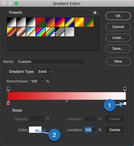
In the gradient editor, click on the bottom right handlebar (1) and then on the color (2). I have provided a screenshot below for your reference.
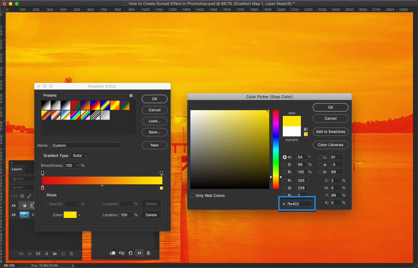
Write #ffe402 in the HEX value. Press OK.
The photo is looking a bit better now, right? We’ll make it even better.
This article is submitted by Terence Murray. He is a journalist and an editor from London. He loves to meet new people and talks with them about literature, photography and jazz music. Join him on Facebook and Google+.
One question that comes from our readers what is the best photo editing software to choose between Photoshop and Lightroom. To the beginner, it’s hard to choose between these two Adobe products.
Noel Anderson, The Senior UI Designer of Essay on timesaid,
If you are a UI designer, you would love to pick Adobe Photoshop. It’s a powerful design tool to create the UI of a website, mobile app, and desktop app.
By using Photoshop, the UI designer can design any custom graphics for websites that include logos, patterns or custom background images.
The creators of Photoshop then created a new app for the photographer to edit photos called Lightroom. Though both of the applications are related to photo editing, there are some factors on which they can be different. It’s becoming a burning question what form you should learn and use? In this article, I am going to show you the main differences between Adobe Photoshop and Adobe Lightroom.
The Main Differences between Photoshop and Lightroom
Adobe always tries to improve user experiences. To provide excellent opportunities to edit photos, they created Photoshop and Lightroom one after another. Both of their photo editing apps offer the users to edit and manipulate photos. Still, there are some differences between these applications.
Price: You can use Adobe Creative Cloud to get both of the software buying the subscription. The cost is as low as $10 a month.
Keep Historical Changes: If there are no layers created in Photoshop, you can not go back to the previous settings as Photoshop cannot keep historical changes. On the other hand, using Lightroom, you can go back to your last settings and restore it.
Advanced Retouching: Both Photoshop and Lightroom can do retouching using the retouching tools. But, for advanced retouching, you’ll love to pick Photoshop as there are some great options to patch and remove the blemish.
Compositing Multiple Images: If you want to combine multiple images and their elements into a single one, Photoshop is the best option. You can mix, manipulate and save the composition in Photoshop whereas using Lightroom it’s difficult.
Display Image Metadata: Lightroom can display the image metadata to make an overlay to the image where Photoshop cannot display image metadata. You cannot show image metadata when an image is opened.
Batch Process Multiple Images: Lightroom is way better than Photoshop when it comes to batch process multiple images. Though you can batch process with Photoshop using Actions, the presets and the smooth workflows of Lightroom is more straightforward than Photoshop.
Layer Management: In Photoshop, you can use layer managementto add effects and modifications. On the other hand, there is no layer management option in Lightroom. You can store multiple layers within a master file and modify or enhance the layers separately.
In The End, Both Programs Are Great Depending On Your Needs
Based on the differences and features of both Adobe programs, we can say that both apps are great photo editing tools. It’s a draw between both apps as you can use it for different purposes. If you want to use photo editing software to edit or tweak your images only, then Lightroom can be your best choice. But, if you’re going to do more with photo editing software, Photoshop is the best choice for having extra options that boost your task.
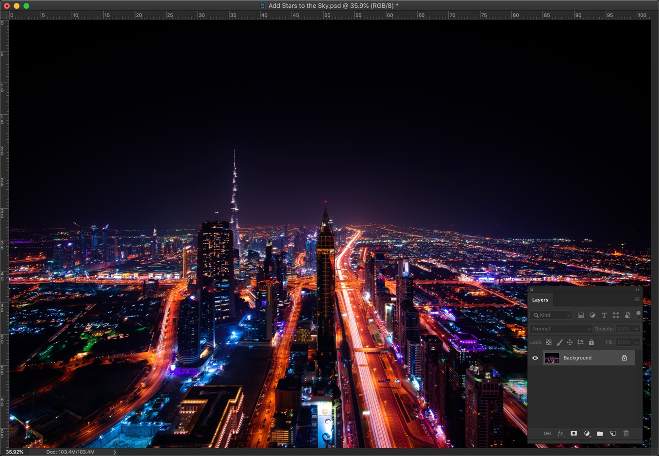
Today, I am going to show you how to add stars to the sky in Photoshop. I remember that I wrote a similar tutorial back in 2013 but I used a very old version of Photoshop (probably CS5) and the images were not optimized for today’s browsers.
I thought that I should modify that old tutorial and optimize the images for today’s browsers. But, then I decided that I should write a new one. So, here we go.
For this project, we’re going to make use of Blend Modes to add stars. There are lots of tutorials out there in the market where you add stars using “Add noise” filter but this one is much simpler than those.
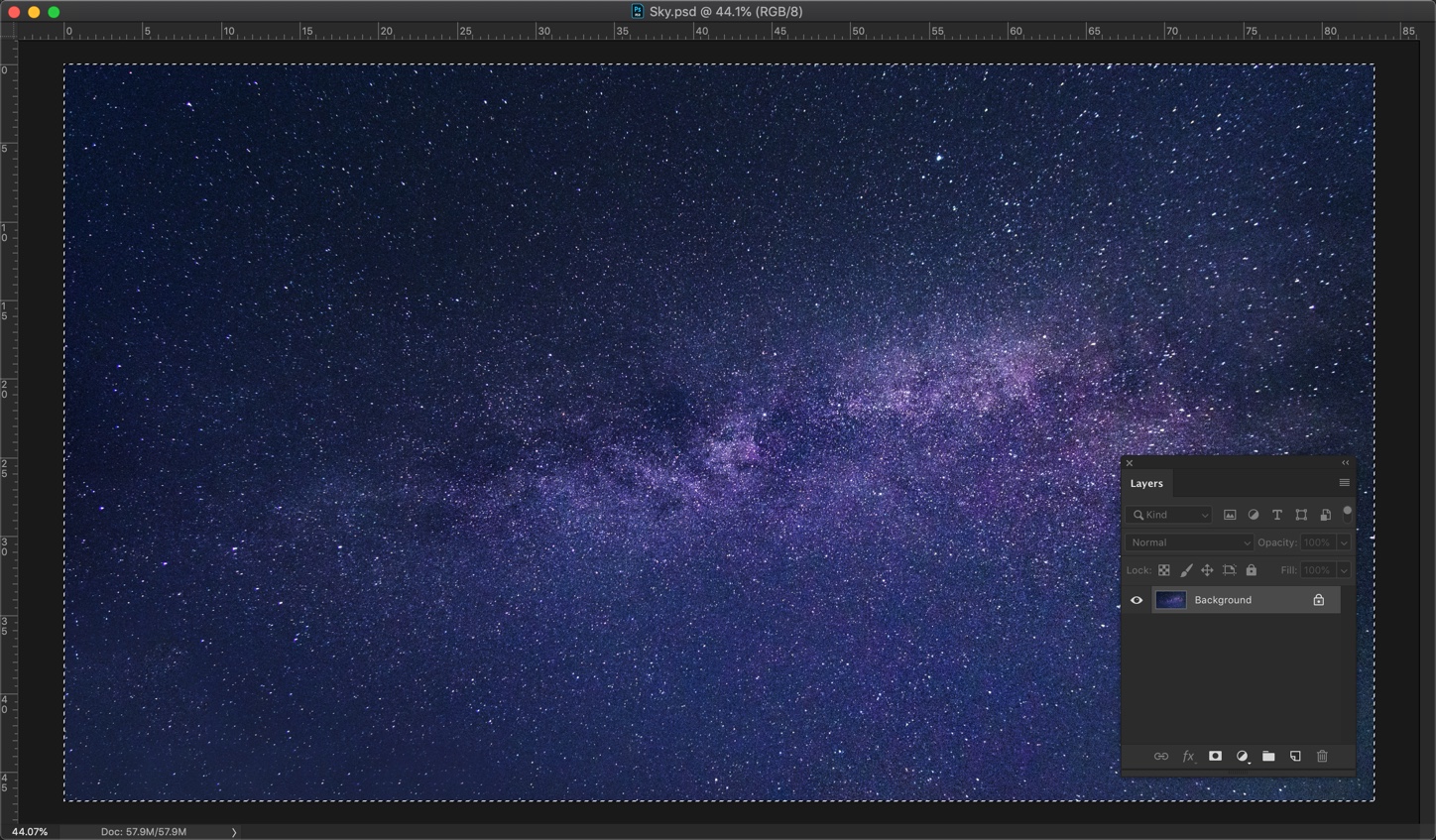
The next thing would be to open the sky image. We’re going to put this image onto the city image. Press Cmd + A/Ctrl + A to select the entire image.
Copy the image by pressing Cmd + C/Ctrl + C.
Now, go back to the city image and paste it by pressing Cmd + V/Ctrl + V.
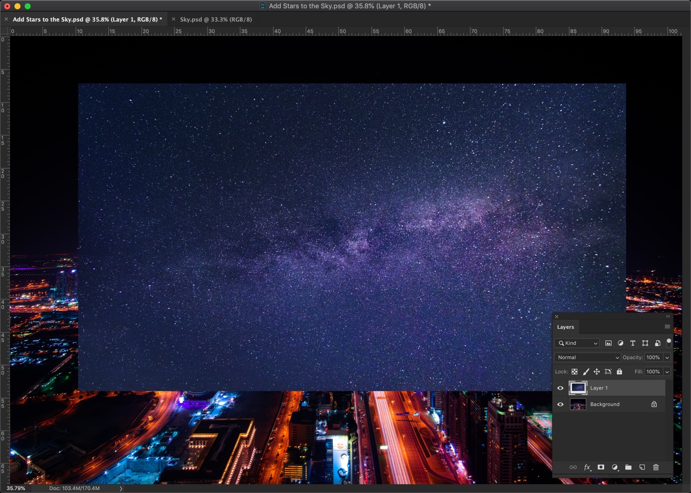
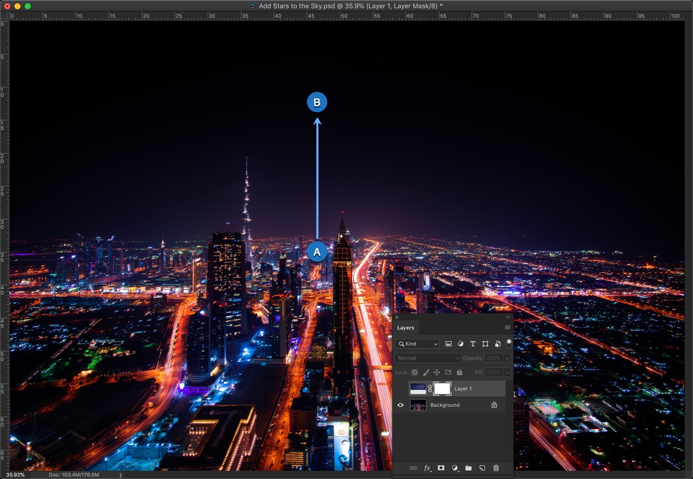
Step 2 – Align the sky image
Time to align the sky image so that it fills the sky of the city.
Activate the Free Transform Tool by pressing Cmd + T/Ctrl + T. Now drag the handlebars so that it covers the sky of the city image.
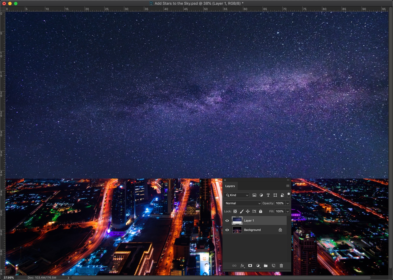
Step 3 – Hide the stars near the horizon
We need to determine from which point to which point should we use the gradient tool.
Open the layer panel by pressing F7 or by going to Windows > Layers.
In my image, I am going to start the gradient right at the horizon and end it slightly above the tallest building.
The starting point is at the horizon because we don’t want any stars below the horizon. The ending point is just above the tallest building because we want stars to show up from that point.
Grab the Gradient tool from the tool panel or press Shift + G again and again until it comes.
Change the foreground color to Black.
In the option bar, use Foreground to Transparent effect and choose the gradient type as the liner. I have highlighted both in the below screenshot.
Add a layer mask to the sky image in the tool panel.
Drag and drop the gradient from the starting point to the end point.
Drag and drop it multiple times to get an even better result.
Here’s the GIF for you.
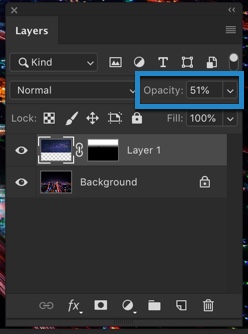
Step 4 – Give the stars a realistic effect
Reduce the opacity of the sky in the layer panel.
And, here you go.
This is all.
Make sure that you make the most out of the offer below.
This article is written by Jennifer Sanders. She has been working as an editor and a copywriter at a journalistic company in London for 3 years. She is also a professional content writer in such topics as inspiration, productivity, education, and technologies. Feel free to connect with her Twitter or Facebook.
There are tons of options to enhance the quality of your photography by using Adobe Photoshop. In most cases, Photoshop is the standard to measure all other image-editing software programs. You can be, however, dithering on which one to choose out of numerous options, as it is a vast area to explore and master all of the tools and techniques.
Gregory Wright, the Head of Creative Design at essaygeeks.co.uk.said,
You can be overwhelmed or lost by the tools of Adobe Photoshop which you can use to beautify the objects of your photos, but to be professional in this field you need to know the secrets of Photoshop.
Don’t worry; we have chosen the top 10 Photoshop secrets you need to know to save your time and make your ordinary shots into stunning artworks.
Repeat Transformations to A Layer
If you want to step and repeat your previously made object or layer, you can repeat the transformation very quickly in Photoshop. It saves time as you don’t need to put extra effort to recreate the layer or object. The entire process is known as Step and Repeat Transformation. To do this, you need to click the Control + Alt + T and Control + Alt + Shift + T to make a repeated transformation in Photoshop.
Design Space Preview
To explore simplified designs and have fun with it you go to Photoshop >Preferences (Edit>Preferences on Windows OS) select “Technology Previews” from the left side menu and tick on “Enable Design Space (Preview).” Press “OK” and go to Window>Design Space (Preview) to enable this stunning design view.
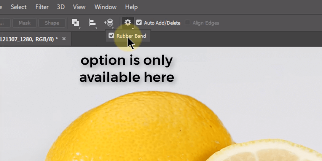
Using the Rubber Band to Draw a Path
When you are drawing a path using the pen tool, you cannot see the exact location of the path. In that case, you can use Rubber Band to know where you are drawing the path. To do this, you need to select theRubber Band option from the control bar. Now you’re able to see the path like as Illustrator.
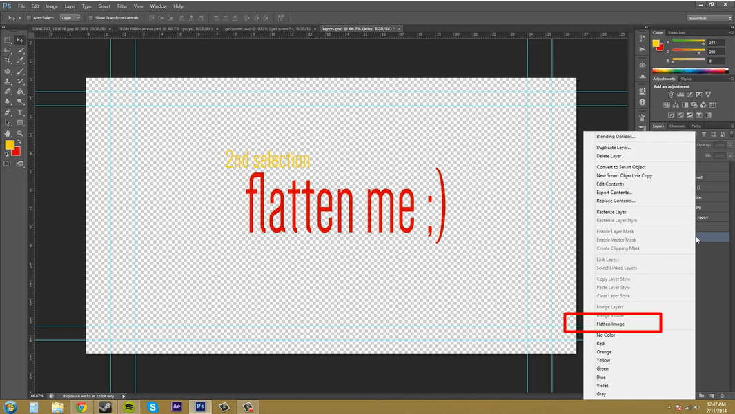
Flattened PSD for saving time:
When it is time to save your valuable time, you can create flatPSD. When you are working with a large PSD, it is better to stick with flattened images by clicking on the layer and select Flatten Image.
Transparency in Background Image:
If you want to make transparent background images with Photoshop, then you need to use the Magic Wand Tool or press “W”.Then, you need to select your desired area to preserve transparency. When you are done choosing the areas to be transparent, you need to click on save or press Ctrl+Shift+S. Save the image as PNG to have the transparent background.
Adjust Global Light:
To any layer or object in Photoshop, you can give live effects. And, these are called the drop shadow, bevel and emboss, inner shadow and more, and they rely on “direction” that tells where the artificial light source would be. Click on Layer>Layer Style>Global Light and set the Global Light to 40 degrees and see as every effect that uses Global Light will update instantly in your document.
Spring Loaded Tools:
The hotkeys found in every tool of Photoshop and temporarily can be switched between the tools in Photoshop. That makes the task easier to perform in Photoshop. For instance, hold the letter “J” to bring up the Spot Healing Brush tool. And when you are done with it, you can switch back to the Brush tool by releasing the hotkey.
Precise Painting Mode:
To jump into “Precise Painting Mode” that changes your cursor to a crosshair for a different and more elegant look, press Caps Lock key anytime while using the Brush tool.
Add Shallow Depth of Field:
Most common techniques used to make photos look more exciting and professional is the depth of field. By this the distance between the nearest and farthest parts of an image that appear sharp or in focus. That is why, only a small portion is focused, while the rest is blurry.
If you want to give your photographs the appearance of shallow depth of field, the quickest way is the Iris Blur tool. But this technique offers less customization as the other methods; however, you can do pretty good jobs in less than 2 minutes. Just Right-click the layer “Background” in the Layer’s box. Select “Duplicate Layer” and name the new layer “Blur Effect.”
Bird’s Eye View:
You can quickly navigate any document at any zoom level. This is called Bird’s eye view. To do this, you need to hold “H” and drag your cursor to zoom in your desired area. By this way, you can have an idea where you are working on the document and get a clear view of the image.
Final Words
As Photoshop has excellent features, we couldn’t cover all of them. However, We hope these secrets will be conducive for you when you use Adobe Photoshopnext time, especially, to save your time and better your tasks as a professional one. As mentioned earlier, it is a massive area to explore; you will always have the chances to tweak the caveats while playing with the tools.
If you have enjoyed this article on our website, please share it on social media so that all of your friends can have fun too.
This article is contributed by Serena Dorf. She’s is an enthusiastic content writer. She is passionate about writing, personal development, psychology, and productivity. Feel free to connect with her on Twitter.
Any occupation is made fun-filled, interesting and relatively convenient with good kits. The same goes for graphic designers who seek to maximize their work potentials and make things simpler. No graphic designer should downplay the need to keep track of new useful tools that can make the life of graphic designers easier. Here, you are about to learn amazing graphic design tools that will make your professional life easier.
1 – Photoshop
Editing photos have never been such easy prior to the advent of Photoshop. Photoshop is a design tool invented in the year 1988. In spite of this long period of existence, it still retains its place with graphic designers generally. Photoshop has interesting features that make the work interesting. The programmed options bring life to the images which make the job of the graphic designer quite exquisite.
This even works for beginner graphic designers. It has simple basic options like cropping, rotating, flipping, and straightening. It also comes with other advantages like one-touch alteration, the ability to remove every blemish, the slide controls which enhance the colors of the images, one-touch filter, RAW template support and other social media plug-ins like Facebook, Twitter, etc. Due to its versatility, Photoshop has found its way into other professions. For example, expert writers at EssayOnTimemake use of Photoshop for some technical papers that require images. With this tool, you can weed out unwanted objects from the image; you can use basic features like perspective correction, clone stamp, and channel mixing. The tool works on all Windows and Mac.
2 – GIMP
Another graphics design tool you can make use of is the GNU Image Manipulation Program (GIMP). The standard tool makes it befitting for not only graphic designers but pro photographers also. The photo manipulation feature appears to be greatly improving. The flexibility it provides for designers is amazing.
The moment you start making use of GIMP it is likely to attain the level of being your major publishing device on desktop. The interface or tool is absolutely customizable and the complete screen option permits you to see and edit all at the same period. GIMP can be used on Linux, Windows and some other OS. As a tool that is useful with other graphic design software, it enjoys a viable community that supports it.
3 – Illustrator
Suppose you desire to make use of vector arts to design sketches, icons, typography, logos or some other topnotch illustrations for video or mobile, then Illustrator comes to your aid. You are capable of designing splendid artworks with thorough alignment by simply drawing pixel orientation shapes.
You can create designs faster with Illustrator. Plug-ins which help you in designing a blank web page into an excellent looking web page are available for your use on Illustrator. The price may be high though. But this downside is made up for with its useful merits – Illustrator comes with awesome advantages of Touch-type tool, the Free Transform tool, and is also useful on Windows as well as Mac.
4 – Inkscape
This is an alternative to Ai. Ai is a pro device properly used for admirers of vector art and other graphic designers who employ SVG file format. The device is great on Linux, OS, Mac, Windows, etc. It really does not matter if you were a pro or even a person who only designs vector images for a personal blog or even as a hobby.
It helps you with coloring, sketching or making photos Inkscape poses to be very easy to employ. With respect to the Ghostscript annex, the EPS files are convenient to read. The capability to openly edit the source code; the edit clones on the canvas; edit gradients; keys to move screen pixels are some of the features you would find interesting.
5 – CorelDraw
For all aspiring web designers who want the services of a graphics editor that offers infinite designs without any restrictions, CorelDraw is at your help. CorelDraw offers the most popular industry standard editors currently. It also has some good-to-go functions and such a convenience of use which no other vector editor can offer. CorelDraw greatly works properly with very large files in Corel Photo-Paint which makes it a must-have graphic design software.
6 – Adobe InDesign
Created and supported by the Adobe Corporation, InDesign is a typical business leader for laying out design templates on the desktop and mobile devices. Adobe InDesign is proper for all layout design usage like online magazines. If you design layouts like brochures, digital magazines, printed books, Adobe InDesign is the tool to opt for. CorelDraw affords every graphic designer the flexibility of drag-dropping isolated layers. It helps you resize the image with all manner of convenience.
7 – Corel PaintShop
Here’s another useful tool from the Coral team. We consider it the latest adaptation tool for editing impressive photos which even helps photo management generally. It also has some high-grade features which newbie and professionals would enjoy.
8 – ACDSEE Photo Editor
This photo editor has unique features of standard photo editing kits. You can always draw your own designs or make use of the software’s templates or formats that. It also provides better sharing modules. Its maximum zooming option of about 3200% also helps graphic designers to view and edit every detail of the design.
Conclusion
Creativity is the substance of greatness. We encourage any professional, especially graphic designers to stay creativeand focus on leveraging the best tools. Because we all need the best tools in order to optimize our performance, irrespective of the profession. With good tools within reach, you will be more confident, your services will be more attractive to people and you will be able to stay on the top of your game.
Today’s world is full of sharing our own content. You take photos and share them on 500px.com, Instagram, Flickr, and Facebook. But, your photos can be used by any person without your permissions. One more problem is that if someone wants to contact you by looking at your photo on a random site, it will be very hard. This is where adding copyright and contact info to your photos come handy. So, I think that I should write a tutorial on how to add contact info to a photo in Photoshop.
I found a beautiful picture on Pexels by Mr. Luke Siemionov and I decided to use that photo for this tutorial. For this tutorial, I am just showing how to add copyright and contact info. I respect Luke’s work and I will not add my copyright info to this image.
Photo by Luka Siemionov from Pexels
Let’s go
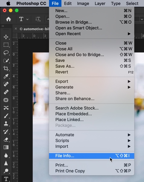
Step 1 – Open File Info
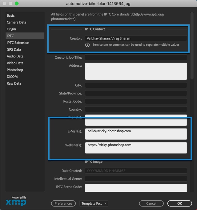
Open the image in Photoshop. Go to File > File Info. You can also press Cmd + Opt + Shift + I/Ctrl + Alt + Shift + I as keyboard shortcut.
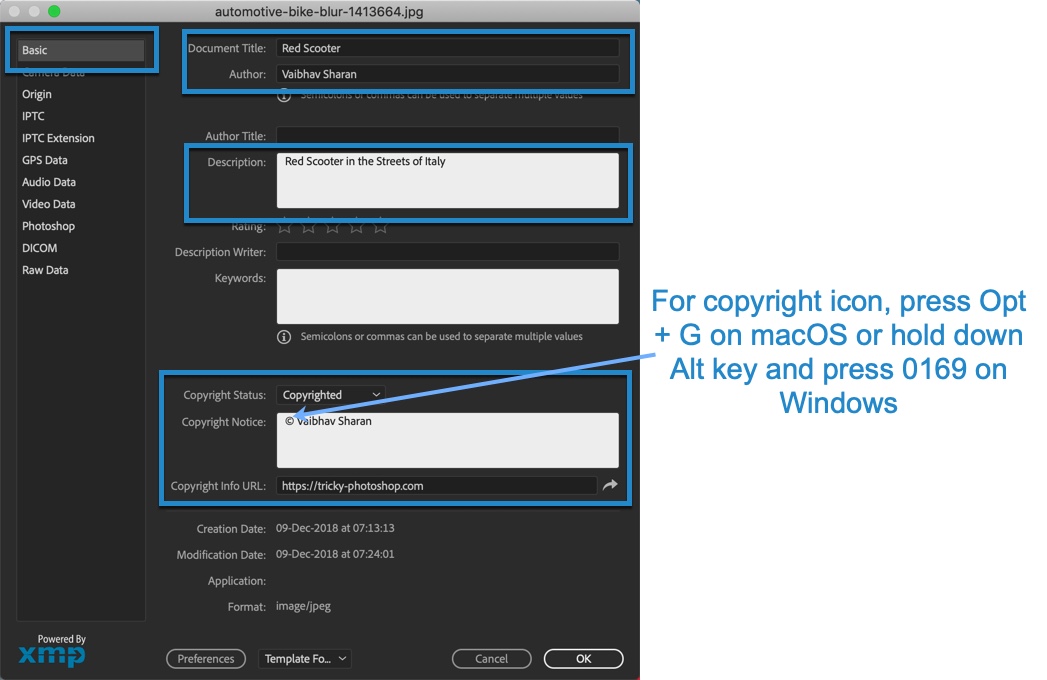
Step 2 – Fill the Information in the Contact Details
Photoshop will open the Basic tab as soon as it opens the File Info.
Write down everything that you want to add.
In the copyright status, change the status to “Copyrighted”.
Wondering how to add the copyright symbol? For macOS, press Opt + G. For Windows, hold down Alt and then press 0169.
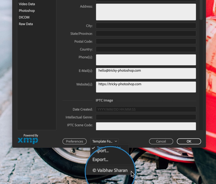
Now, switch to the IPTC tab.
Before we begin, I want to explain what is IPTC.
What is IPTC?
IPTC (International Press Telecommunications Council) is the most common metadata among photographers to add their contact info and copyright status.
This tutorial is contributed by Lilian Chifley. She’s an IT specialist, teacher, and blogger from Sydney. She loves to talk about artificial intelligence and modern education. You can find Lilian on Facebook and Twitter.
Even the most skilled photographers don’t always get the result they wanted. To fix up images, both professionals and beginners use the single best tool available – Adobe Photoshop.
What people love about the program the most is its versatility and the vast number of tools available. But what are the most essential ones that everyone needs?
To answer this question, we’ve analyzed views of various photographers and come up with the 5 tools that will transform your images. Let’s take a look…
Shadow and Highlights Tool
The purpose of this tool is to make the details more visible in the shadowed areas of the image. In some cases, you want your photos to be as realistic as possible, but a lack of light might prevent you from doing so. If your photo contains dark shadows, the shadows and highlights tool is the perfect solution for restoring clarity.
To access it in Photoshop, follow the route: image > adjustments > shadows and highlights
The highlights part of the tool might seem a bit too unnatural to some, so you can use the shadows part. To determine the best way to use the shadows tool, Tabitha Marsh, designer at Aussie Writings Service suggests that the Amount slider should be at about 30-30%. She has used the feature for the company’s website. She’s of the view that more than 35% will make your image seem artificial. Once you start seeing a strange glow, don’t go further.
Levels Tool
Now that you’ve set your shadows to increase the detail, you will want to focus on the exposure. Follow the path: image > adjustments > levels, to reach the levels tool.
Once you’ve clicked it, you will see something that’s called a histogram appear. This graphic is merely a representation of all the pixels in the image.
How can you analyze the graphic? Well, if the graph is more oriented towards the left, your image has darker tones. If the pixels are concentrated to the right, it means that you are dealing with light colors mostly.
Adjusting the contrast is possible by using the output slider. Calibrate it any way you want, but stop when the color contrast seems unnatural. The point of fixing images is adding details that are possible in reality, not crossing the line.
Color Balance
Many photographers love the color balance tool due to its influence on the atmosphere of the image. Sometimes, when you snap in an environment, you can’t capture the right color composition. To make your image seem more realistic, you can calibrate the color balance using this tool. The path is image > adjustments > color balance.
Once you’ve opened the tool, you will see three sliders dedicated to colors. By default, they’re set in the middle. The sliders balance between cyan/red, magenta/green and yellow/blue, respectively. Move the slider to see how your image is affected.
For daytime photography, we would suggest striving towards red, magenta and yellow. In spite of the general consensus about Photoshop, it’s easy to use, and color balance is an example.
All you have to do is observe the image and see which hues should be added. Be sure not to overdo the balance, as your image will see oversaturated and artificial.
Hue and saturation
Here, we encounter perhaps one of the most underrated tools in all of Photoshop. Opening it is done by following the path: image > adjustments > hue/saturation.
Upon opening the tool, you will see that there are three sliders here as well. They are dedicated to Hue, Saturation, and Lightness. The hue-dedicated slider calibrates the shade of color, but don’t overuse it, as it rearranges the color scheme.
Our main focus is on the saturation and lightness sliders. How dark you want your image to be? Adjust the lightness slider to see which amount of light fits you best. Additionally, saturate the image if you feel like it’s too “cold” or that the colors aren’t warm enough. For more complex settings, you can manually calibrate each color, instead of the same image.
Vibrance
Once you’re done with the other tools, you would want to put the finishing touch on the image. The truth is that not even the above 4 tools are enough to make the image perfect.
Some people want every detail to be perfect, and there is no better finishing tool than the vibrance one. There is not much science to it. It’s an AI-governed tool that fixes colors that aren’t properly saturated.
Containing two sliders, one for saturation and one for vibrance, this tool allows you to fix any mistakes. Oftentimes, photographers use it to restore the image to a more natural state.
Vibrance will give you more pronounced colors individually, but they will seem to be in harmony rather than in contrast. The amount you move the sliders is entirely up to you, and you should stop once the image seems unnatural.
Concluding thoughts
These five tools can make significant changes to your images. What makes them so spectacular is the fact that applying them won’t make your image seem unnatural. To the naked eye, it will be impossible to spot the changes that the image had undergone. In Photoshop, it’s best to go slow and not overdo it. These five simple tools are enough to take your photography to the next level.
This tutorial is contributed by Peter Hill. He is the best editor of BestEssayTips. He is a socially active person, likes traveling and photo/video editing. He finds himself in writing. Feel free to contact him on Google+.
Sometimes you may need to turn a set of negative images into positive those have inverted values, or it may also happen that you have mistakenly scanned a number of negatives without using the appropriate mode. In such a situation, you may feel depressed being unaware of the process of changing a negative image into positive. But, from onwards you don’t have to be so because in this article we have presented a complete guideline that shows you the step by step process of turning your negative images into a bunch of successful positives. We feel delighted to let you know that there is rarely any guideline that is as exact and clarified as this one. So, stay till the end and preserve the article.
Changing of Negative Images to Positives
The changing process is essentially divided into two precise segments where the first one relate how you can invert the image and the second segment tells you about the correction of color. The sole motive of this division is to facilitate the entire thing for you. Let’s begin with the first segment.
Inverting Image
Inverting image refers to the interchange of up and down and right and left of an image. An inverted image is also known as a reversed image. However, the first segment is divided into the three following phases to present the entire method easily.
Step 1
At first, click the file > option to open it. Then, from there press the open option or Ctrl+O.
Step 2
Now, use the following options consecutively: image, adjustment, and invert. Your image will instantly turn into positive. You can even back it to negative using the command once more. Using this procedure, you can change both the color and values according to the complements of them.
Step 3
In this final step of the inverting image segment, you should click Layer, then New Adjustment Layer and finally Invert only if you are interested in completing the action as a segregated layer. You can remove it subsequently if needed.
So here ends the ‘Inverting Image’ part whose successful completion leads to the beginning of the latter segment known as ‘Correction of color.’
Correction Of Color
Correction of color is an attempt to set colors on your positive matching the settings and requirement. Though the phrase sounds to be interesting and exciting, yet it is a matter of great responsibility because a faulty color correction can ruin the entire image or even make it look funny. Like the previous segment, this one also has three significant phases where each phase is connected to one another and remains unfinished when another phase is not performed correctly.
Step 1
At first, you should open the Color Balance Toolby consecutively clicking Image, Adjustment, and Color Balance. Otherwise, you can simply click Ctrl+Bfor opening the window of Color Balance.
Step 2
Then, draw the descending ruler for Cyan / Red the entire path to the right side toward Red. You should perform this for the midtones, highlights, and shadows by examining each of the choices of Tone Balance at the end of your window and re-performing the action of the sliding ruler.
Step 3
In the end, you should drag the sliding ruler for Yellow / Blue whole path towards Yellow with the Shadows selected. Your image will start looking like a bit well-adjusted at this situation. You can still bring additional slighter modifications for removing any cast of cyan and blue that appears on the image through the inversion of the orange-dyed negative.
With this, the segment of color correction comes to an end. If you can follow each phase meticulously, then there is no doubt that you will be 100 percent successful in creating a great color combination without causing a bit damage to your image.
Pro Tips For You
Never perform a subsequent phase leaving the leading one unperformed
Never drag the sliding ruler for Red/Cyan or Blue/Yellow in lieu of Cyan/Red or Yellow/Blue
Final Judgment
Though there might be many more ways for changing your images from negative to positive, yet the way mentioned above is the most accredited one all over the world. So, why to take a risk while the best procedure is at hand? Therefore, we humbly recommend you to adopt this methodology just to enjoy the great outcomes that you never have.
I get asked how to remove a person many times. Every time I am asked, I say the same thing. There’s no one-way to remove a person. Just like there are more than 5 ways to convert a photo into Black and White in Photoshop there is more than one way to remove a person in Photoshop.
Some people say that the Clone Stamp tool is good, some say that they use Content Aware Fill, some uses the Healing Brush tool, and so on. They all are correct. To remove a person in Photoshop, or to remove an object in Photoshop, it all comes down to the area that is surrounding that person or object and personal preferences.
Today, I am going to show you a workspace (it was a tool in older versions of Photoshop than CC 2019) that can remove a person in Photoshop based on its surroundings. Adobe calls in Content-Aware Fill.
Content-Aware Fill works best if the surrounding of the person or object has a pattern and isn’t too complex. In my image, the background has a pattern of straight lines of sea and sand. Had it been too complex like there were so many random people around the man, Content-Aware Fill would have failed.
It was a menu icon back in versions which are older than CC 2019. But, it is launched as a workspace in Photoshop CC 2019. Adobe might have seen the potential of this tool and decided to enhance it.
I know that all of you don’t have Photoshop CC 2019. So, I am going to write this tutorial for both segment of people i.e. one who have CC 2019 and another who don’t.
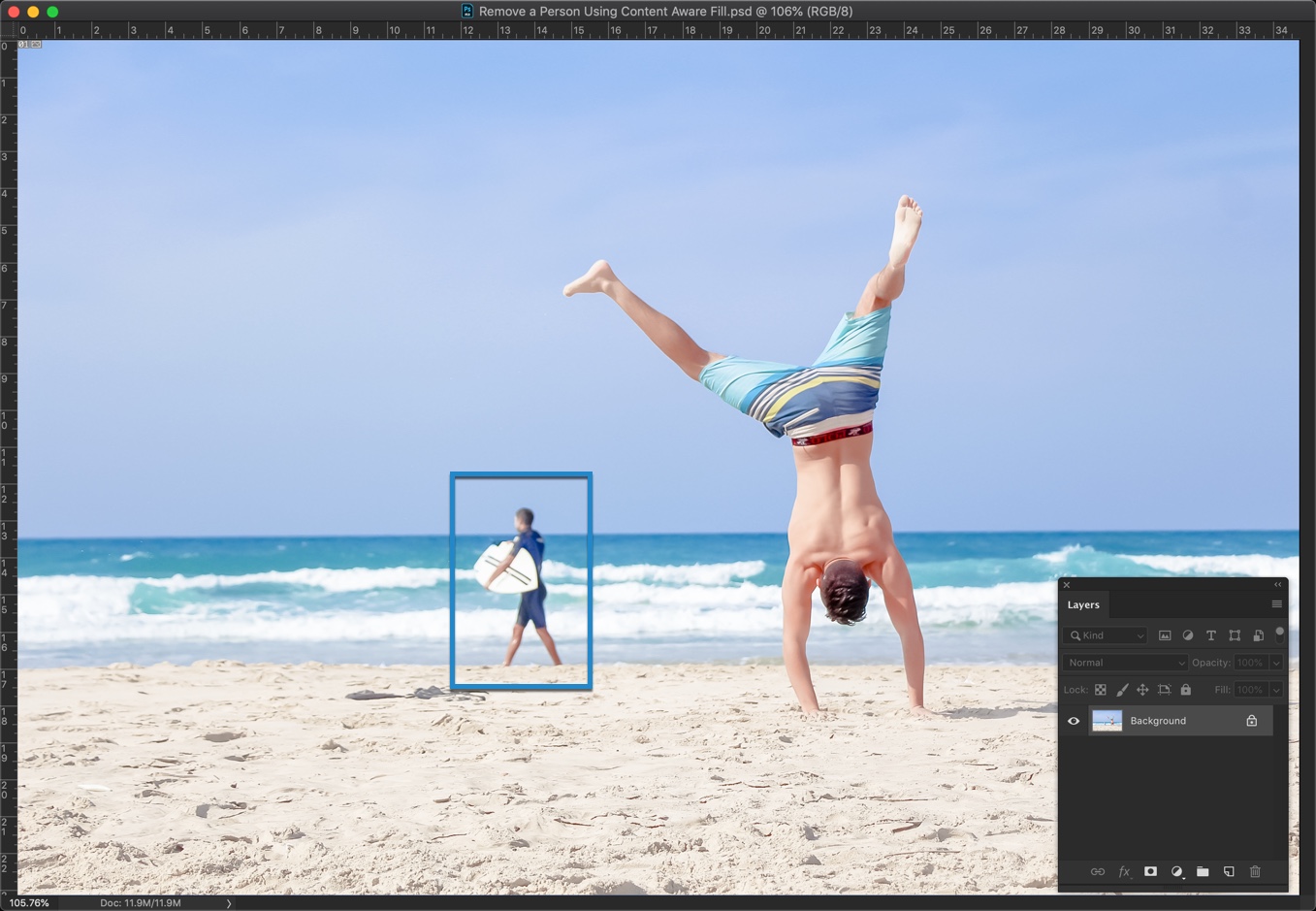
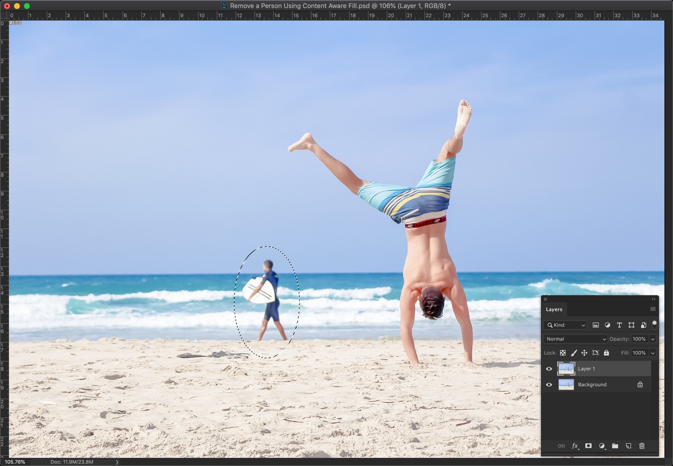
Here’s my image. I want to remove the person who is holding the surfing board.
Content Aware Fill for Older Versions of Photoshop
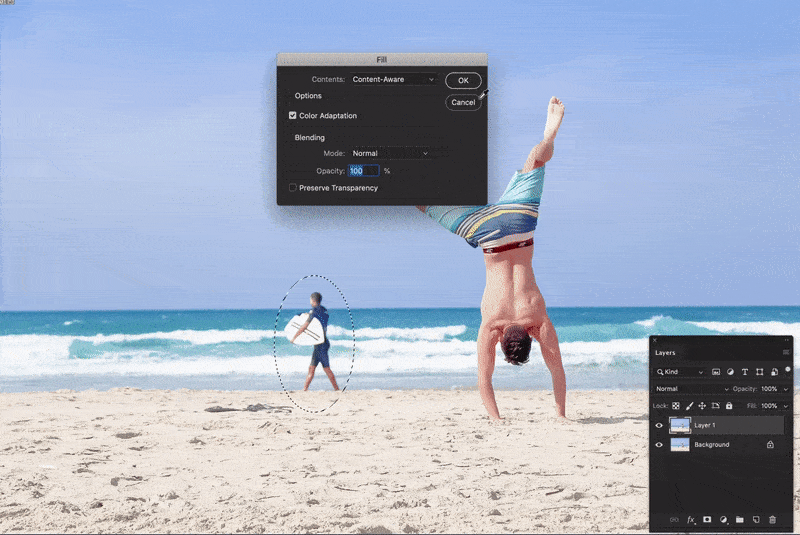
We are going to use the Fill option and ask Photoshop to automatically fill the person based on his surroundings.
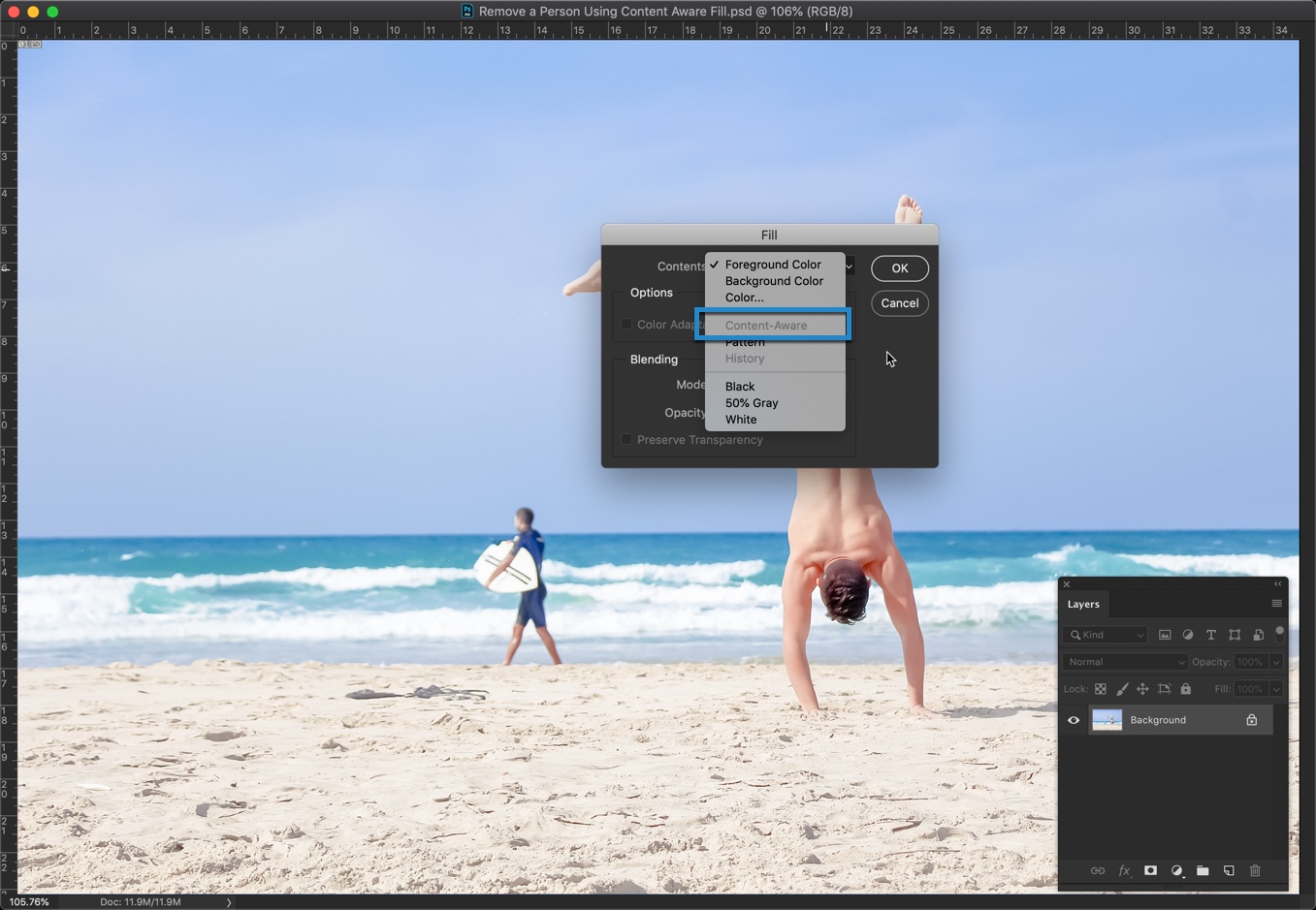
Go to Edit > Fill. We will use Content Aware. But, I noticed that it’s grayed out. This is because I don’t have any selection in my image to fill.
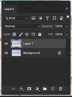
Step 1 – Duplicate the Layer
Now, I am going to duplicate my background layer because I want the editing to be non-destructive. This ensures that whatever I do, I will not be touching the original image, and I can go back in time if I mess something up.
Press Cmd + J/Ctrl + J to duplicate the background layer.
Step 2 – Select the person, and Remove the person in Photoshop
Time to select the person to remove using any selection tool. I am using the Elliptical Marquee tool.
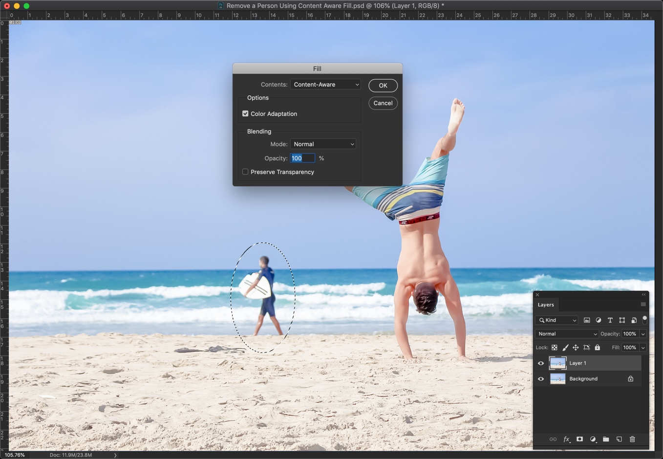
Now, again go back to Edit > Fill. Press Shift + F5 as a keyboard shortcut.
Choose “Content-Aware” and make sure “Color Adapdation” is turned on. Press OK.
Color Adaptation basically tells Photoshop to fill the selection based on the change in colors.
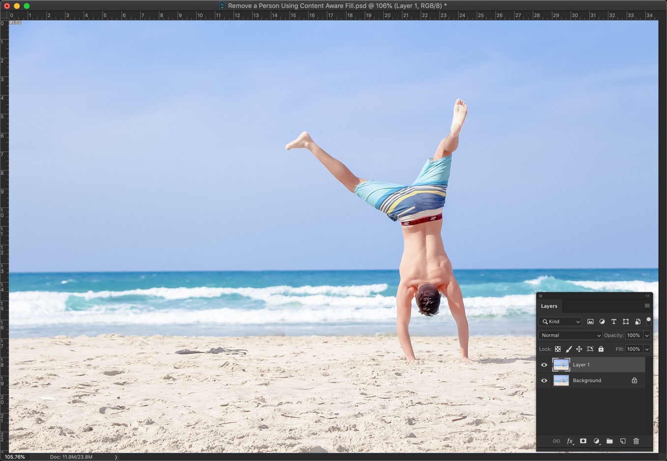
This is how your photo should look. Press Cmd + D/Ctrl + D to deselect.
Here’s the GIF for you.
Content Aware Fill Workspace for Photoshop CC 2019 and Newer Versions
Time to show how to remova a person in Photoshop who like to keep their Photoshop up to date.
Step 1 – Duplicate the Layer
Now, I am going to duplicate my background layer because I want the editing to be non-destructive. This ensures that whatever I do, I will not be touching the original image, and I can go back in time if I mess something up.
Press Cmd + J/Ctrl + J to duplicate the background layer.
Step 2 – Select the Person
Time to select the person to remove using any selection tool. I am using the Elliptical Marquee tool.
Step 3 – Use Content-Aware Fill Workspace
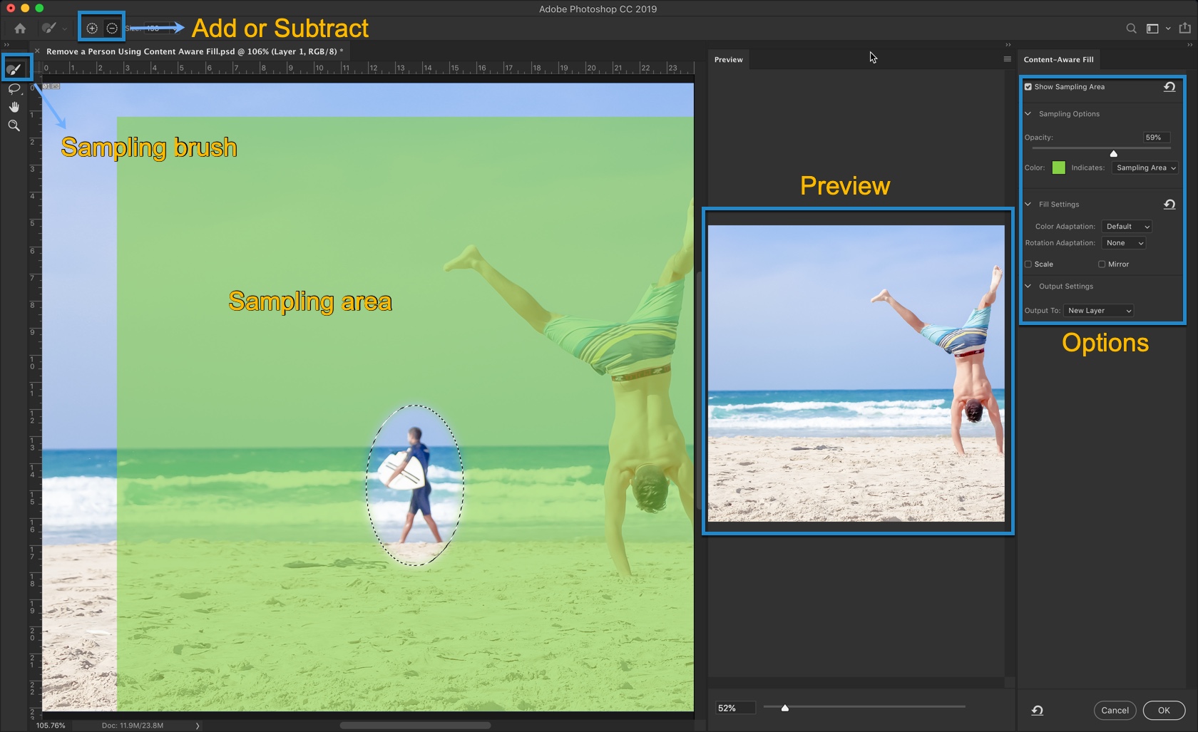
Go to Edit > Content-Aware Fill.
Now, you will see a workspace which looks like the below screenshot.
There are 5 parts in this workspace. I have labelled each of them. Allow me to explain to you part one by one.
Sampling Area:
This is the area that is highlighted with the green color.
It shows that Photoshop will use this area as a sample to remove the person. In a simpler language, Photoshop will use this area to identify what to fill in the selected area.
Sampling Brush:
If you want to add or remove the sampling area, use this brush.
Add or Subtract:
If “Add” is turned on (denoted by the + icon), then wherever you brush with the Sampling Bursh, Photoshop will include those areas to the sampling area.
If “Remove” is turned on (denoted by the – icon), then wherever you brush with the Sampling Bursh, Photoshop will exclude those areas fom the sampling area.
Preview:
Real time preview of the final image.
Options:
This is where you tweak the settings to help Photoshop fill the area in a better way.
I will soon write a detailed tutorial on the Content-Aware Fill workspace soon. But for now, coming back to the original topic to remove a person.
The default setting is looking good and it has perfectly removed the person and solved the purpose. So, I am just going to click OK to finalize it.
This is how it looks.
And, this is how you do it.
Make sure that you make the most out of the offer below.