You found a beautiful font for your design and you want to use it in Photoshop. But, you don’t know how to use that font in Photoshop. I have been there. This is why I am writing this tutorial on how to install fonts in Photoshop for you.
I am going to show you how to install fonts in Photoshop that is powered by either macOS or Windows.
If you like watching videos, here’s the video for you.
Install fonts in Photoshop for macOS
Photoshop for macOS shows the fonts that are installed in your macOS Operating System. To use a font in Photoshop, you need to install the font in your macOS first.
Let’s see how we can install a font in macOS.
Step 1: Download the font
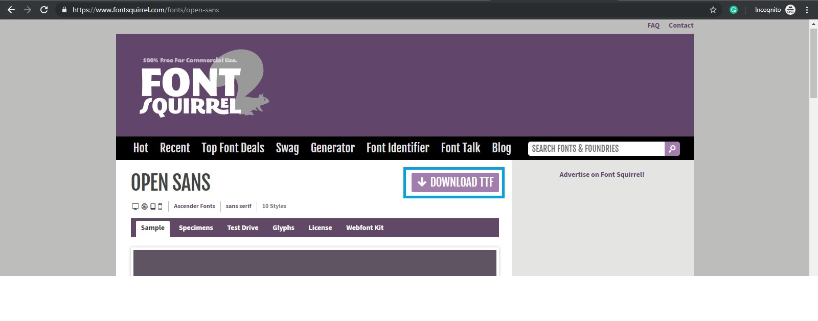
Open the site from where you can download the font. Not all sites let you download fonts for free. I am going to download Open Sans font from Font Squirrel.
Open the font and click on the Download TTF button.
Step 2: Install the font
Generally, when you download a TTF file, it gives you all versions of the font. You can install all the versions you want but I am interested in OpenSans-Regular.ttf version.
Open the font and click on Install.
That’s all. Restart Photoshop and you would see the font.
Install fonts in Photoshop for Windows
Photoshop for Windows shows the fonts that are installed in your Windows Operating System. To use a font in Photoshop, you need to install the font in your Windows first.
Let’s see how we can install a font in Windows.
Step 1: Download the font
Open the site from where you can download the font. Not all sites let you download fonts for free. I am going to download Open Sans font from Font Squirrel.
Open the font and click on the Download TTF button.
Step 2: Install the font
Generally, when you download a TTF file, it gives you all versions of the font. You can install all the versions you want but I am interested in OpenSans-Regular.ttf version.
Open the font and click on Install.
That’s all. Restart Photoshop and you would see the font.
I know how bad it feels when you have a nice photo but it’s not big enough to print or post. I had so many photos that I wanted to enlarge badly but I didn’t know how to. Finally, I am glad that I finally found how to enlarge photos in Photoshop and I am going to share this knowledge with you.
Enlarging photo reduces its quality. Yes, it’s the truth and you cannot do anything here. The thing we will focus on is to enlarging a photo and keeping as much quality as we can.
Let’s start the tutorial.
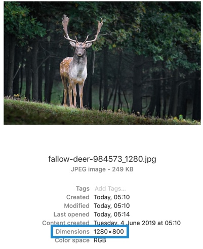
I am going to enlarge this photo in Photoshop. I downloaded it from Pixabay. I wrote a tutorial back in 2012 but it’s 2019 now and who cares about 2012.
Its size is 1280 by 800 pixels.
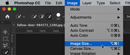
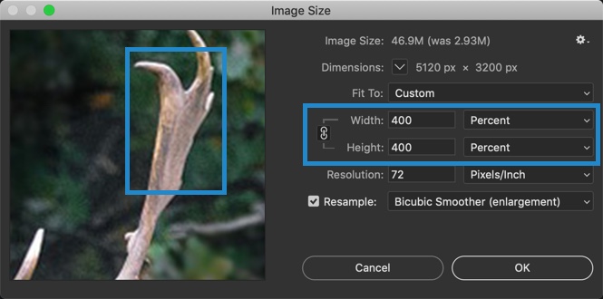
Step 1: Open the Image Size Box
Go to Image > Image Size or press Cmd + Opt + I / Ctrl + Alt + I.
This will open the Image Size box.
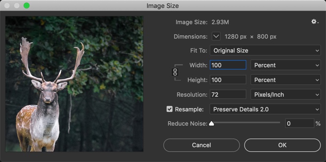
Step 2: Enlarge Photos in Photoshop
You are wondering what is resampling, right?
Resampling means you’re changing the pixel dimensions of an image. When you downsample, you’re eliminating pixels and therefore deleting information and detail from your image. When you upsample, you’re adding pixels. Photoshop adds these pixels by using interpolation.
We’re going to discuss each of the resampling methods one by one and see which one is the best.
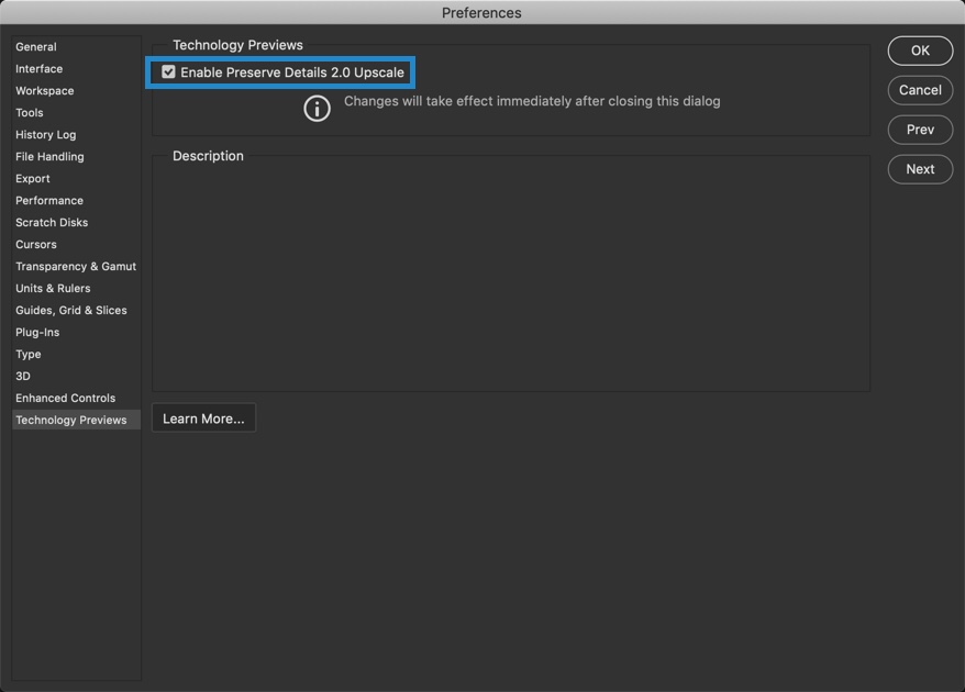
But, we need to turn on Preserve Details 2.0 in the Photoshop Preference. Preserve Details 2.0 is available only for testing purpose and not turned on by default. Go to Photoshop > Preference (macOS) or Edit > Preference (Windows).Go to Technology Preview.
Turn on the “Preserve Details 2.0.”
Now, come back to the Image Size box. Here’s a screenshot of 8 resampling methods.
Here are the 8 resampling methods that are not of much use.
Automatic
Photoshop will decide the best resampling method for your photo and enlarge it. I am not a fan of this though.
Preserve Details
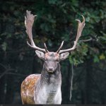
Preserve Details keeps the edges sharp when you enlarge a photo in Photoshop. Let’s see a sample. I am going to enlarge the photo by 400%. Let me show you before and after.
Preserve Details 2.0
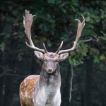
Preserve Details 2.0 uses advanced deep learning artificial intelligence to detect and maintain important image details without oversharpening anything else. In a common man’s language, it sharpens the edges when you enlarge a photo in Photoshop but it makes sure that the edges don’t get oversharpened. Let’s see a sample. I am going to enlarge the photo by 400%. Let me show you before and after.
This method creates lesser noise than the previous method and edges are even sharper.
Bicubic Smoother
Bicubic Smoother resampling method is similar to Bicubic in the way it creates new pixels. But, this method blurs pixels slightly to blend the new ones into the old ones, making the image smoother and more natural looking.
This method softens and slightly blurs the image. Also, this method does not have “Reduce Noise” slider like the previous two methods.
Bicubic Sharper
Bicubic Sharper resampling method is also similar to Bicubic in the way it creates new pixels. But, instead of blurring whole pixels to improve blending between the new and old like Bicubic Smoother, it softens only the pixels’ edges. Adobe recommends this method for downsizing images, though some Photoshop gurus claim that it also produces better enlargements than Bicubic Smoother.
Bicubic
Bicubic resampling method tells Photoshop to figure out the colors of new pixels by averaging the colors of even more pixels surrounding the new one in order to make a better guess. This method takes longer than the previous two but produces smoother transitions in areas where one color fades into another.
Nearest Neighbor
Nearest Neighbor resampling method gives you the lowest image quality. With this method, Photoshop looks at the colors of surrounding pixels and copies them. It is infamous for creating jagged edges, so you’ll want to use it only on images with hard edges like vector images.
Bilinear
Bilinear resampling method tells Photoshop to guess the color of new pixels by averaging the colors of the pixels surrounding it. It produces slightly better results than the Nearest Neighbor and is still pretty fast.
Bicubic Smoother vs. Preserve Details vs. Preserve Details 2.0
I am going to show you the enlarged images which are resampled by the three most popular resampling methods. Yes, the three most popular resampling methods are Preserve Details 2.0, Preserve Details, and Bicubic Smoother.
Bicubic Smoother softens the edges which make the images slightly blurry. Preserve details does a good job but the edges get oversharpened. Preserve Details 2.0 does the best job and the edges don’t get oversharpened.
So, Preserve Details 2.0 is the best choice as of now till Adobe launches a new and better resampling method in Photoshop.
Stretch marks don’t look good. It doesn’t matter how much you’re asked to love your body and embrace your flaws like stretch marks. The reality is that you and I cannot. The stretch mark on the belly, hips, thighs, and arms don’t look good. The laser removal of stretch marks is expensive and costs around $2500 per session. So, this is why I bring you a workaround. You can remove stretch marks in Photoshop.
You just want to post a photo and realized that your belly stretch marks are showing and you badly want to post that picture. Going to a doctor and laser remove those stretch marks are not an option. The quick workaround is to remove that stretch mark.
So, let’s begin the tutorial on removing stretch marks in Photoshop.
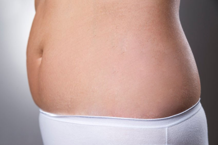
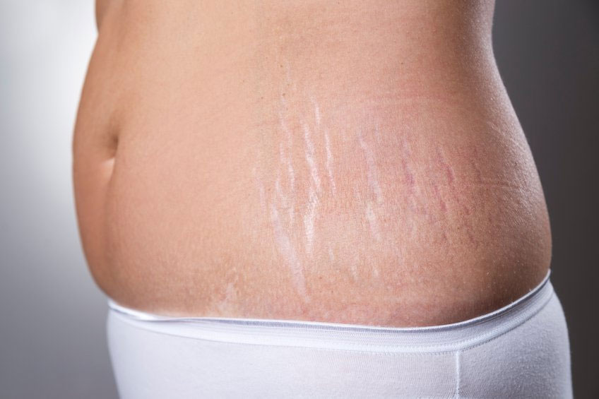
Before we begin, I want to show you the after and before image.
Final
Initial
Let’s begin the tutorial
Video
If you like watching video tutorials, here’s the video tutorial for you.
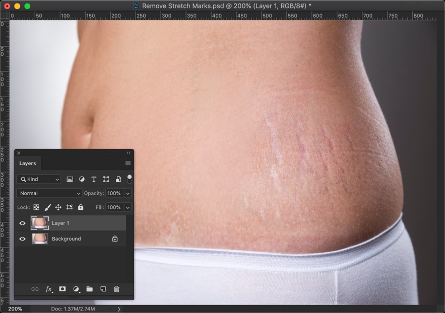
Step 1: Duplicate the layer
We’re going to remove the stretch marks with the Patch tool. There are many tools out there like Mix Brush, Healing Brush Tool, Clone Stamp Tool, etc. but I personally like the Patch Tool.
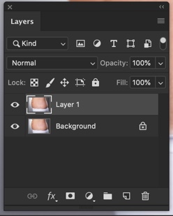
We want the editing to be non-destructive. So, we’ll duplicate the background layer and work in that layer.
Open the Layer panel by going to Window
[vc_message message_box_color=”warning” icon_fontawesome=”fa fa-picture-o”]Just in case, if you’re feeling lazy to remove the stretch marks then you can hire me to remove that for you. The min cost is $4 per image and the max cost is $10 per image. Send me the image at hello@tricky-photoshop.com.[/vc_message]
Step 2: Remove the Stretch Marks in Photoshop
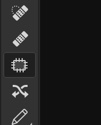
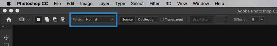
Grab the Patch tool from the tool panel or press Shift + J again and again until it comes.
Make sure that the normal is turned on in the option bar.
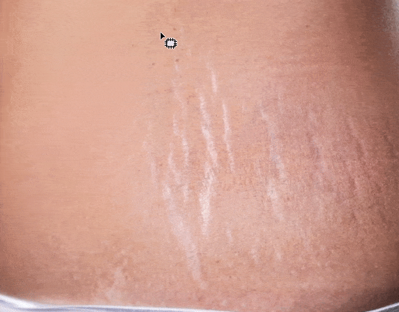
Roughly draw a selection across one of the stretch marks. Now, drag the selection to the area which does not have any stretch mark.
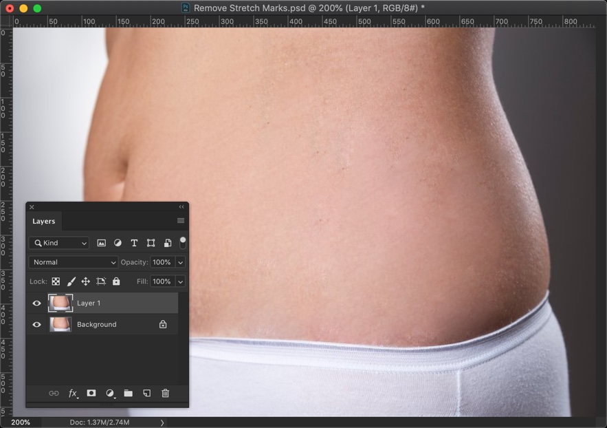
Did you see how beautifully it removed the stretch mark?
Now, do this with other stretch marks also.
Here’s my result.
[vc_message message_box_color=”warning” icon_fontawesome=”fa fa-picture-o”]If you’re feeling lazy to remove the stretch marks then you can hire me to remove that for you. The min cost is $4 per image and the max cost is $10 per image. Send me the image at hello@tricky-photoshop.com.[/vc_message]
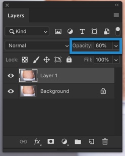
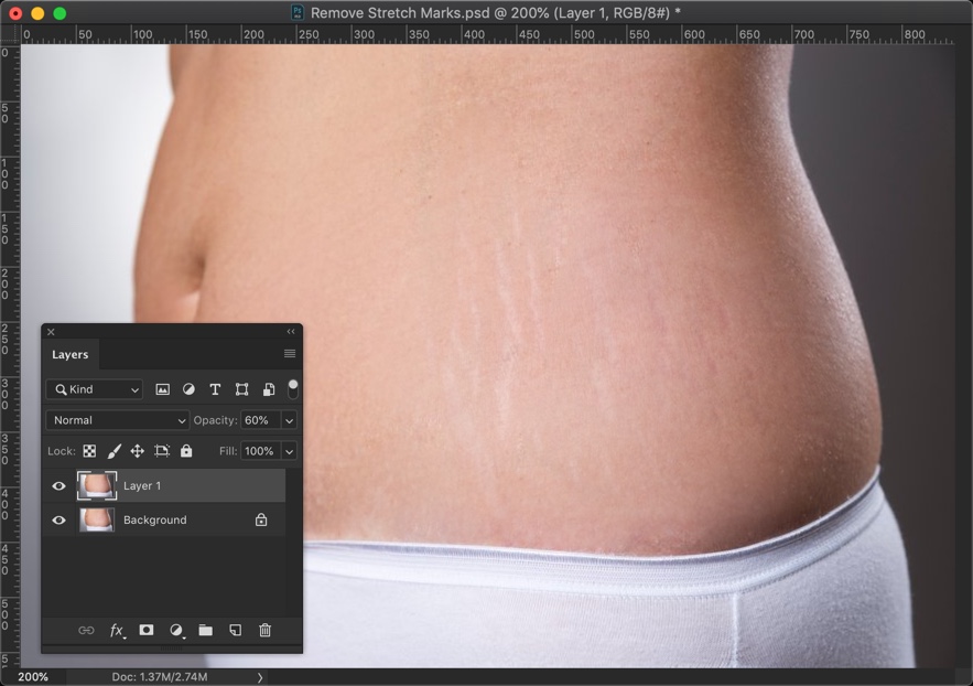
(Optional) Step 3: Make the stretch marks partially visible
If you don’t want to remove it completely then you may want to read this step.
Bring down the opacity of the duplicated layer. Decide the amount as per your requirement. I am going to choose 60%.
This will start showing the stretch marks but it will not be as visible as it was.
[vc_message message_box_color=”warning” icon_fontawesome=”fa fa-picture-o”]If you’re feeling lazy to remove the stretch marks then you can hire me to remove that for you. The min cost is $4 per image and the max cost is $10 per image. Send me the image at hello@tricky-photoshop.com.[/vc_message]
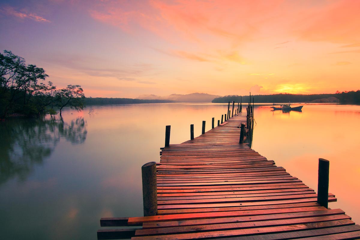
It’s difficult to capture the actual golden sunset in a photo. First of all, it’s rare to find a golden sunset. Even if you find it, your camera’s auto WB messes up everything. It reduces all the yellow tint from the photo. Even if you turn off Auto WB, the camera still doesn’t capture the actual golden sunset. But, you and I have Lightroom where we can create a sunset effect. So, I bring to you the best tutorial on creating beautiful sunset effect in Lightroom.
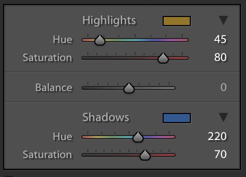
Let’s start with the basics. A golden sunset photo has a golden or yellowish tint. This tint basically covers the Highlight region. The shadow part is covered by a blue tint. We’re going to do the same. The main game changer is going to be the Split Toning and White Balance.
I wrote a tutorial on creating a sunset in Lightroom back in 2013 but it’s 2019 now. Who cares about 2013?
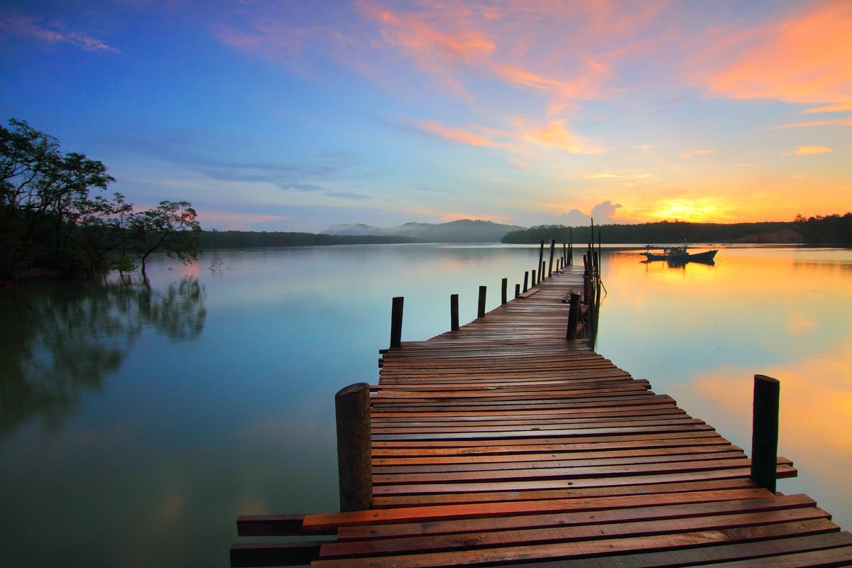
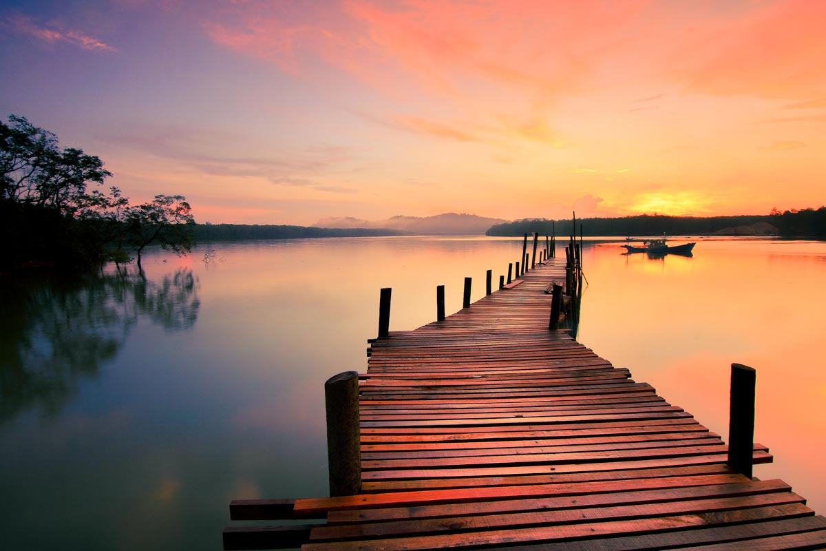
Let’s begin the tutorial. But, before we begin, I want to show you the before and after.
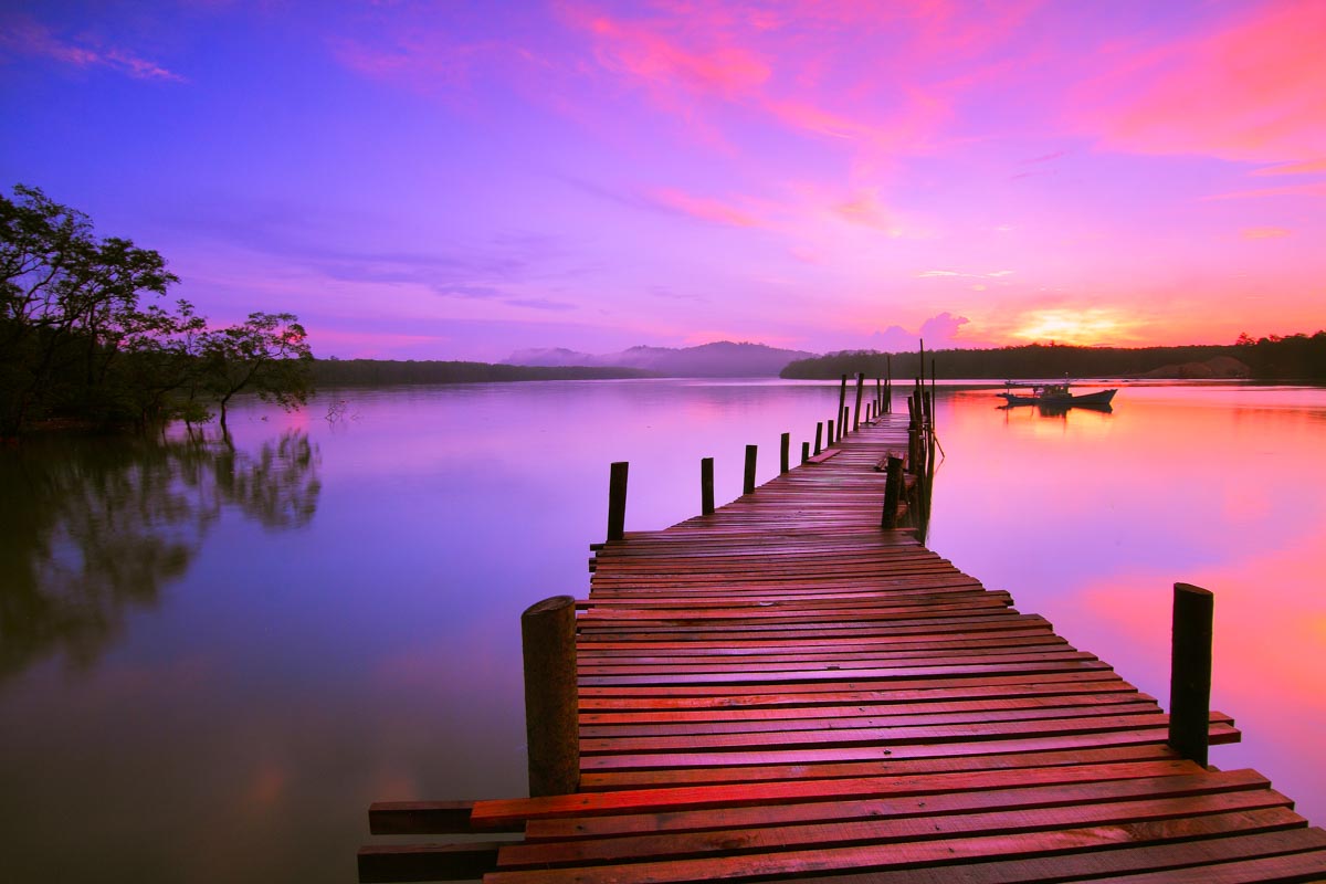
Before
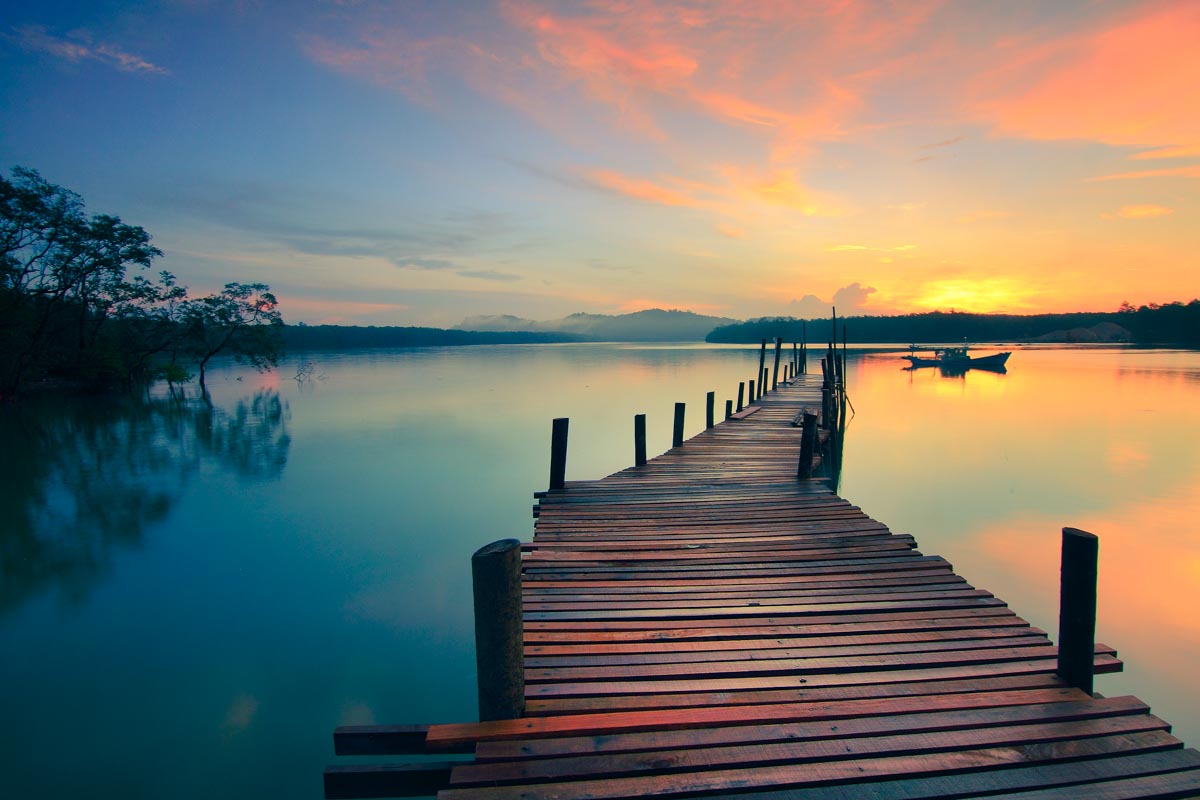
After 1
After 2
Video
If you like watching videos, here’s the video tutorial for you.
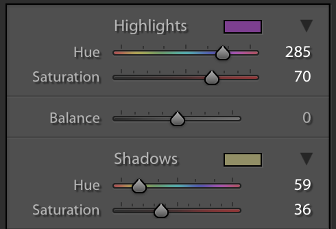
Step 1: Create a Sunset Effect in Lightroom using Split Toning
The first thing we need to do is to change the Split Toning. Use below values.
This will give a beautiful tint to your photo.
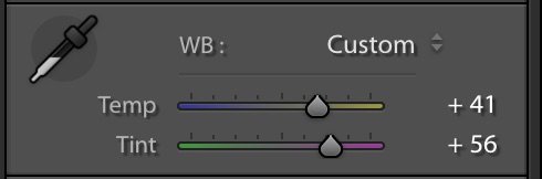
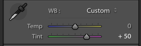
Step 2: Enhance the Sunset with White Balance in Lightroom
Now that we have the color we are looking for, time to enhance the sunset effect.
Sunsets have a yellowish magenta tint. We’re going to create the same tint.
Increase temp to 41 and tint to 56.
This will further enhance the photo and give you a natural looking sunset effect.
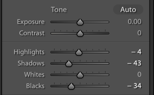
Step 3: Adjust the Tone
Time to change the tone. I am going to change the tone according to my image. The values of the tone sliders may be different for yours.
You don’t need to copy my values if you understand what you’re trying to achieve. Your goal is to reduce the highlights by a small fraction and shadow by a big fraction. This is because the photo is not properly exposed during a sunset. You don’t want the shadowy region to be properly exposed.
I am going to use these values because they suit my image. These may or may not suit yours.
Here’s the image.
Bonus Step
I also have split toning values for a purple sunset.
Lately, I have started posting more on Instagram Filters because I see a rise in people who want to create Instagram filters in Photoshop. More and more users are reading Instagram filters on my website every month. Today, we’re going to see how to create Instagram X-Pro II filter in Photoshop.
Download the Instagram Charmes Filter Photoshop action – click here to download the action. It will scroll you down to the bottom of the page.
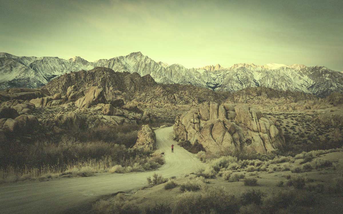
Let’s begin the tutorial. But before we begin, I want to show how the final image would look like.
Final
Initial
Video
If you like watching videos, here’s the video for you.
Step 1: Create a Black Vignette
Instagram X-Pro II filter has a black vignette. So, we’re going to create one. There are many ways to create a black vignette and we’re going to use the easiest way. Yes, we’re going to use the inbuilt Vignette slider in Camera RAW.
Duplicate the layer by pressing Cmd + J / Ctrl + J.
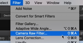
Go to Filter > Camera Raw Filter or press Cmd + Shift + A / Ctrl + Shift + A.
Go to the Effects tab. Decrease the Amount slider to -70. Press OK.
This will create a nice black vignette.
Step 2: Add Multiple Photo Filters
Instagram X-Pro II filter has a greenish yellow tint. Guess what? We’re going to give a similar tint to our photo.
Go to Layer > New Adjustment Layer > Photo Filter.
Change the Filter to Green and increase the density to 42.
This will give a nice green tint to our photo.
We’re going to give a yellow tint now. Go to Layer > New Adjustment Layer > Photo Filter.
Change the Filter to Yellow and increase the density to 77.
With an addition to the green filter that we added earlier in this step, this will give you a greenish yellow tint.
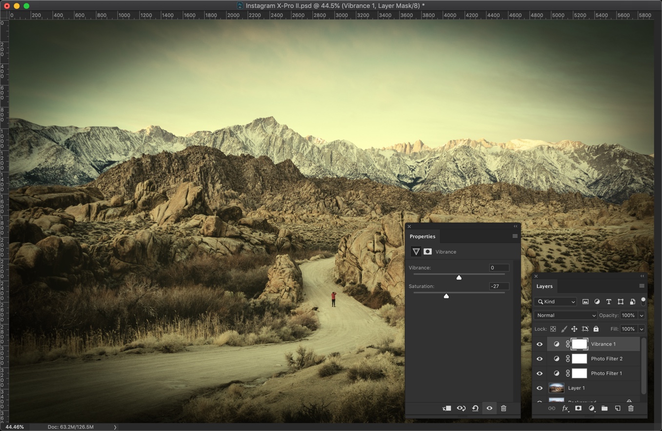
Step 3: Decrease the Saturation
I personally feel that the image is very saturated. I think that we need to decrease some saturation.
Go to Layer > New Adjustment Layer > Vibrance.
Decrease the saturation to -27.
This will desaturate the colors and give you a nice looking retro effect.
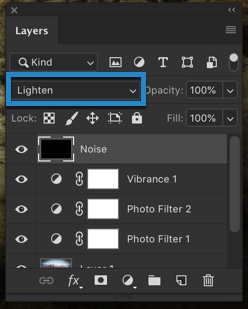
Step 4: Add Some Noise
The last step is to add some noise.
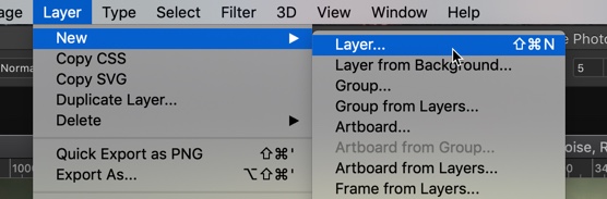
Create a new layer by pressing Cmd + Shift + N / Ctrl + Shift + N or by going to Layer > New > Layer.
Name it Noise.
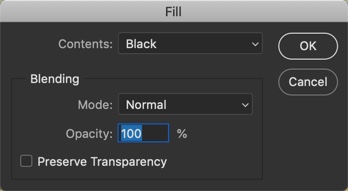
We’re going to fill black color in this layer. Go to Edit > Fill.
Change the Content to Black. Press OK.
This will fill tha layer (and also the image) with black color.
Change the blend mode to Lighten.
Lighten blend mode compares each pixel of the current layer and the layer below it, and shows the pixels that are lighter. If you want to know more about Lighten blend mode, read the lighten subtopic (point #7) on blend modes in Photoshop.
This will bring back the original color of the photo.
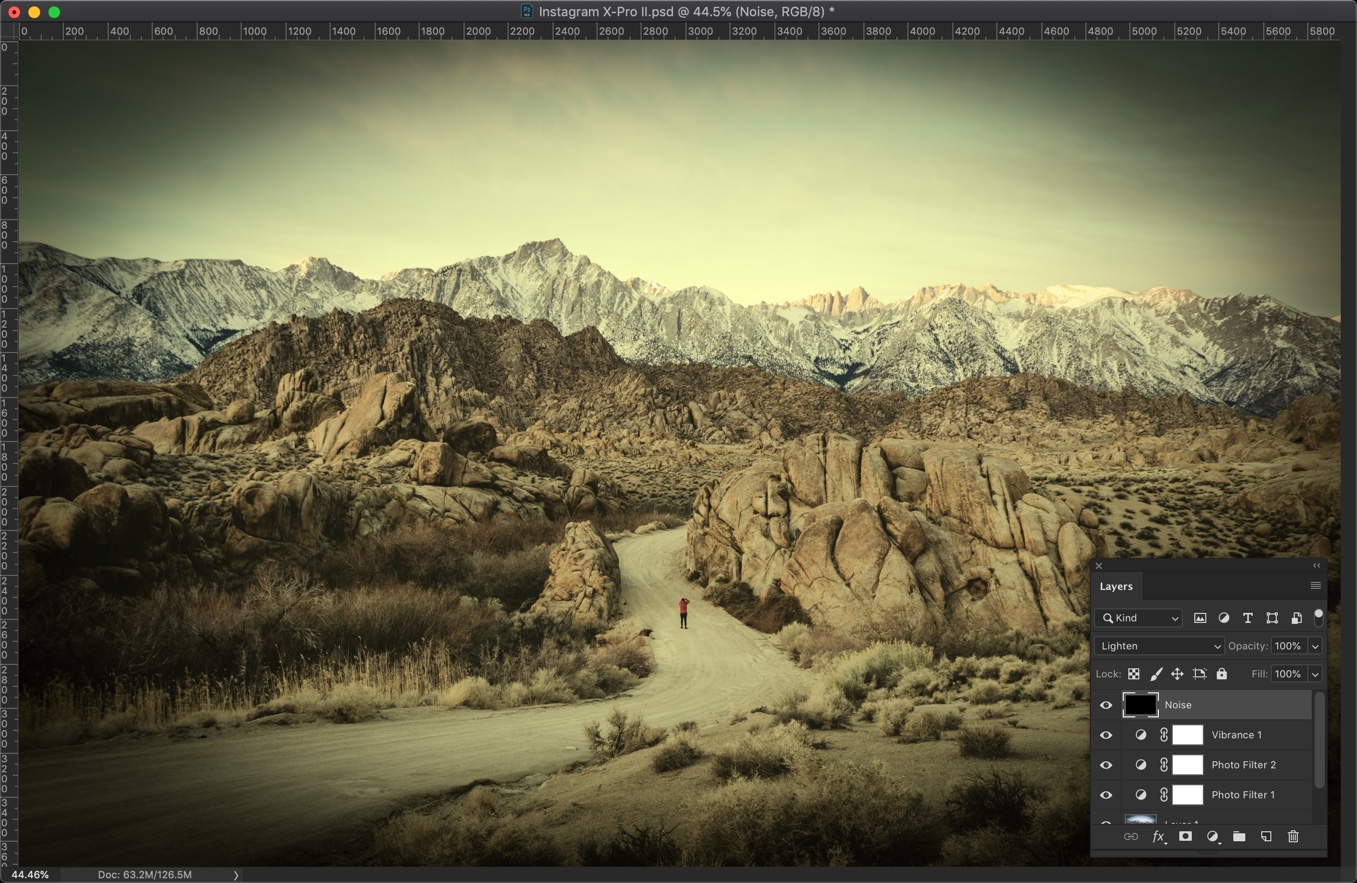
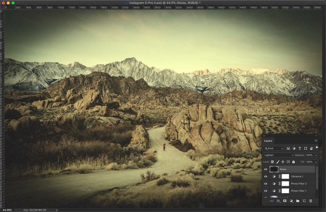
Go to Filter > Noise > Add Noise.
Change the distribution to Gaussian.
The amount depends on the size of the image. My photo is 5700 pixels wide. So, I am choosing 30%. If your image is bigger then choose a higher amount. If it’s smaller then choose a lower amount.
For example, if your image is 3000 pixels wide, you may want to go with 20.
Press OK.
This is how the image should look. The goal was to add the noise but made them barely visible.
Download The Photoshop Action For Instagram Charmes Filter
If you’re interested in the Photoshop action for the Instagram Charmes filter, download it from the below link.
I know that you see Smart Radius checkbox in Photoshop every day. I also know that you also never bothered to check what is smart radius for months or maybe for years.
Allow me to explain to you what’s smart radius in Photoshop.
What is Radius in Photoshop?
Before we understand further, let’s understand what’s Radius in Photoshop.
Radius in Photoshop determines the size of the selection border in which edge refinement occurs. Use a small radius for sharp edges, and a large one for softer edges.
What is Smart Radius in Photoshop?
Smart Radius in Photoshop helps in edge detection.
Smart Radius allows for a variable width refinement around the edge of your selection. There are many cases where you can use the Smart Radius. Among those cases, this option is helpful if your selection is a portrait that includes both hair and shoulders. In such portraits, the hair might require a larger refinement area than the shoulders. -Source: Adobe Official Website
Should I always use Smart Radius in Photoshop?
Personally, I see that the Smart Radius is doing any good when I need to select hair.
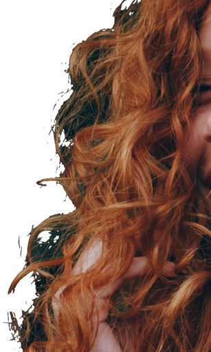
Let me show you why. Here’s an image of the hair. I am going to roughly select the hair. One time I’ll turn on Smart Radius and another time I won’t.
Scenario 1: Smart Radius is turned on
Scenario 2: Smart Radius is turned off
Note: In both images, I have not done any kind of refinement with the Refine Edge brush.
You can clearly see that the Smart Radius keeps more hair. I can further refine the selection with the Refine Edge brush.
Places where you see Smart Radius
The only place where you can find (as far as I remember) Smart Radius is Select and Mask. You can find Smart Radius in the Refine Edge in older versions of Photoshop.
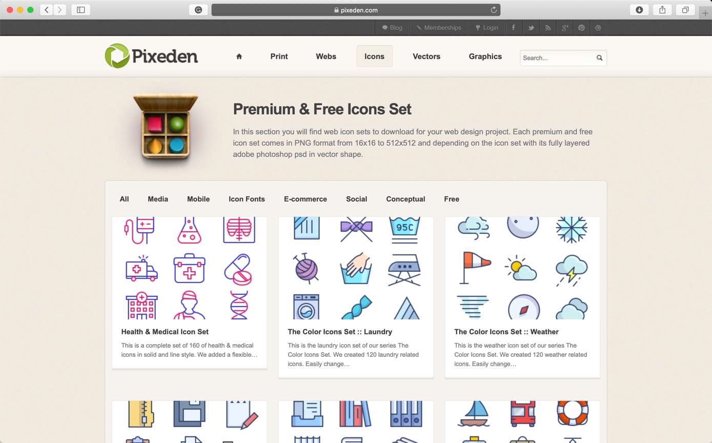
I know that pain of not having the correct icon to complete a design. I have been there and I know that you search a lot just to find the right icon for your designs. You get frustrated sometimes. This is why I have compiled 14 websites from where you can download premium icons. Bookmark this page and make sure that you come back tomorrow to check the sites. Here are the 14 best websites for premium icons.
Some of the websites on the list are popular and provides you more things like photos, PSD, and vectors. I guess that’s a positive point.
List of Websites for Premium Icons
Here’s the list
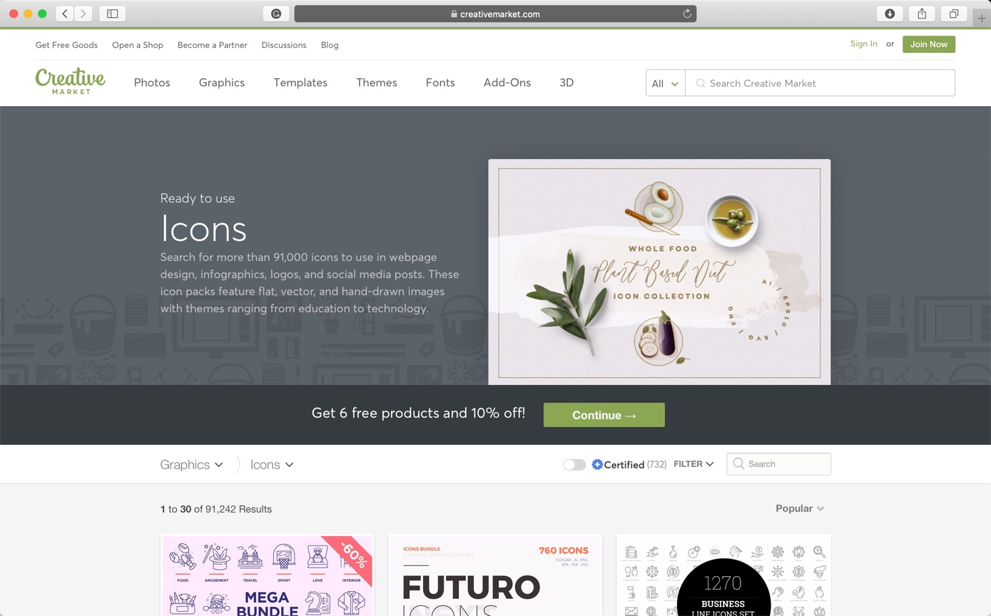
1. Creative Market
Creative Market is the world’s marketplace for design. Bring your creative projects to life with ready-to-use design assets from independent creators around the world.
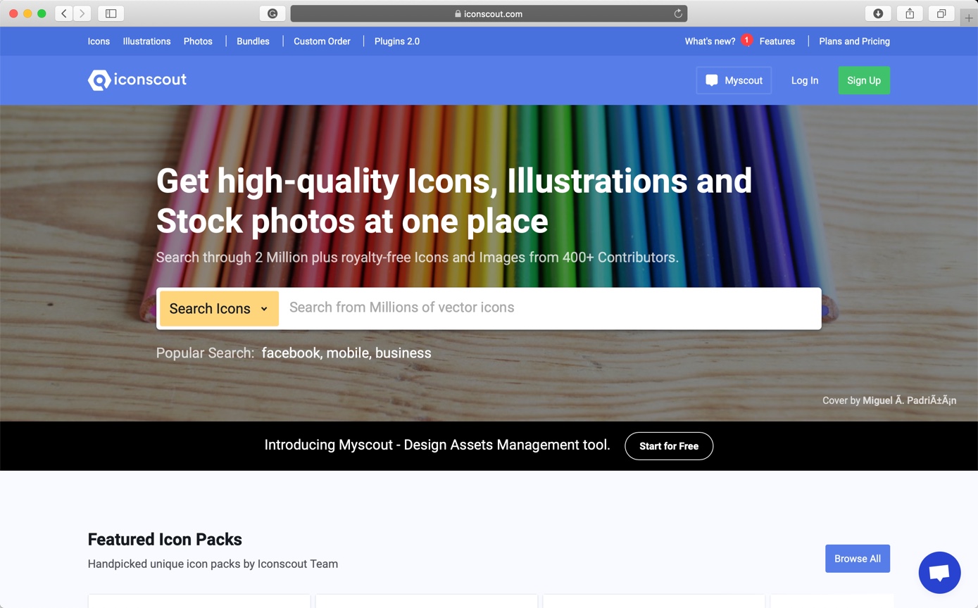
Iconscout building the next-generation Design Resource Marketplace and Design Assets Management tools to simplified collaboration between designers, engineers, product managers, and teams across the organization. They have more than 800,000 icons on their site.
Price: starts from $6 per pack. Free icons are also available.
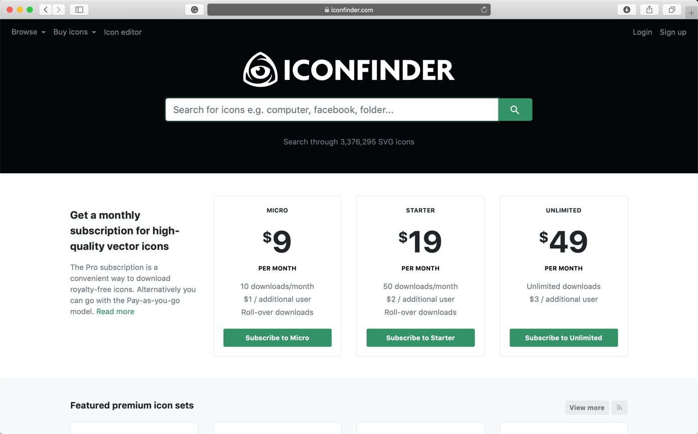
Iconfinder provides high-quality icons to millions of creative professionals. They are a small international team based in the lovely city of Copenhagen, with some of them working remotely.
Price: starts from $9 per pack. Free icons are also available.
The project started late 2014 when it was rare to find an icon pack containing more than 500 icons. Their aim was to create a library of icons where any user, no matter what one is looking for, can find the icon one needs. They started by publishing the Flat Round Icons pack which contained 1000 icons and was a great success.
Price: starts from $35 per pack. Free icons are also available.
Flaticon is the largest search engine of free icons in the world. But they also provide premium icons. Flaticon offers users, high-quality graphic designs: totally editable vectors carefully selected by our design team in order to provide our users with great content that can be used in both personal and commercial projects.
Price: starts from €9.99 per month. Free icons are also available.
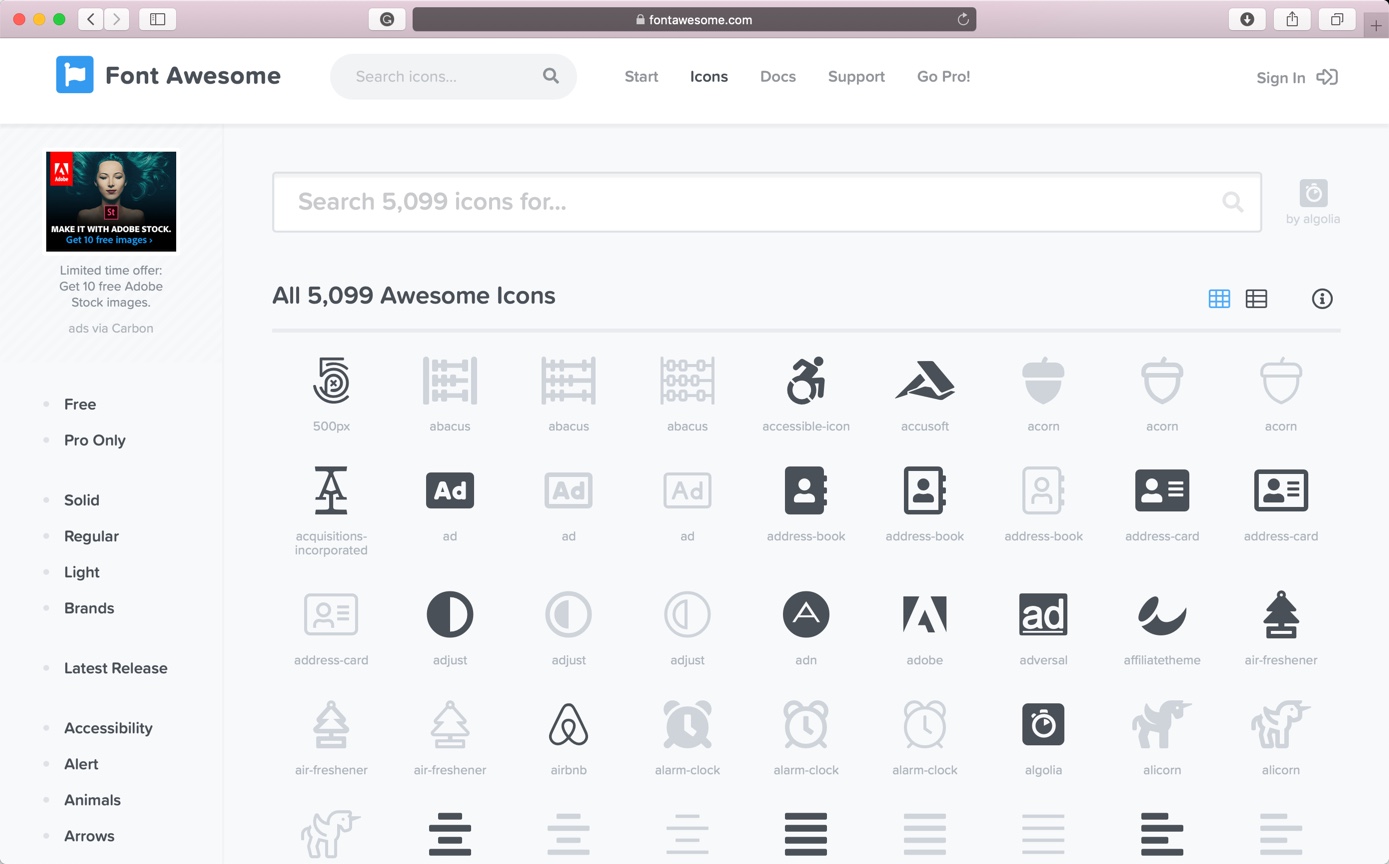
Font Awesome is a font and icon toolkit based on CSS and LESS. It was made by Dave Gandy for use with Twitter Bootstrap, and later was incorporated into the BootstrapCDN.
Price: starts from $60 per year. Free icons are also available.
Lossy vs lossless compression is one of the most searched phrases among photographers and web designers. Choosing one over another can save your hard drive space, make your site faster or even degrade the quality of your photo.
I am asked so many times the differences between lossy and lossless compression, and which one is better. So, I thought that I should write one article on it so that I can give this link to all the people who ask me the differences between lossy and lossless compression.
1. What is lossy compression?
Lossy compression reduces the size of the file by removing some of the details and colors.
Some similar type of data is grouped or averaged out and make the resulting file smaller. For example, there are 10 pixels side by side in a photo and they all have similar but slightly different shades of blue. Lossy compression would average out that blue color and the result would be somewhere around 1 shade of blue.
The changes are normally not visible to the human eyes for a low compression value because human eyes are more sensitive to the brightness rather than colors. So, unless the brightness is altered, you will be having a hard time to find out if the images are compressed because lossy compression does not alter the brightness of the photo.
1.1 Example of lossy compression
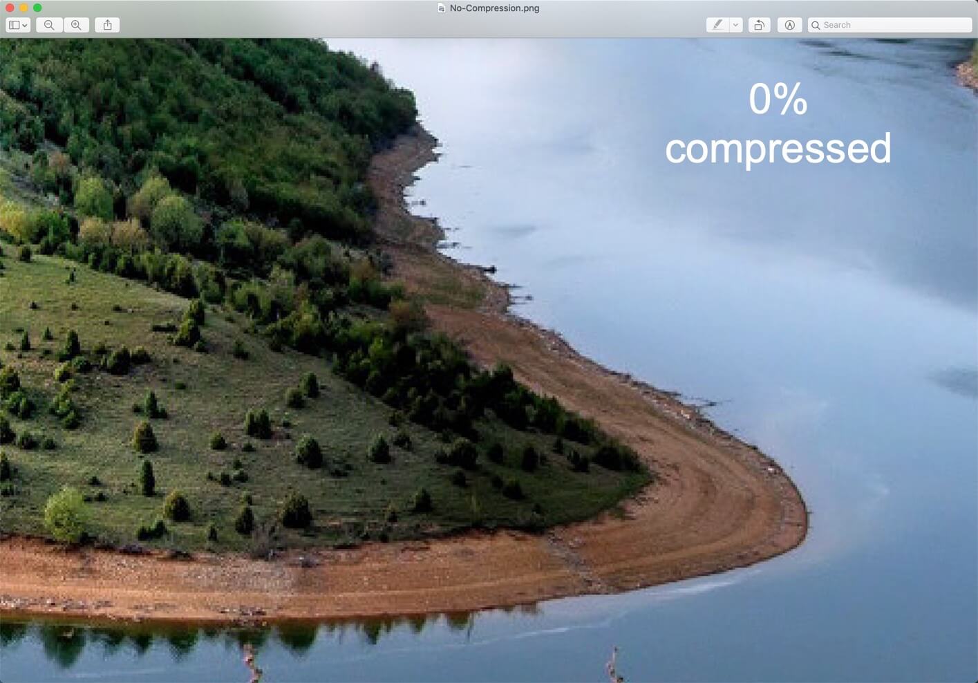
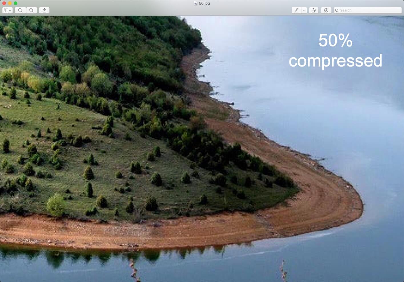
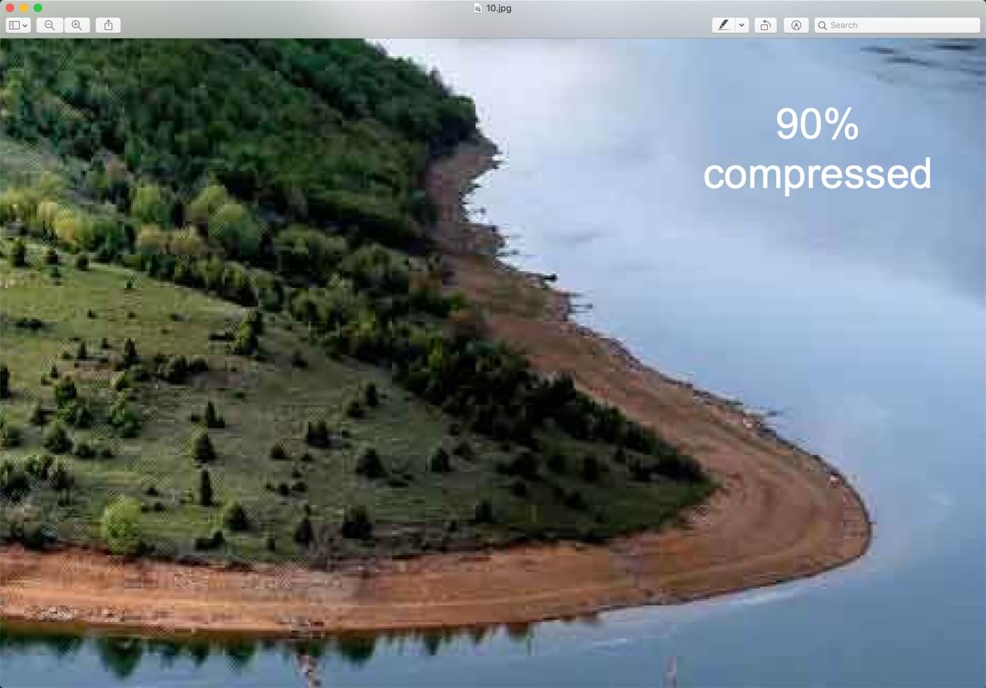
Here’s a screenshot of lossy compression. The images are 300% zoomed in. You can clearly see the difference in quality.
1.2 How to decide the compression value in lossy compression?
The amount of details and colors that we can remove from a photo depends on the compression value. When you use any tool like Photoshop or online websites to compress an image, you’ll see a slider where you can decide the value of the compression. Higher the value of compression, smaller the file size and lessen the details and colors.
Examples of lossy files – JPG/JPEG, audio and video files.
1.3 Each time you save a lossy file, some amount of details is lost
Yes, you read it right. Suppose you have printed photo and you took a photo of it from your iPhone. Now, the photo you’ll see on your iPhone will not have 100% of the details that are present in the printed photo. Already, some details are lost.
Now, you took a photo of the same photo on your iPhone from your Android phone. Now, this Android phone’s photo will have even lesser details.
The same thing happens when you edit a lossy file like JPG. When you edit it for the first time and save it, some of the details are lost but that’s OK. When you can again edit it and save it, more details are lost. So, basically, every time you edit and save a file, some details are lost.
1.4 How to avoid lossy compression?
The only way to avoid lossy compression is to use lossless file types like PNG, TIFF, and PSDs. If you know that you need to keep every single of details and colors, save the photo in PNG or TIFF format. The file size will be larger, but you get to keep the details.
1.5 Who should and should not use lossy compression?
Should use when:
If you’re going to send the image to someone and he’s not going to print it
For emails so that the receiver can see the image in lesser time.
For webpages (but up to a certain amount; don’t overdo it) so that it decreases the page load time. You should also make sure that your images’ dimensions are complying with the width of your site. For example, there’s no point in adding a 1600 pixels wide image to a site which is 960 pixels wide because the image will be realigned to 960 pixels.
Shouldn’t use when:
You need to re-edit the image because the quality decreases each time you save it
You need to print the photo
You’re a photographer
1.6 Google also encourages lossy images for websites.
Do you use Google PageSpeed Insights? If so, you’re probably familiar with the warning that says to “Optimize Images.” Back in 2017, Google updated their documentation and recommend using lossy compression as a way to further speed up your site.
2. Lossless compression
Lossless compression does not remove the details in the file, so your file size does not reduce.
A typical example of lossless compression is text files, spreadsheets, etc. You definitely don’t want your financial data from the spreadsheet to be edited out.
Example of lossless files PNG, TIFF, PSD, RAW files, and so on.
2.1 Who should and should not use lossless compression?
Should use when:
You need to re-edit the image because the quality decreases each time you save it
You need to print the photo
Should not use when:
If you’re going to send the image to someone and he’s not going to print it
For emails so that the receiver can see the image in lesser time.
For webpages (but up to a certain amount; don’t overdo it) so that it decreases the page load time. You should also make sure that your images’ dimensions are complying with the width of your site. For example, there’s no point in adding a 1600 pixels wide image to a site which is 960 pixels wide because the image will be realigned to 960 pixels.
3. Lossy vs Lossless (Tabular comparison)
Lossy filetypes
Lossless filetypes
Reduces the size of the file by removing some of the details and colors.
Does not reduce details and colors.
Takes less space in your hard drive
Takes more space in your hard drive
Should use when you need the photo just to show like for emails and websites
Should use when you need to re-edit the photo multiple times or you need to print the photo
Example: JPG, audio files, video files, and many more
For every craft, there is a different set of tools, each serving their own purpose. Some of these tools could look alike, some serve similar purposes, but there are often essential differences which make each of those tools the best option for a single operation.
In graphic design, the difference between Adobe Photoshop and Illustrator alludes most common user, but those who truly desire to become the masters of the craft should be acquainted with fundamental differences between these two pieces of software. In order to make things clearer, we decided to create this article, which is going to show the main differences between Photoshop and Illustrator.
1. File types
Photoshop uses raster files, as opposed to Illustrator which is manipulating vectors. A raster file is any graphic created by closely arranged blocks of various colors. Another word for raster file is a bitmap, which many people have heard of before. The trouble with raster graphics is that you can zoom in only so much until the image begins to look all squared and losses its original crisp and sharpness.
Vectors, unlike pixels, allow the computer to render images much smoothly. The reason why vector graphics are much easier to scale is that they are constructed via a series of mathematical formulas, instead of colored blocks. Therefore, if you would try to enlarge or make an image smaller, the quality would stay the same.
Raster file types include:
JPEG
PNG
GIF
MPEG4
Vector files include:
SVG
EPS
PDF
2. Use
When it comes to Adobe Photoshop, it’s the best choice you could have for manipulation of already created images. Although changing the scale of the object is not the best thing to do with Photoshop, there are many other features like changing background, adding various other objects, etc. In addition, Photoshop is widely used for web graphics, since these types of projects usually stay the same size.
Illustrator, as we already said, uses vectors – a line connected via two dots through a computer algorithm. This characteristic allows enhanced scaling feature which makes Illustrator the weapon of choice for any graphic designer who wants to design logos or any printable graphics.
Imagine having a client who wishes to print an assignment masters logo on T-shirts and business cards. Instead of creating different graphics for each of these purposes, you can simply use Illustrator to create a single design and then scale it in accordance with the project requirements.
3. Different features
Now let’s take a look at some of the more detailed differences between these two software solutions.
Photoshop zooms up to 300 percent but only to display a messy pixelated image. Illustrator shows a crispy sharp image at 900 percent zoom.
Photoshop provides a single canvas, while Illustrator gives you the chance to design in multiple Artboards. This is another reason why Illustrator is a more optimal choice for web designers, as multiple Artboards allow you to work on multiple design options for various devices or screens.
With Illustrator, layers can contain multiple objects, while Photoshop provides you with a single object per layer. This makes Illustrator a better solution for complex graphics which would require adjusting and editing later.
Both Photoshop and Illustrator can create amazing 3D images, however, Illustrator is a more potent solution due to its vector-based nature.
4. Conclusion
As we can see, the difference between Adobe Photoshop and Illustrator is not in regards which one is better or more useful. What separates these two pieces of Adobe Creative Cloud is their purpose. While Photoshop is an excellent choice for image manipulation and simple web graphics like buttons, Illustrator is a tool you would use for logos and printable media.
This article is provided by Cathy Baylis. She is a freelance content writer specializing in leadership, career development and education. She loves sharing her interests with readers, and she has something to say, for sure. Writing is not only her hobby but the profession at the same time.
Instagram is growing day by day and so are the number of Instagram filters. I see that Instagram regularly adds new filters in its app. LoFi is still one of the most popular filters in Instagram, but there are other filters also that people use. Today we’re going to see how to create Instagram Charmes filter in Photoshop.
Chames filter gives a retro look to the photo which basically means desaturating the image, adding a yellow tint, and adding some noise. We’re going to do the same thing in Photoshop. But, we’re going to do it in a better way.
And yes, don’t forget to download the action.
Download the Instagram Charmes Filter Photoshop action – click here to download the action. It will scroll you down to the bottom of the page.
Before we go ahead, let me show you the before and after image.
Before
After
Video
If you like watching a video, here’s the video for you.
Step 1: Reduce the colors
The very first thing that you and I are going to do is to reduce the colors. This is the first step to give a retro look to an image.
Go to Layer > New Adjustment Layer > Vibrance. Reduce the saturation to -55.
If your layer panel is not opned then press F7 to open or you can go to Window > Layers.
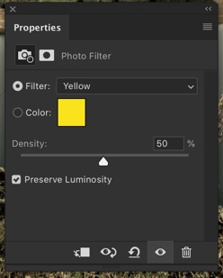
Step 2: Give Yellow tint
The second step in giving a retro look is to give a yellow tint. This is a very important step in creating Instagram Charmes filter in Photoshop.
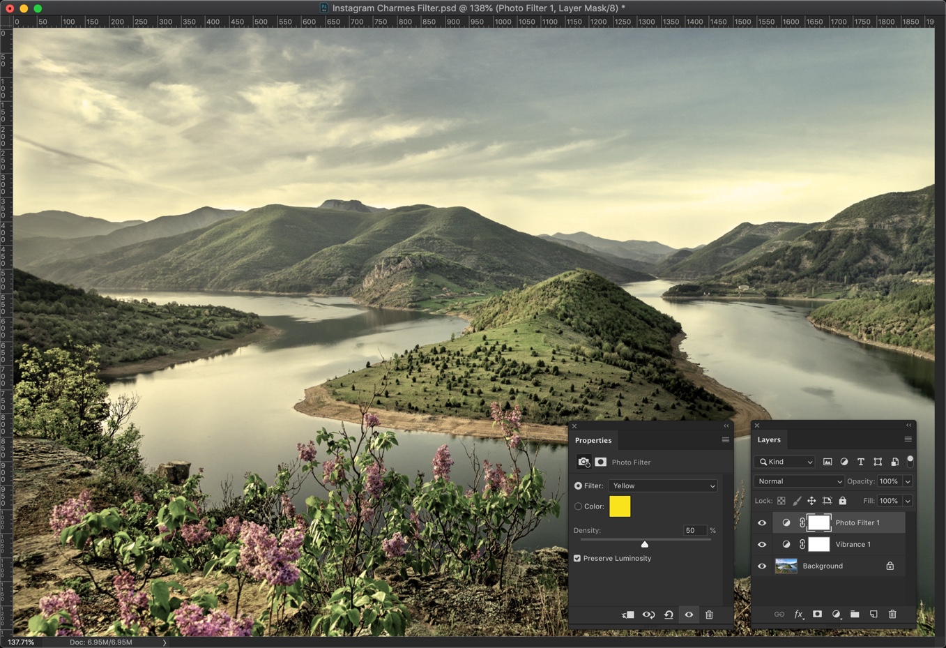
Go to Layer > New Adjustment Layer > Photo Filter. Change the Filter to Yellow and increase the denisty to 50%. Make sure that Preserve Luminosity is turned on otherwise your photo will get dark.
This will give a good looking yellow tint to your photo.
Step 3: Decrease the Contrast
The next step in creating Instagram Charmes filter in Photoshop is to reduce the contrast.
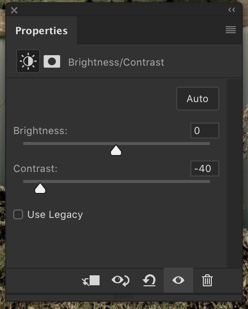
Go to Layer > New Adjustment Layer > Brightness/Contrast. Reduce the contrast to -41.
This will reduce the harsh contrast in your image.
Step 4: Give Magenta Tint
The next step is to give magenta tint.
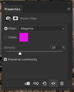
Go to Filter > New Adjustment Layer > Photo Filter. Change the filter to Magenta and increase the desity to 25%. Make sure that Preserve Luminosity is turned on otherwise your photo will get dark.
This will add a magenta tint to your image.
Step 5: Complete Creating Instagram Charmes Filter in Photoshop by Adding Noise.
The last thing that we need to do it to add noise.
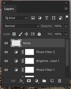
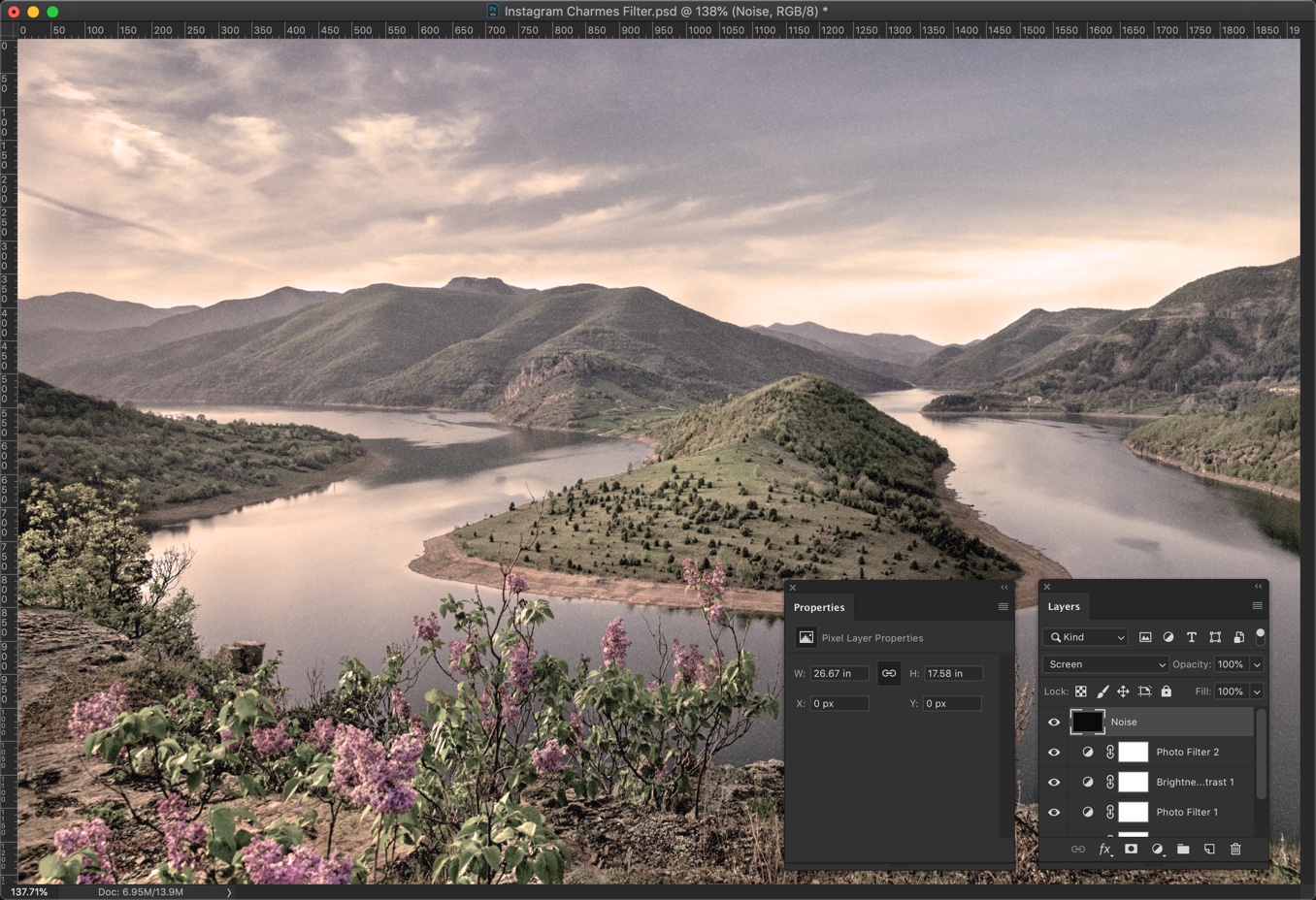
Create a new layer by pressing Cmd + Shift + N / Ctrl + Shift + N or go to Layer > New > Layer. Name that layer Noise.
Change the foreground to black. You can also press D to make black as your foreground color.
Press Opt + Delete / Alt + Backspace to fill the newly created layer with the foreground color which is black.
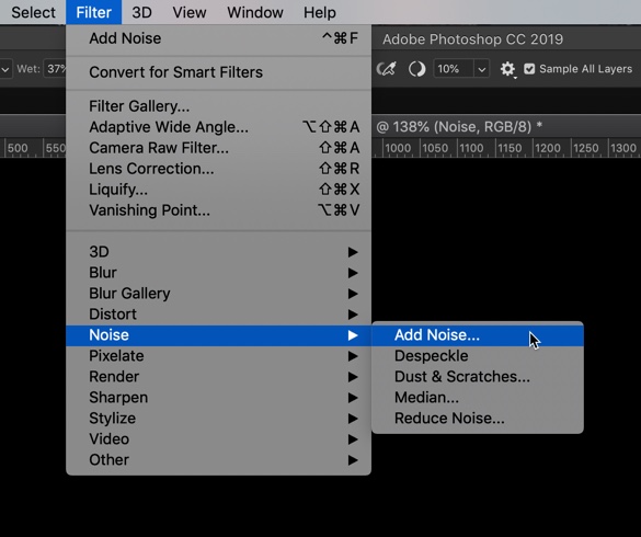
Go to Filter > Noise > Add Noise.
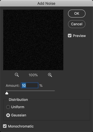
Change the Distribution to Gaussian and turn on Monochromatic.
The Amount depends on how big your image is. My image is 1920 by 1080 pixels and I am going to choose 10%. If your image is lesser in dimension, choose a lower value and if your image is larger in dimension then choose a bigger value.
For example, if your image is 3600 pixels wide then you may want to go with 20%.
Screen blend mode looks at each channel’s color information and multiplies the inverse of the blend and base colors. The resulting color is always a lighter color. Screening with black leaves the color unchanged. Screening with white produces white. The effect is similar to projecting multiple photographic slides on top of each other.
This is all, guys.
Here’s The Photoshop Action For Instagram Charmes Filter
If you’re interested in the Photoshop action for the Instagram Charmes filter, download it from the below link.