Background color of e-commerce photos – The Ultimate Guide

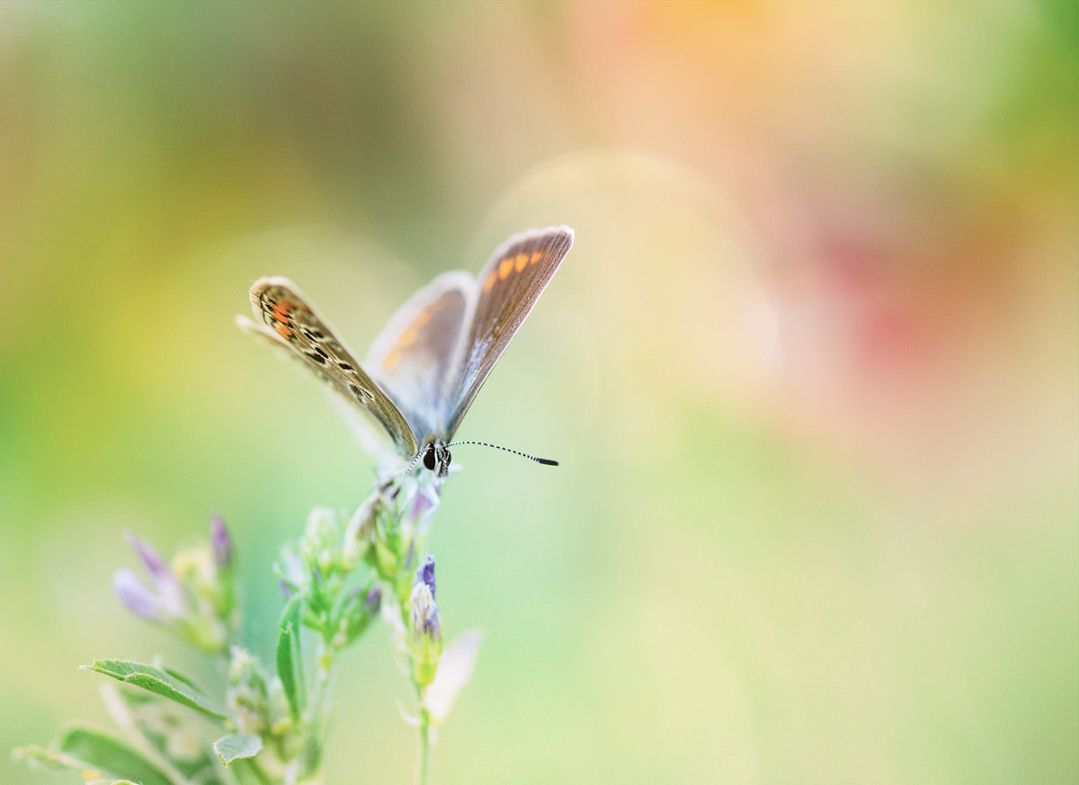
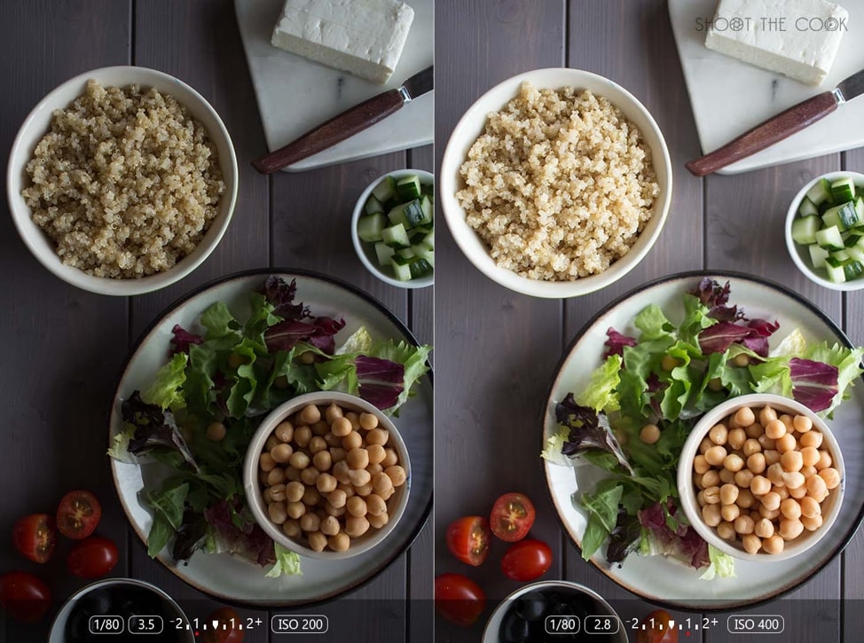
We edit thousands of photos daily. White remains the most preferred color for the background but the trend is now changing. Light gray is now emerging but there’s a catch. Let’s see what this guide for the background color of e-commerce photos bring to you.

The ultimate guide for the background color of e-commerce photos

You are thinking that why is background important. Don’t you?

Here’s a fact.

50% of online shoppers think that product photos are more important than product information, reviews, and ratings. Shopify

Your background can make your photo more appealing or can do the opposite.

1. Types of the background color of e-commerce photos

There are mainly three types of background

  1. Lifestyle background – The products are shot in a way that it shows the usage of them. It’s good to build an emotional connection with the product.
  2. Product only – The photos are shot against a neutral color background. It increases the conversion rate.
  3. Pattern background – The background is a pattern. It’s a good option for those who don’t want to have a neutral background.

2. Lifestyle background for e-commerce photos

Let’s see one example

1.jpg

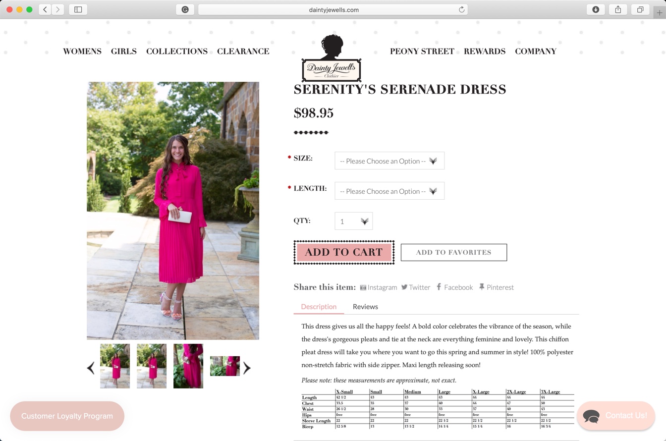
Take a look at the above screenshot. It’s of Dainty Jewells. I think that Charity, founder of Dainty Jewells, like potential customers to build a connection with the dresses.

The main purpose of liefstyle photos is to show where and how to use your products.

Photos with lifestyle background do this.

Its product page also has only lifestyle photos. I could not find any photo with a solid or neutral background.

2.jpg

Lifestyle photos don’t perform well in terms of conversion rate.

Take a look at the above screenshot of Joinery. Aren’t the photos looking beautiful? But, are the photos converting well? I doubt so.

6.png

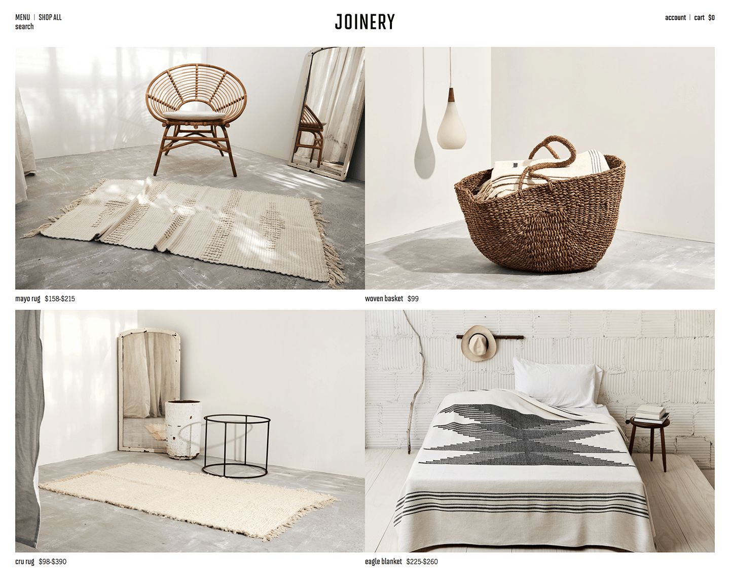
At first glance, I got confused that what is the actual product they’re selling. Was it the chair or the rug in the first photo? I don’t know and I won’t bother clicking on the photo to find out. Also, the title of the product is written in such a small font that my eyes won’t naturally go there.

Sometimes, lifestyle photos confuse the potential buyers because the customers can’t figure out the actual product in the photo. It further decreases the conversion rate.

According to us, the best way to show lifestyle photos is after showing the product only photo. Here’s an example.

3.jpg

This backpack is on Rom Outdoor. The site is showing the lifestyle photos after showing the product only photos.

It’s also good to add a few lifestyle snaps to your product page, helping to to boost emotional engagement.

3. Product only backgrounds for e-commerce photos

Here you show the product against a neutral background like white color, gray color, or any other color.

These photos describe your product at a glance and are best suited for your catalog and product pages. Their job is to nurture page visitors towards making a purchase.

When consumers view a product page, they are looking for proof of quality and value. A neutral background provides this proof and value.

There are mainly three colors which most of the e-commerce stores owners are using nowadays

  • White color
  • Light gray color
  • Pastel colors

You should make sure that your product covers 85% of the photo in the photos having a neutral color background.

3.1 White color background

Have a look at Amazon. All photos have a white background.

There’s a reason Amazon uses only the white background. The reason is that the white color background gives the highest conversion rate. Amazon invests millions on research and if they’re still using white background means that research supports this color.

4.jpg

But, there’s a change in trend.

Although white color background converts a lot better than other backgrounds but white color backgrounds fails to build an emotional relationship between your products and potential buyers.

3.2 Light gray background

You put a shade of gray in the background.

Here’s a lookbook of Sarah Pacini. Can you see the shade of gray in the background?

5.jpg

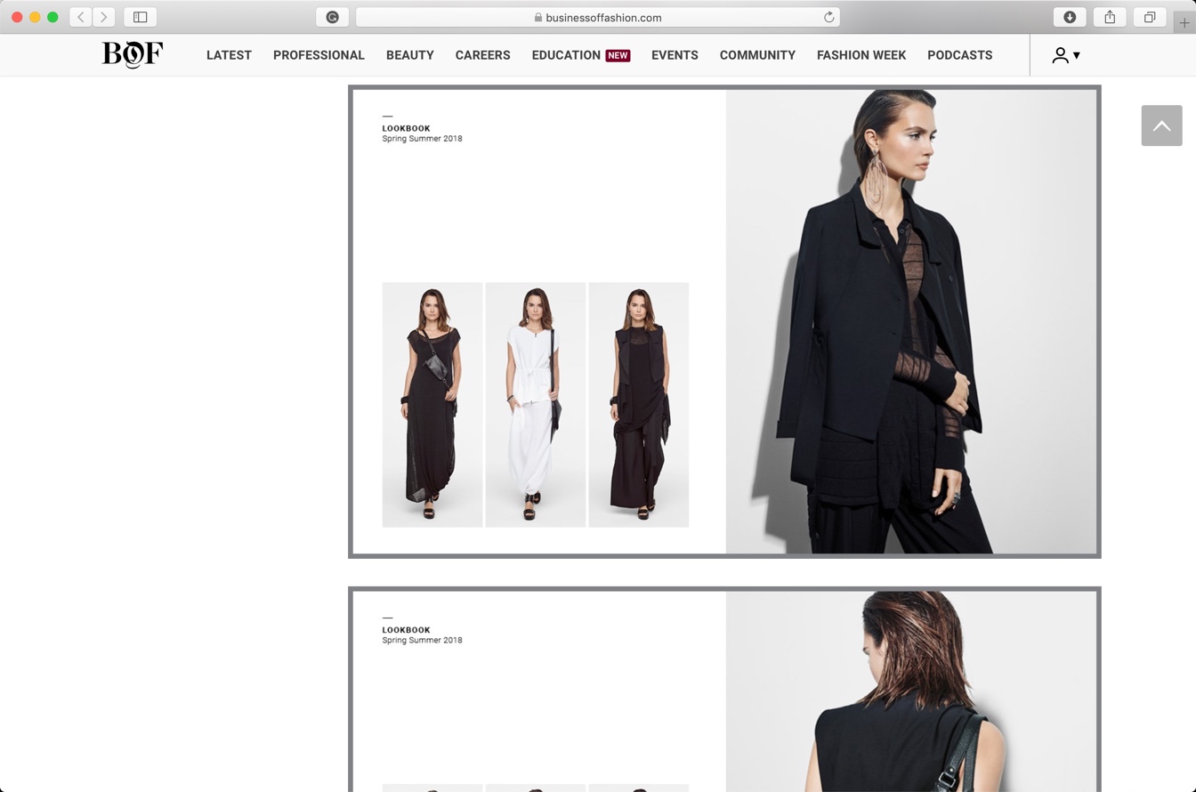
The gray background does not give as high conversion rate as the white background.

Gray background adds premiumness to the photos. It does not have a high conversion rate like white backgrounds but it adds an emotional connection with the potential buyers. Your existing buyers are more likely to purchase from you again.

This is what we also advice.

You know that we edit e-commerce photos. We also advise our clients to use a light gray background (usually #eeeeee) for their photos.

3.3 Pastel background

Pastel colors are pale colors that soothe eyes. Here’s a Wikipedia article on pastel color.

Take a look at the screenshot of Flaire Junkie.

8.jpg

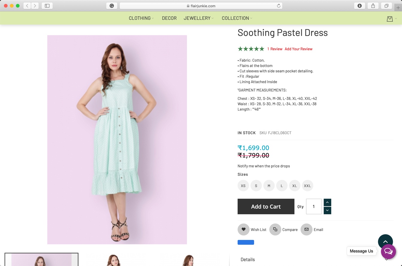
Pastel colors are very eye-catchy. Maybe because they soothe the eyes.

Pastel colors tend to work good with colorful dresses. It also works good with fancy items like colorful phones, cloths. iPhone red also has a red pastel background on apple.com.

4. Pattern background for e-commerce photos

You show a pattern in the background.

Here’s a screenshot of a page on Oh Polly.

7.jpg

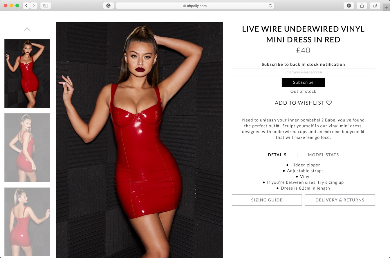
The photo has neither a neutral background nor a lifestyle background.

The conversion rate of pattern background is between the lifestyle background and neutral color background.

The choice of pattern plays a crucial role in the perception of the product in the potential buyers’ minds.

Black color signifies luxury and this dress has a black pattern background. The photo is also edited in such a way that it signifies the luxuriousness of the dress. But, the dress costs only 40 pounds. Guess what? It’s cheap.

The buyer will think that it’s a luxury dress but costs only 40 pounds. She won’t think twice before making the purchase.

How to Write a Great Bio Page for Your Photography Website

As a photographer, you have all sorts of skills behind the lens, but you’re still going to have to turn your hand to other things.

Writing copy may or may not come naturally to you, so let’s take a look at the basics you need to know to write a great bio page.

Why do you need a bio page?

Bio pages are just as important in the world of photography as they are anywhere, and in a lot of cases, they can really clinch the deal.

mountain-4387827_1280-min.jpg

When someone’s hiring you to take their wedding photos, for example, they want to know they’ve found someone that will put them at ease. If you have a bio that’s welcoming, personable, and easy to connect with, people are going to want to do business with you.

This is what a bio page is for, and it’s why you cannot afford to go another day without one.

Introduce yourself by painting a picture of who you are

The first thing you need to do is introduce yourself. If people don’t know who you are they’ll find it hard to connect with the rest of what you have to say.

savoy-3860933_1280-min.jpg

You’re a photographer after all, so if there’s not a picture of you looking creative near the top of your bio, it’s going to feel a little strange.

Find something that matches the tone of the writing you’re aiming to produce, and then combine it with a friendly opening. This isn’t the part where you want to pitch for work, so introduce yourself, and nothing more.

Tell the reader what you do

With the introductions over and done within a few lines, you can turn your attention to your expertise.

dom-4404207_1280-min

You’re providing a service, so don’t assume that people will know exactly what areas of photography you specialize in. Be explicit, be clear, and most of all make it plain that you’re flexible and adaptable.

These are the things people look for most with a photographer, especially if they haven’t hired one before and will be making up a part of what they want as they go along.

Talk about where you work, and why

You cover a particular area, or you shoot a particular type of shot, so talk about it. This doesn’t mean that you have to limit yourself to these types of jobs for the rest of your career, far from it.

ape-4398922_1280-min

But what it does do is give the reader an idea of whether you’re someone they can realistically hire.

There are also some photographers who aren’t available for hire. They spend all of their time on the shoot and then sell collections afterward. If that’s what you do, make sure people know.

Remember to make a point of your experience

There are so many different web copy errors out there, but one of the most egregious is forgetting to sell yourself.

You’re someone who has spent a lifetime behind the lens, so make sure people know they’re hiring an expert. It’s not boastful to say you’ve been doing it all your life; it’s actually rather reassuring.

You want to set the reader at ease, and there’s no better way to do that than by making it crystal clear you know exactly what you’re talking about.

Describe why you got into photography with plenty of passion

Photography is a creative art, and half the time people are hiring you because of the way you approach your medium.

the-feather-of-a-bird-4395771_1280-min.jpg

It’s about making people know you care about the end result just as much as they do. You’re not someone who goes through the motions and emails in the prints.

You’re a creative with a passion for capturing those fleeting moments which can define a life well-lived.

Be passionate and creative with the way you describe how you got into photography and it will make the world of difference to the quality of your bio.

How do you run your business?

Another one of the common mistakes is to make no mention of how you run your business. Of course, this is a bio, so there’s not all that much space for the specifics and logistics, but you still need to mention them.

Perhaps you do engagement shoots to get people ready for their weddings, maybe you only do seasonal shoots in certain parts of the country; just drop in a few little pieces of information to get people thinking about how they can use your services.

End with a great call to action that hooks the reader

If you want to hook the reader, you need to end with a call to action. It’s a bio page, after all, so you can’t go directly to the hard sell otherwise it will just make the rest of your copy feel insincere.

gerbera-4346124_1280-min

The secret is to talk about how excited you are to work with the reader. This will convey your passion for your art, whilst at the same time giving them a gentle nudge that you are open for business.

Make sure you check the spelling and grammar

Ask the professional writers out there what drives them mad and they’ll tell you it’s a great piece of copy that no one has spellchecked.

It’s an indication that you’re not quite on it when it comes to that all-important attention to detail, and you’ll lose more than your fair share of customers as a result of it.

Make sure you check your work, sleep on it, and check it all over again. That way you can sleep with the peace of mind that you’ve given your bio your best effort.

Find a tone of voice that fits your personality

Lastly, put a lot of thought into the tone of voice you want to use. If you make the bio feel overly corporate and rigid then it will read like just another generic LinkedIn page.

You’re a creative person, so let a little bit of your personality shine through. Not only is it far more original and unique, but it’ll also help you stand out from all the other photography sites out there.

Final Thoughts

Now that you’ve heard all about how to create the bio of your dreams, all that’s left is to start putting pen to paper.

Take your time, don’t try and force it when you have writer’s block, and embrace it when the words really start to flow.

Before you know it you’ll have an irresistible piece of copy that tells browsers everything they need to know. Just what you need to grow your business by sharing a little bit about yourself.

How to create Transparent Text in Photoshop?

Adding your contact details as a transparent text is the best way to add watermark in your photos. Viewers can see your details and at the same time, your contact details are not blocking anything. In this tutorial, I am going to show you how to create transparent text in Photoshop.

This is going to be a short tutorial. We’re not going to use any adjustment layers but just layer styles.

Before we go ahead, I want to show you the after and before photos. Here’s a very beautiful photo of Praca do Comercio that is present in Lisbon, Portugal.

This photo is by Frank Nurnburger and present on Pixabay. Nice work, Frank!

After

Final.jpg

Before

Initial.jpg

Let’s start the tutorial.

Step 1: Write the text

Grab the Text tool from the tool panel.

1.jpg

Change the font to the one you want to use. I am going to choose League Spartan (one of my favorite fonts 😀).

2.jpg

Write the text.

3.jpg

Step 2: Adjust the position of the text

Go to Edit > Free Transform or press Cmd + T / Ctrl + T to activate the Free Transform tool.

4.jpg

Drag and drop the text to your desired position. Press Return/Enter to deactivate the Free Transform tool.

5.jpg

Step 3: Make the text transparent in Photoshop

Go to Window > Layers to activate the layer panel.

Make the “Fill” 0%.

6.jpg

This will make the text transparent.

7.jpg

Step 4: Add some style using Layer Style

Click on the fx button that is present at the bottom of the layer panel. It’s the second icon from the left. Choose Bevel and Emboss.

8.jpg

Adjust the setting in the option. I am going to go with the below settings. You can tweak these settings. This will give an emboss like effect to the text.

9.jpg

Click on Outer Glow and adjust the settings. This will make your text glow.

10.jpg

Click on Drop shadow. This will add a shadow to the text.

11.jpg

And this is how you make a text transparent in Photoshop.

What should be the size of e-commerce photos?

This is a debatable topic. There’s no exact guide for us to follow. But, the rule of thumb is that each photo should be lesser than 100Kb.

Google says that high page loading time decreases sales. Sites loading between 1 to 3 secs have 32% higher bounce rate than the sites which load under 1 minute.

Shoppers are really having no time nowadays.

image13.png

Do you see the increase in bounce rate?

Understand the effect of high bounce rate

Bounce rate means the number of people come to your site and doesn’t do anything (no link click, no button click, nothing) and leave your site divided by the total number of people who come to your site.

Case 1: Site loading speed is 3 secs

Suppose your current bounce rate is 20%. You get 1,000 visitors every month and with 20% bounce rate means 200 people leave your site straight away. Now, only 800 people are left to buy your product.

Case 2: Site loading speed is 5 secs

Now, your bounce rate will be increased by 90%. So,  90% of 200 is 180. Which means that total people who’ll leave your site are now 480.

Out of 1,000 visitors you get, 480 straight away leave your site.

Damn!

Now only 520 are left to buy your product.

How photos affect the loading speed and bounce rate?

Photos are a lot heavier than text.

In 1 KB of text, you can put 1,024 characters. Can 1 KB of the photo has this many characters? No.

Photos are heavier so they take time to load and page loading time increases.

Page loading time increases which increase the bounce rate.

So, there’s a direct relation between the size of the photos and bounce rate. Heavier the photo, higher the bounce rate.

But why are product photos necessary?

75% of Online Shoppers Rely on Product Photos When Deciding on a Potential Purchase. Source

Do you see it? I don’t think that I need to explain to you anymore.

One more.

Good Visual Content is 40% More Likely to Get Shared on Your Social Accounts. Source

What is the ideal size of the e-commerce photos?

My company and I edit e-commerce photos (yes, we make your e-commerce photos better by editing them).

From my experience, you should not worry if the total size of the photo is less than 100KB. You also need to make sure that your photo is looking equally beautiful even if it’s only 100KB.

But why 100KB?

Typically, a product has 5 photos. If each photo is 100KB then the total size would be 500KB.

Average net connection speed in the US is 2.33MB per second so loading 500Kb will take less than 0.3 sec. [Source]

The speed also varies by the cities. Kansas City has the fastest net and the average downloading speed there is 19.8MB. [Source]

How can you make photos lesser than 100KB in size?

The answer is “Export As” in Photoshop.

I use this feature all the time. I simply go to File > Export > Export As

2.jpg

I decrease the quality to 50% and dimension to 800 pixels wide.

This normally make the photo only 40-60KB in size which I consider a perfect size.

3.jpg

3 ways to remove colorcast in Lightroom

I am like you. The first thing I do in my photos is to remove the colorcast or tint. Adobe also knows that most of the photographers prefer to remove colorcast in Lightroom first and then play with other sliders. Maybe that’s why it has put White Balance slider at the top.

Today, I am going to show you the 3 ways to remove colorcast in Lightroom. Colorcast and tint are the same things. This tutorial will stay relevant to you if you want to remove tint in Lightroom.

I will remove the color cast using 3 different ways. In the end, I’ll show you which one gives the best result.

Related: Remove colorcast in Photoshop

(Fastest) Method 1: Remove colorcast in Lightroom using White Balance dropdown preset

Open the photo in the Lightroom.

1.jpg

Click on the dropdown that is next to WB.

2.jpg

Choose “Auto”.

3.jpg

Here’s the final photo.

Final Auto WB.jpg

Here’s the before photo.

Raw.jpg

Method 2: Remove color colorcast in Lightroom using the Eyedropper tool

Click on the Eyedropper tool left to the WB.

4.jpg

You need to choose the area that should be white but appearing yellow or blue because of the colorcast.

I am going to this leaf. I know that it should not be white but this leaf’s color is very close to white.

5.png

As soon as you put the eyedropper tool on it, Lightroom will show you the average colors. Click on it.

6.jpg

Here’s the final photo.

Final Eyedropper Tool.jpg

Here’s the initial photo.

Raw

Method 3: Remove color colorcast in Lightroom manually

This is the most powerful method but requires the most amount of time.

You’ll be playing this these two sliders.

7.jpg

You see that my original photo has a yellow colorcast. The invert of yellow is blue. So, to cancel out yellow, I need to add blur color.

I’m dragging my slider to the left. My photo has already started looking better.

8.jpg

The next thing I’ll do is to drag the Tint slider to the white to add more magenta.

9.jpg

This is the final photo.

Final Manual.jpg

Conclusion

  • Method 1 (Auto White Balance) – the easiest and the fastest. Doesn’t give the best result every time
  • Method 2 (Eyedropper tool) – Gives a good result but you need to have something in the photo which’s color is white or very close to white.
  • Method 3 (Manual) – Time-consuming but gives the result that you like. You need to have an eye that can see at which point the colorcast is removed perfectly.

Here are all three photos again.

Original

Raw

Method 1 (Auto White Balance)

Final Auto WB

Method 2 (Eyedropper tool)

Final Eyedropper Tool

Method 3 (Manual)

Final Manual.jpg

Top Photoshop skills that you need for marketing

If you work in marketing for a small business, you don’t always want to be hiring a designer for small jobs especially when it comes to digital media.

There are many things you can do yourself in Photoshop or similar programs even if you have little to no experience in it.

Also, don’t hesitate to search for video tutorials online to complement this article and get you well on your way.

1. Edit and enhance your images

First off, you want to be able to do basic things like resizing, cropping and editing any photo so it can fit different online and social media parameters. You need to make sure you’re loading images on your website that isn’t too large, or your profile picture on Facebook isn’t poorly centered.

sand-3157732_1280.jpg

The visual focus of your images should be the exact same regardless of which channel you’re on so that customers can recognize your brand’s identity. For example, a banner on Facebook is horizontal and is perfect for text information, whereas a Twitter profile photo is quite small.

Learn your image measurements for different platforms and make sure your images stay sharp when you’re resizing them.

2. Make sure your images are mobile-friendly

Another key factor in this day and age is making sure that your images are mobile-friendly since the majority of your customers will probably access your brand via mobile.

This is all about sizing and compression and they are the two most important aspect of a successful image for marketing. If they’re too clunky for mobile, it doesn’t matter how stunning the image is, you will lose many potential clients.

Some helpful suggestions to make your image more mobile-friendly is choosing something that is clear and without too much going on so when you resize it to a smaller size, you won’t lose the impact and it won’t seem too busy.

3. Add depth and texture to your images

This suggestion comes from Nancy Riddick, a design blogger at Last Minute Writing and Writinity: “you can use Photoshop tools to add depth and texture layers even as a beginner.

pier-569314_1280

There are many options for adding textures to flat images to make your design pop.

Don’t make the mistake of going too simple that it looks like you created the graphic in a Word processor. This can work for anything from rustic to bold looks.”

4. Create a blurred background to put the focus where you want it

If you want the viewer to be focused on an aspect of your image or design, the easiest way to do this is to blur the background, which naturally draws the viewer’s eye to the sharply focused part of the image.

1024px-Squirrel_with_Blurred_Background_by_Monique_Haen

Make sure there aren’t too many distractions around the focus of the image and put it in a central location. This isn’t too complicated to do as you can use quite a basic blurring technique to achieve a great result.

5. Make your text wrapping look effortless

Tara Bourne, a writer at Draft Beyond and Research Papers UK, says that “it’s normal to add text to an image but it can be difficult to do this with little experience in photo editing.

1024px-Andrew_Rozario_-_Motivational_Quotes_2_-_Film_Director,_Book_Author,_Motivational_Speaker,_Screenplay_Writer

The issue here is that your text placement and style can look cheap or basic. One way to avoid this is to create a space between the subject of the photo and the text.

With Photoshop, you can wrap text around an image but also layer it on top of an image. Look at the different options in Photoshop tools to do this because as a marketer it’s important to be able to maximize your images by incorporating text which looks professionally done.”

6. Give your text a reflect effect

A new emerging trend in web design is to create a reflection effect on your landing page text which creates depth.

You don’t want to use this throughout your website but if you use it only on certain parts like headers or categories it can make your webpage pop and appear more dynamic. If this is a look that would work for your business, look into adding text reflection on Photoshop because it’s one of the more straightforward and easy to use Photoshop skills.

Try to avoid doing a full reflection because that is a very dated look – you want to achieve only a suggestion of a reflection.

7. Use blend modes to make images stand out

There are easy ways you can make images pop using Photoshop, such as brightening it or increasing the contrast to make the color stand out more.

1024px-Hoatzin_in_Peru

Photoshop has many blend modes that let you easily brighten your images to make them livelier and draw viewers in.

In fact, you can consult the Photoshop Essentials guide to learn more about this process. As a marketer, it’s good to know that the images which have a higher contrast are those which are best received online. 

Ashley Halsey, a professional writer at Lucky Assignments and Gum Essays, is involved in many marketing and web design projects online. She enjoys helping her readers develop their online presence and is the go-to person to consult for new design trends.     

Tips for Beautiful & Tempting iPhone Food Photography

Food is an excellent and tempting subject for photography, and with an iPhone, you can achieve incredibly artistic outcomes. Beautiful food photography not just means to snap a plate on your table; there are specific rules of genre to follow to make your photos spectacular.

1.jpg

Instead of hassle up with Photoshop tricks, below are nine tips that are highly useful and effective to take beautiful and tempting food photos from your iPhone.

1. Use Neutral Backgrounds

The complimentary background is essential for food photography. It doesn’t matter if it’s messy or appealing; it should grab the attention on first sight. A neutral background doesn’t have to be dull or simple; it just emphasis on food.

2

There are three common types of backgrounds food photography:

  • Dark backgrounds: for dense colored foods.
  • Light backgrounds: for bright colored foods.
  • Wooden backgrounds: for making an excellent backdrop with natural light.

Also, table cloths, tea towels, subtle patterns, vintage floral prints look good if used well. You can also include natural elements to give an organic look.

2. Go for the Right Angle

Shooting from the above angle is the option to capture arranged platter. It enables you to include every detail of food along with crockery. It is also easy to arrange all the elements on a single surface to shoot. It also eliminates all the distracting stuff from the background, and you can add multiple layers to balance the composition.

3

Side angles are ideal when you want to show inner details of food like a slice of cake. Just make sure you use a neutral background. Diagonal shootings are best when you want to add both angles to capture a three-dimensional shape of your food.

3. Care for Shadows & Lights

Light plays a significant role in every shot. Try to snap in natural lightning instead of artificial light to avoid color scheme misbalance. It will also help you to present colors accurately. Natural light will add natural beauty to the subject with a neutral tone.

4

Diffused, soft, and natural daylight is an ideal option to avoid excessive sunlight and harsh shadows. Also, natural light illuminating indoors enhances the composition of your subject. Shadows are also essential to include depth and create a visual interest in the photo. So don’t exaggerate it by dominating the picture. Avoid harsh light and shadows as it will flatter your subject and result in denser stills.

It is best to place your deflector on the side of shadow to reflect sunlight. You can also use a paper sheet to play with the scene and creating an envisioned image.

4. Take Care of Negative Space

“Negative space is important to highlight the subject in a positive manner” says Jack Thomas, Creative Head at King Essay.

5

Don’t fill the whole frame with stuff; let your subject breathe. Leave some space around with close up shots to make them look great. It will also increase the focus on your subject. Especially when you are working with dark backgrounds, negative space will make food look better.

5. Enhance Colors With Highlighting

The main issue with food photography is of exposure. It simply refers to the brightness of the image. To avoid overexposure, use highlights to set the brightness levels to see more detail in the brighter areas.

6

You can adjust brightness in an iPhone by tapping to set focus to the selected area and slide your finger up or down to make the image brighter or darker.

7

You may be likely to face the problem when you shoot for a robust contrasting image. The camera will struggle to maintain both details of shadows and highlights at once. So, either darkness will be underexposed, and highlights will get overexposed. To avoid this, you can adjust the highlights by setting the exposure to bring the details back in highlights.

6. Décor With Natural Elements

To make the photos more creative and unique, try adding some natural elements to décor. You can add dry ingredients, floral, leaves, or spoons full with colorful spices to be placed in the frame. You can also place ingredients as a visual recipe around your dish to add interest.

Add different piles of colored berries, nuts, chocolates, fresh herbs, and sprinkled spices to your frame to enhance décor. Non-food natural items can also be used to décors like utensils, and actively shaped dishes. Compliment the food with seasonal color schemes as well. Make sure they complement your food.

8

Like, you can use sunflowers to shoot for mangoes, or you can use chocolate and dried leaves with coffee. Yellow leaves add beautiful autumn element along with the vibe of pine cones, dried chestnuts, pebbles, and acorn. They can be an unusual combination of your subject.

7. Build Storyline

No way is better to tell a story than photos. It tells everything without words. The elements you add to the frame create an exciting timeline to draw the attention of the viewer at first sight. You can decide a storyline along with theme then add objects to tell your story. It can either be bold, modern, exciting, atmospheric, and dreamy of urban.

9

You can add laptops, snack platters, books, cameras, candles, or chunks of chocolates or even pillows to convey a specific message.

8. Use Hidden iPhone Camera Features

There is a variety of hidden camera features in iPhones to use it for great photos. You can adjust grind levels, exposure levels, focus dimensions, and even place different filters to create a striking and unique look for your subject. You can also use different capture modes to get the perfect short for every time of the day.

9. Keep It Simple

After talking about a lot of style elements, and adding different statements to increase the appeal of your food photo, we second the rule that simplicity is the beauty of art. This will help you if your subject has a bold, dense and deeper shape, color or you have to shot with an extremely contrasting background. A simple composition will create a strong impact.

10

“Simplicity is the best complexity a photographer can ever include in a frame” (Sophia Holbeck- Academist Help)

You can do this by placing your platter in the center of the frame with a strong background. Also, it is recommended to avoid bright colored and patterned utensils, dishes, and crockery to make them less competitive for distraction. Moreover, if you are shooting for close-ups, you don’t need any decorations.

Foreword

Photography needs creativity and passion more than technicality. However, the use of relevant tricks can make your photos outstanding among others. There are so many tips and tricks to use to improve your photos snapped from an iPhone.

11

iPhone photography may look smoother, but it needs the correct use of features when you dig deeper. You can use the above tips to make your photography more interesting and compelling. And once you have done with it, don’t forget to post it on your social media platforms to grab a decent amount of fans!

Author bio:

Liza Brooke is a qualified digital marketer and currently working as an SEO content writer and co-founder at Crowd Writer. She is aware of the quality content. Liza loves to keep her knowledge updated with the current trends in the industry.

5 tools for marketers that are as useful as Photoshop

Color, images, and anything visual add life to content. According to Jeff Bullas, blogs and articles with images get 94% more views. In fact, you will likely rank high on Google’s page if your blog post has at least one image. 

Think of images as the lifeblood of your marketing strategy. High-quality content alone will not produce much buzz, get a whole lot of shares or much viral promotion. You’ll probably get 50% less traffic without visuals.

However, this sounds much easier said than done. Producing visually pleasing images is time-consuming. Adding to this, you need the design skills and creativity to do it.     

Tools such as Photoshop are a given on many marketers’ wishlists. But software from big brands can be expensive and require quite a learning curve. You want software that’s as simple as ABC which will help you make an infographic or banner in a pinch. 

 Here are 5 tools which will help you with your design needs that are as useful as Photoshop.

1. Canva

1.jpg

Link: Canva

Hands down one of the best image editing tools, Canva has some diverse and incredible features. The best part is that most of them are free to use besides a few premium, advanced icons, and templates, which cost a few dollars.

There are unlimited templates to use which you can directly export to social media or your computer. You can create resumes, logos, presentations, Instagram posts, Facebook posts, magazine covers, blog titles, Facebook Ads, Google+ header, YouTube thumbnails, and much more. The options are limitless. Canva also has a neat phone app, which can be used to create posters, creatives, and much more! 

The platform is pretty easy to use. Once you create an account, the dashboard lets you choose what you want to create. Select a template, choose from designs, customize it if you like, add additional elements and text, and start editing.

All you have to do is drag and drop any element of your choice. From fonts to icons to frames to grids to shapes to charts, there’s a lot to choose from.   

You can use Canva to create your next blog post or header or anything in between!

From individuals to a logo design company, make use of this excellent tool.  

2. Picmonkey

2 Picmonkey.jpg

Link: Picmonkey

A useful and powerful image editing tool is great for those who seek crystal-clear, high production value images. 

Its slew of distinct features let you perform multiple functions. The primary functions which PicMonkey focuses on are collage, design, and edit/touch up.

 You can start a new design from scratch with an existing template, edit images, or touch up photos with new effects.

 All you have to do is create a free account, and you’re ready to edit!

More than content marketing or social media images, PicMonkey is an extensive platform like Photoshop. From editing to blurring to sharpening to filters, there are plenty of editing options. Experts can even tap into advanced skills and tools such as levels and curves, overlay, touch up real-life photos, etc.

The templates on PicMonkey aren’t as diverse as Canva. What it lacks in templates, it makes up for with its image editing capabilities. 

All in all, PicMonkey is an excellent tool go-to tool for the everyday person who wants to edit images in detail and create something appealing in a short time. At the same time, doesn’t want to get bogged down by advanced, technical programs.

3. Snappa

3 Snappa.jpg

Link: Snappa

On Snappa you will find a toolbelt of easy-to-use features. It has a library of countless, high-quality templates, icons, and photos. The icons are worth a special mention as they’re free and of top-quality.

Snappa’s best feature is the social media scheduling tool. You can share images directly from the platform without having to download. You can also schedule it. Plus, images can be easily repurposed according to the platform where you intend to post it.

They also have a diverse selection when it comes to creating PPC and social media ads. In a few minutes, you can create high-quality ads with the multiple options available at your disposal. The templates are easy to work with and customizable. Whether it’s an icon or a background, you can add it for free.

Snappa has free, distinct offerings which you can take advantage of and look like a professional designer.

4. Piktochart

4 Piktochart.jpg

Link: Piktochart

Piktochart is centered around infographics and beyond basic image editing. Typically, it’s not easy to create infographics. It’s a time-consuming process which requires expertise. With this platform, you don’t need that. It’s exceedingly easy to use and simple.

There are plenty of free templates which you can use to create three types of graphics – infographics, presentations, and graphics.

Select a template, choose different color schemes to match your branding, and pick the icons of your choice. Everything is of super high-quality.

Piktochart has come to become a favorite because it has plenty of free options. You aren’t tricked into buying anything. What you see is what you get. 

Your best bet for a high-quality infographic tool is Piktochart!

5. Pixlr

5 Pixlr.jpg

Link: Pixlr

Not designed for the faint-hearted, it’s all all-time favorite among more experienced users. It’s designed for those who have a background in graphic design and provides a more in-depth customization options.

It’s a bit challenging to use this tool if you lack the experience in creating graphics from a blank canvas.

The Pixlr photo editor looks almost identical to Photoshop. This tool offers detailed adjustments, layers, and filters. While it’s free to use, it comes with top-notch editing features which are mostly found in paid, high-quality, expensive applications. 

Pixlr is best-suited for designing images from scratch. It requires some design elements and skills which are above the level of Snappa or Canva. It shouldn’t be your go-to tool if your just a beginner.

It’s definitely not one of the easiest tools to use. But it offers various customization options which you can experiment with, and it’s completely free! 

You can build a graphic from ground up or simply stitch images together like in Photoshop. 

Do you really need graphics?

Content without visuals is like toast without butter. Posting a bunch of text and expecting your audience to read and digest every word is far-reaching. 

Your social media strategies and content marketing should focus on images. They drive clicks and shares in higher volumes, which plain text cannot do.

Undoubtedly, Photoshop is amazing. The list of alternatives mentioned in this article has been designed to follow its footsteps. They all come with their own impressive features.

For a high-powered designer who pumps out deliverables day in and day out, a full-scale photo editing solution is essential.

Those focused on a narrow area, who create templates for emails or banners for display ads, can find these simple, easy to use applications a boon. They simplify the process and provide quick access to the right elements and tools.

How to Install the Lightroom Preset?

You’ve downloaded a free Lightroom preset and ready to give your photos a new look. But you have no idea how the hell you’re going to install the Lightroom preset. This is why I bring you the tutorial on how to install Lightroom presets.

This is going to to be a short tutorial with only a few steps. Because Lightroom has made it very easy for you to install Lightroom presets.

I am going to use macOS Adobe Lightroom Classic CC for this tutorial. But, you can follow this tutorial for other versions also.

By the way, if you are looking forward to downloading free Lightroom presets, you know where to click.

Are steps different between Lightroom for macOS and Windows?

No. Adobe has made sure that the interface and keyboard shortcuts remain the same in macOS and Windows.

I am going to install the Lightroom preset on macOS. But you can follow the same steps for Windows. Everything is the same for Windows. Good job, Adobe!

Step 1: Import the photo and go to the Develop tab

You already know how to import the photo. Now go to the Develop tab by opening the photo and then pressing D. You can also Develop module by click on the Develop by clicking on the second option in the menu.

This is how the Develop tab looks like.

1.jpg

Step 2: Install the Lightroom preset

Click on the Plus icon next to the Presets. You’ll find this in the left sidebar. Click on Import Presets…

2.jpg

Locate the preset that you just downloaded. Click on it and press OK.

3.png

Step 3: Use the preset

Your new preset would be added inside User Presets. There’s ba chance that a new folder would be created here for the preset.

If you look at the below screenshot, Amanda folder is created because I downloaded a preset from Amanda. But, the preset that I just imported is inside the User Presets folder.

4.png

Expand User Presets. Locate your preset. Here’s mine.

5.png

Here’s the final photo after the preset.

FInal.jpg

Here is my initial photo.

Initial.jpg

Outsourcing e-commerce photo editing – what should you know?

After or before starting your e-commerce store, one of the most important questions is who would take your product photos. If you hire a professional photographer then it’s good. But you may want to shoot photos by yourself if you don’t have much cash. The question here is whether you’d outsource e-commerce photo editing to someone else?

Nowadays, even phone cameras like iPhone’s and Oppo’s camera do a great job. The photos are big enough to put on your e-commerce store and sharp enough for your customers to see the edges of your products.

What you should know about e-commerce store owners psychology on product photos?

You’re not alone if you think that your product photos should look better than your competitors. But if your competitors have a great in-house photo editing team or outsource their photo editing task to companies like us then you’re already behind them.

Does this mean that you’ll sell less?

This is where the tension among e-commerce store owners start. But, you don’t need to worry.

Orlego says that 68% of your potential customers make buying decisions after seeing your product photos. 60% after reading the description and 58% after reading the reviews.

You don’t need to go worried as long as you see that your customers are liking your product photos.

When should you NOT outsource your photo editing job?

When you set up your e-commerce store, you have two options for the photo editing task.

    To hire some agency to edit your photos or outsource your photo editing job
    To do the photo editing job by yourself

The question is which one should you do?

Well, there are answers.

1. When you have only so many photos

If you’re starting very small then you should do the photo editing job by yourself.

Let’s say that you have only 10 photos and you’re not planning to have 10 more photos next month or anytime soon. In the case, you should do the photo editing job by yourself because outsourcing it will be a costly affair.

I charge $4.99 per photo for photos up to 50. Editing 10 photos will cost you $49.

3.jpg

Yes, $49 is not much but you already have so many other expenses like setting up a store, paying the merch, and running ads. First, see whether you’re getting traction.

What’s the point of adding $49 to your expenses?

2. When you have good and reliable in-house photo editing team

Guess what? Most of the e-commerce store (even those which are making millions) use their in-house photo editing team.

I’ve met so-so many e-commerce company CEOs who say that their in-house photo editing team is the best?

How can you be sure that your in-house photo editing team is doing a good job?

I wrote at the beginning of this guide that 68% of people say the product photos affect their buying decisions. If you see that your conversion rate is high (the number of the purchase divided by the number of unique visitors saw the product) you don’t need to bother.

A typical conversion rate for an e-commerce store is 2-3%. If you’re getting this then you’re doing good. If you’re not then something is wrong. And the issue is not necessarily to be with the photos.

In this case, it’s best to ask someone else to review your site. Some of the photo editing agencies like us do the review at free of cost. Contact them and let them do their job.

3. When you don’t have any budget

This one is self-explanatory. You may not need to hire a photo editing agency if you’re running short on cash.

Yes, if you don’t have good photos then your sales will dip. But, you need to make a profit out of those minimal sales and then hire an agency when you have some cash.

When should you outsource your photo editing job?

1. When you have so many photos

If you’re a fashion and apparel excommunicated store, you may be having 100+ photos every month. As a CEO or creative director, your job is to focus on the growth of your company rather than editing photos.

It’s a good time to hire an agency rather than editing the photos by yourself.

2. To save time

Editing photos is a boring task for the majority of people. It’s not boring for the photo editing agencies because of they breath Photoshop.

Editing one e-commerce photo requires 10 mins if you’re an intermediate user and 5 mins if you’re a pro. Don’t even calculate the time if you’re a newbie because most of your time will waste in searching the right tutorials that’ll enable you to edit your photos.

Many of our clients are from the fashion and apparel industry. They all have 200+ photos every week and we edit those for them. Some of them have also 200+ brick and mortar store across the US.

Just think about the time they’ve wasted if they decided to edit the photos by themselves

But I already have an in-house photo editing team. Then why should I worry about the time?

Photo editing agencies use many tools to edit one batch of the photo. We keep ourselves updated with the latest apps and tools in the market which can help us to edit the photos in minimal time.

2.jpg

For example, making the background light gray takes 2-3 mins in Photoshop for a medium complex photo. There’re tools we know that does this job in 1-click. Guess what? We just saved 2-3 mins.

Photo editing agencies also spend several thousand dollars to purchase the license of these tools.

My agency uses around 27 tools for photo editing. Yes, Photoshop and Lightroom are the most used among them.

3. If you want to save your a*s

Photo editing is a daunting task. Imagine that you’re planning to launch a product next week and photos are not even edited. If this has already happened to you then you’re not uncommon. If this has never happened to you then you’re uncommon.

We see this kind of issue every week. Many of our clients come to us and say that they’ve messed up. New 100 products are launching next week and 500+ photos are not even edited. We ask them to calm down and send all the photos to us. They send the photos using Dropbox or Google Drive and we use our additional workforce to deliver the project on time.

Guess what? He spent his weekend happily after that.

1.jpg

4. When you start making profit

It’s a rule in business that you need to keep on making your product better. Product photos on your e-commerce store is a kind of product that your customers see. Making the. Better is the thing you always want to do.

Once you have a profit, you’ll have enough money to hire a photo editing agency. Photo editing agency doesn’t charge much. One of the services we provide is e-commerce product photo editing and we charge only $1.99 per photo for 100+ photos. The cost per photo is higher for lesser photos.