I know that you see Smart Radius checkbox in Photoshop every day. I also know that you also never bothered to check what is smart radius for months or maybe for years.
Allow me to explain to you what’s smart radius in Photoshop.
What is Radius in Photoshop?
Before we understand further, let’s understand what’s Radius in Photoshop.
Radius in Photoshop determines the size of the selection border in which edge refinement occurs. Use a small radius for sharp edges, and a large one for softer edges.
What is Smart Radius in Photoshop?
Smart Radius in Photoshop helps in edge detection.
Smart Radius allows for a variable width refinement around the edge of your selection. There are many cases where you can use the Smart Radius. Among those cases, this option is helpful if your selection is a portrait that includes both hair and shoulders. In such portraits, the hair might require a larger refinement area than the shoulders. -Source: Adobe Official Website
Should I always use Smart Radius in Photoshop?
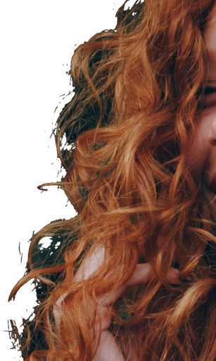
Personally, I see that the Smart Radius is doing any good when I need to select hair.
Let me show you why. Here’s an image of the hair. I am going to roughly select the hair. One time I’ll turn on Smart Radius and another time I won’t.
Scenario 1: Smart Radius is turned on
Scenario 2: Smart Radius is turned off
Note: In both images, I have not done any kind of refinement with the Refine Edge brush.
You can clearly see that the Smart Radius keeps more hair. I can further refine the selection with the Refine Edge brush.
Places where you see Smart Radius
The only place where you can find (as far as I remember) Smart Radius is Select and Mask. You can find Smart Radius in the Refine Edge in older versions of Photoshop.
I know that pain of not having the correct icon to complete a design. I have been there and I know that you search a lot just to find the right icon for your designs. You get frustrated sometimes. This is why I have compiled 14 websites from where you can download premium icons. Bookmark this page and make sure that you come back tomorrow to check the sites. Here are the 14 best websites for premium icons.
Some of the websites on the list are popular and provides you more things like photos, PSD, and vectors. I guess that’s a positive point.
List of Websites for Premium Icons
Here’s the list
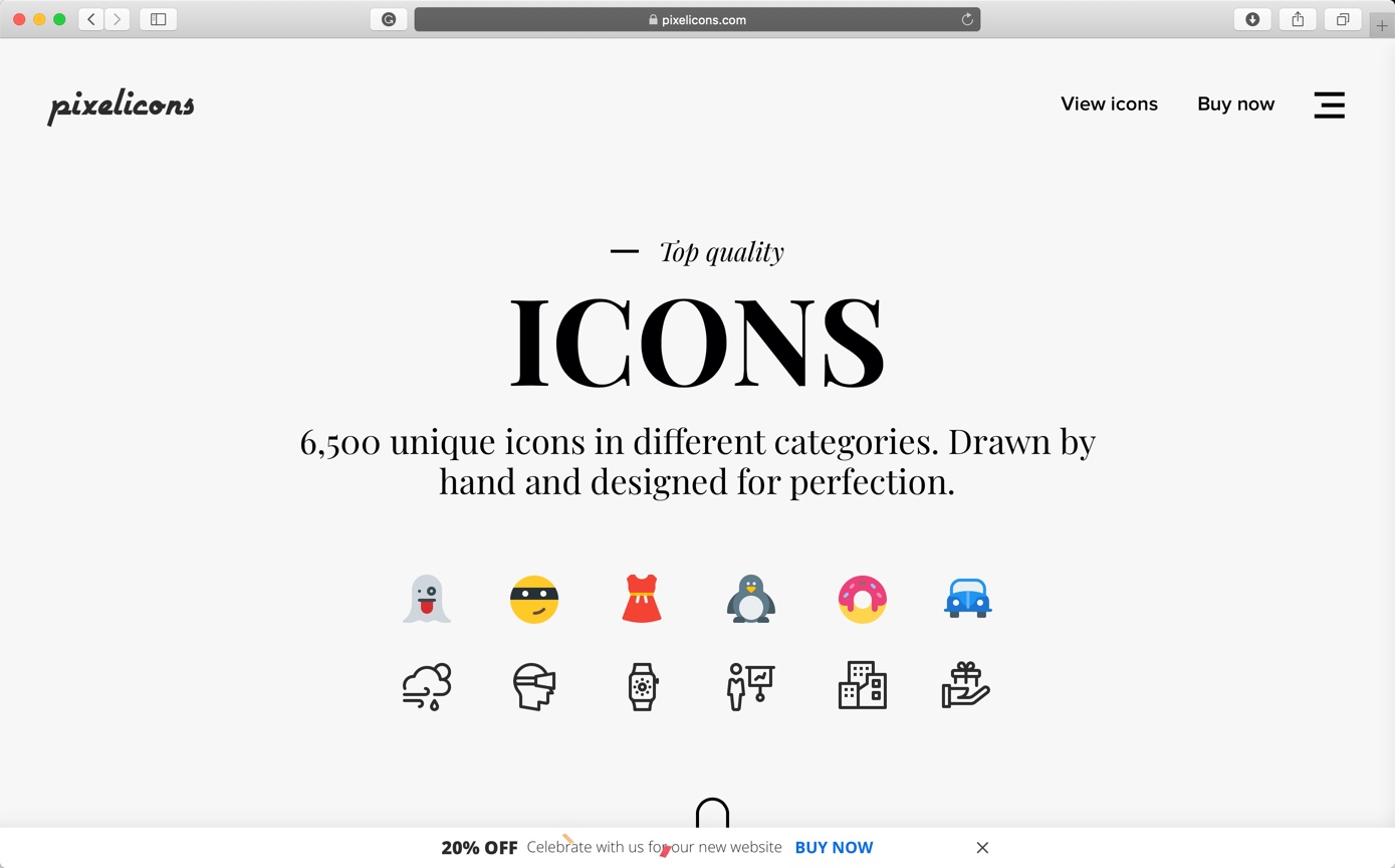
1. Creative Market
Creative Market is the world’s marketplace for design. Bring your creative projects to life with ready-to-use design assets from independent creators around the world.
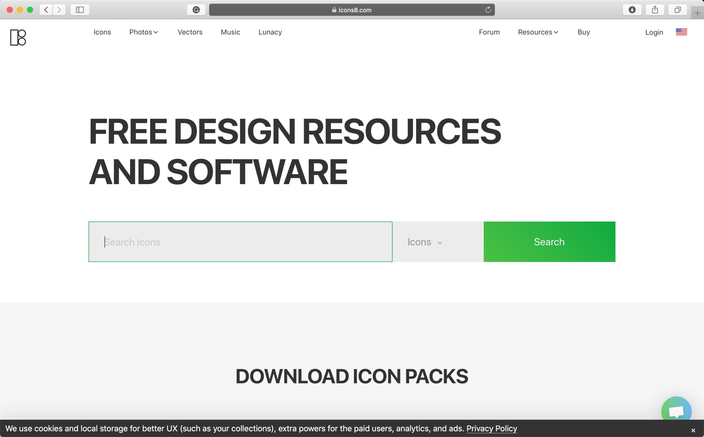
Iconscout building the next-generation Design Resource Marketplace and Design Assets Management tools to simplified collaboration between designers, engineers, product managers, and teams across the organization. They have more than 800,000 icons on their site.
Price: starts from $6 per pack. Free icons are also available.
Iconfinder provides high-quality icons to millions of creative professionals. They are a small international team based in the lovely city of Copenhagen, with some of them working remotely.
Price: starts from $9 per pack. Free icons are also available.
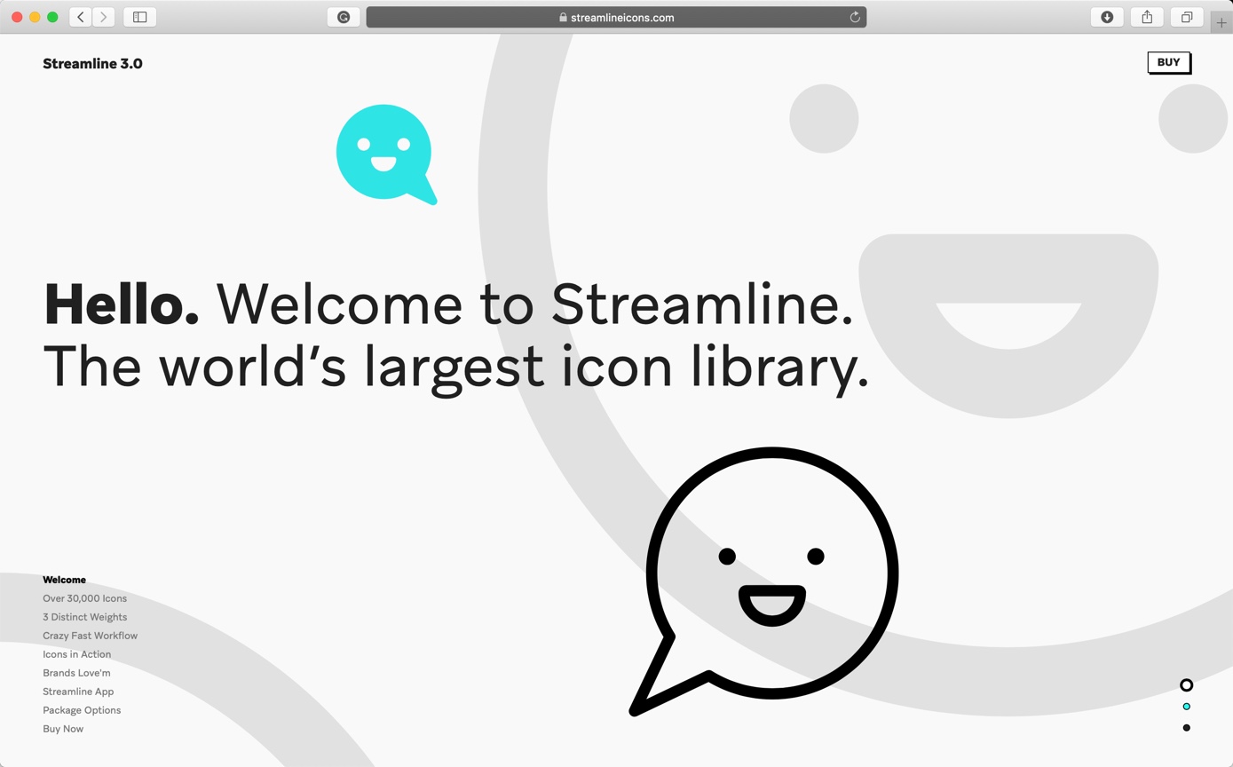
The project started late 2014 when it was rare to find an icon pack containing more than 500 icons. Their aim was to create a library of icons where any user, no matter what one is looking for, can find the icon one needs. They started by publishing the Flat Round Icons pack which contained 1000 icons and was a great success.
Price: starts from $35 per pack. Free icons are also available.
Flaticon is the largest search engine of free icons in the world. But they also provide premium icons. Flaticon offers users, high-quality graphic designs: totally editable vectors carefully selected by our design team in order to provide our users with great content that can be used in both personal and commercial projects.
Price: starts from €9.99 per month. Free icons are also available.
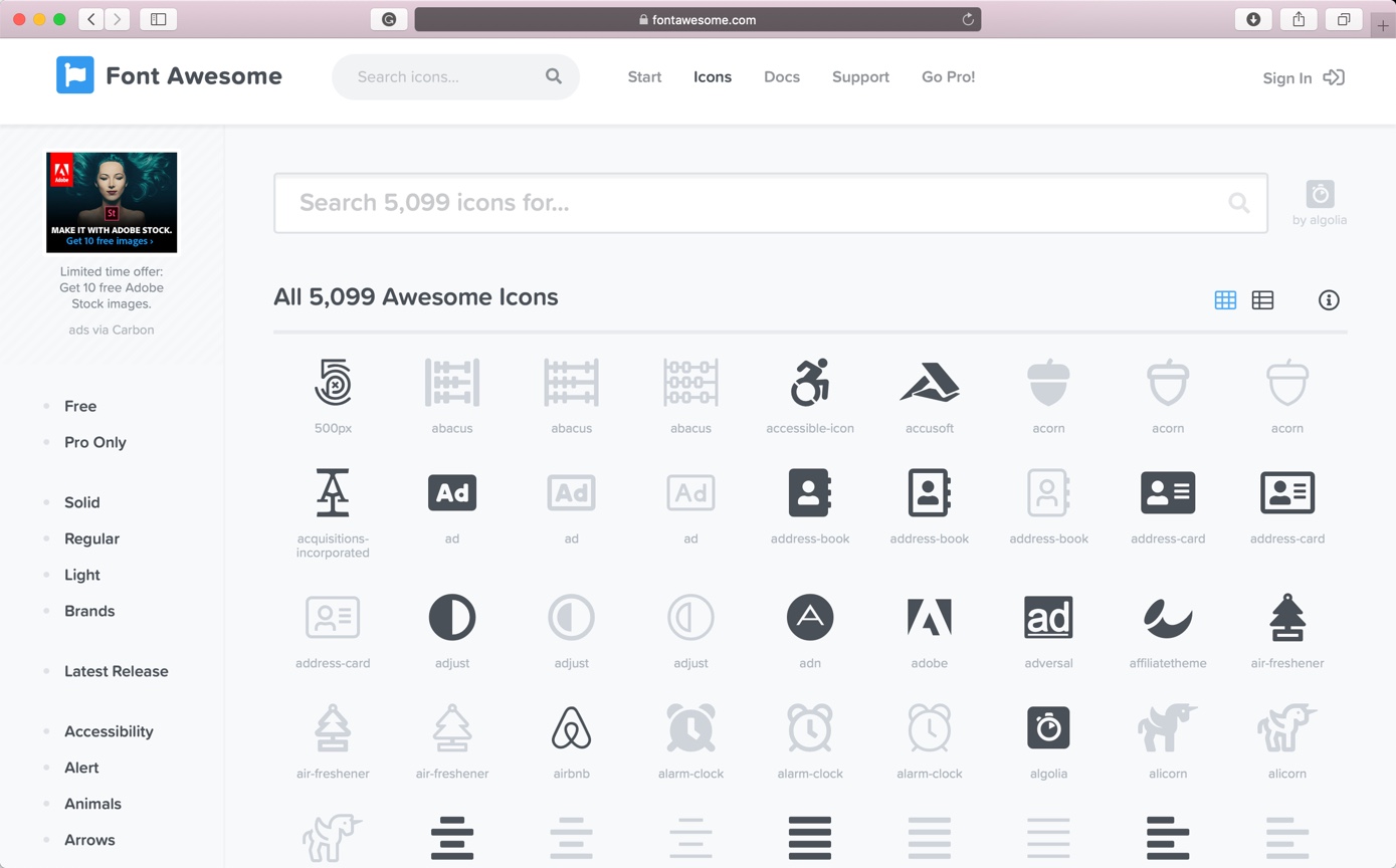
Font Awesome is a font and icon toolkit based on CSS and LESS. It was made by Dave Gandy for use with Twitter Bootstrap, and later was incorporated into the BootstrapCDN.
Price: starts from $60 per year. Free icons are also available.
Lossy vs lossless compression is one of the most searched phrases among photographers and web designers. Choosing one over another can save your hard drive space, make your site faster or even degrade the quality of your photo.
I am asked so many times the differences between lossy and lossless compression, and which one is better. So, I thought that I should write one article on it so that I can give this link to all the people who ask me the differences between lossy and lossless compression.
1. What is lossy compression?
Lossy compression reduces the size of the file by removing some of the details and colors.
Some similar type of data is grouped or averaged out and make the resulting file smaller. For example, there are 10 pixels side by side in a photo and they all have similar but slightly different shades of blue. Lossy compression would average out that blue color and the result would be somewhere around 1 shade of blue.
The changes are normally not visible to the human eyes for a low compression value because human eyes are more sensitive to the brightness rather than colors. So, unless the brightness is altered, you will be having a hard time to find out if the images are compressed because lossy compression does not alter the brightness of the photo.
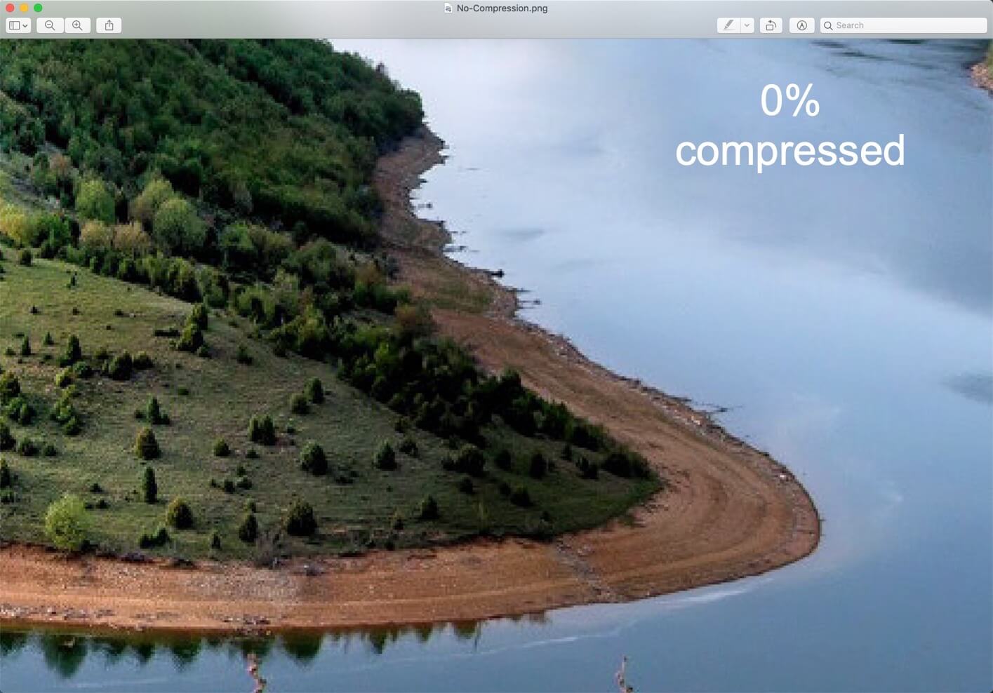
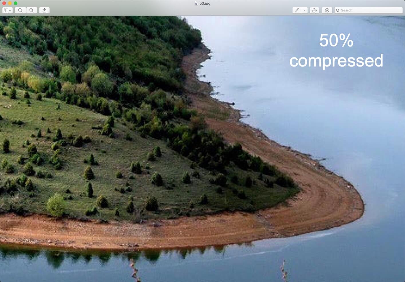
1.1 Example of lossy compression
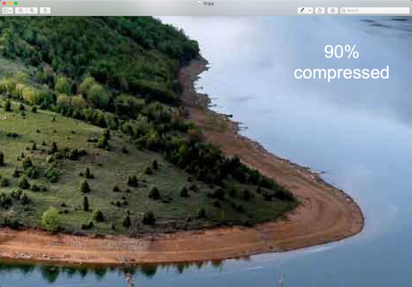
Here’s a screenshot of lossy compression. The images are 300% zoomed in. You can clearly see the difference in quality.
1.2 How to decide the compression value in lossy compression?
The amount of details and colors that we can remove from a photo depends on the compression value. When you use any tool like Photoshop or online websites to compress an image, you’ll see a slider where you can decide the value of the compression. Higher the value of compression, smaller the file size and lessen the details and colors.
Examples of lossy files – JPG/JPEG, audio and video files.
1.3 Each time you save a lossy file, some amount of details is lost
Yes, you read it right. Suppose you have printed photo and you took a photo of it from your iPhone. Now, the photo you’ll see on your iPhone will not have 100% of the details that are present in the printed photo. Already, some details are lost.
Now, you took a photo of the same photo on your iPhone from your Android phone. Now, this Android phone’s photo will have even lesser details.
The same thing happens when you edit a lossy file like JPG. When you edit it for the first time and save it, some of the details are lost but that’s OK. When you can again edit it and save it, more details are lost. So, basically, every time you edit and save a file, some details are lost.
1.4 How to avoid lossy compression?
The only way to avoid lossy compression is to use lossless file types like PNG, TIFF, and PSDs. If you know that you need to keep every single of details and colors, save the photo in PNG or TIFF format. The file size will be larger, but you get to keep the details.
1.5 Who should and should not use lossy compression?
Should use when:
If you’re going to send the image to someone and he’s not going to print it
For emails so that the receiver can see the image in lesser time.
For webpages (but up to a certain amount; don’t overdo it) so that it decreases the page load time. You should also make sure that your images’ dimensions are complying with the width of your site. For example, there’s no point in adding a 1600 pixels wide image to a site which is 960 pixels wide because the image will be realigned to 960 pixels.
Shouldn’t use when:
You need to re-edit the image because the quality decreases each time you save it
You need to print the photo
You’re a photographer
1.6 Google also encourages lossy images for websites.
Do you use Google PageSpeed Insights? If so, you’re probably familiar with the warning that says to “Optimize Images.” Back in 2017, Google updated their documentation and recommend using lossy compression as a way to further speed up your site.
2. Lossless compression
Lossless compression does not remove the details in the file, so your file size does not reduce.
A typical example of lossless compression is text files, spreadsheets, etc. You definitely don’t want your financial data from the spreadsheet to be edited out.
Example of lossless files PNG, TIFF, PSD, RAW files, and so on.
2.1 Who should and should not use lossless compression?
Should use when:
You need to re-edit the image because the quality decreases each time you save it
You need to print the photo
Should not use when:
If you’re going to send the image to someone and he’s not going to print it
For emails so that the receiver can see the image in lesser time.
For webpages (but up to a certain amount; don’t overdo it) so that it decreases the page load time. You should also make sure that your images’ dimensions are complying with the width of your site. For example, there’s no point in adding a 1600 pixels wide image to a site which is 960 pixels wide because the image will be realigned to 960 pixels.
3. Lossy vs Lossless (Tabular comparison)
Lossy filetypes
Lossless filetypes
Reduces the size of the file by removing some of the details and colors.
Does not reduce details and colors.
Takes less space in your hard drive
Takes more space in your hard drive
Should use when you need the photo just to show like for emails and websites
Should use when you need to re-edit the photo multiple times or you need to print the photo
Example: JPG, audio files, video files, and many more
For every craft, there is a different set of tools, each serving their own purpose. Some of these tools could look alike, some serve similar purposes, but there are often essential differences which make each of those tools the best option for a single operation.
In graphic design, the difference between Adobe Photoshop and Illustrator alludes most common user, but those who truly desire to become the masters of the craft should be acquainted with fundamental differences between these two pieces of software. In order to make things clearer, we decided to create this article, which is going to show the main differences between Photoshop and Illustrator.
1. File types
Photoshop uses raster files, as opposed to Illustrator which is manipulating vectors. A raster file is any graphic created by closely arranged blocks of various colors. Another word for raster file is a bitmap, which many people have heard of before. The trouble with raster graphics is that you can zoom in only so much until the image begins to look all squared and losses its original crisp and sharpness.
Vectors, unlike pixels, allow the computer to render images much smoothly. The reason why vector graphics are much easier to scale is that they are constructed via a series of mathematical formulas, instead of colored blocks. Therefore, if you would try to enlarge or make an image smaller, the quality would stay the same.
Raster file types include:
JPEG
PNG
GIF
MPEG4
Vector files include:
SVG
EPS
PDF
2. Use
When it comes to Adobe Photoshop, it’s the best choice you could have for manipulation of already created images. Although changing the scale of the object is not the best thing to do with Photoshop, there are many other features like changing background, adding various other objects, etc. In addition, Photoshop is widely used for web graphics, since these types of projects usually stay the same size.
Illustrator, as we already said, uses vectors – a line connected via two dots through a computer algorithm. This characteristic allows enhanced scaling feature which makes Illustrator the weapon of choice for any graphic designer who wants to design logos or any printable graphics.
Imagine having a client who wishes to print an assignment masters logo on T-shirts and business cards. Instead of creating different graphics for each of these purposes, you can simply use Illustrator to create a single design and then scale it in accordance with the project requirements.
3. Different features
Now let’s take a look at some of the more detailed differences between these two software solutions.
Photoshop zooms up to 300 percent but only to display a messy pixelated image. Illustrator shows a crispy sharp image at 900 percent zoom.
Photoshop provides a single canvas, while Illustrator gives you the chance to design in multiple Artboards. This is another reason why Illustrator is a more optimal choice for web designers, as multiple Artboards allow you to work on multiple design options for various devices or screens.
With Illustrator, layers can contain multiple objects, while Photoshop provides you with a single object per layer. This makes Illustrator a better solution for complex graphics which would require adjusting and editing later.
Both Photoshop and Illustrator can create amazing 3D images, however, Illustrator is a more potent solution due to its vector-based nature.
4. Conclusion
As we can see, the difference between Adobe Photoshop and Illustrator is not in regards which one is better or more useful. What separates these two pieces of Adobe Creative Cloud is their purpose. While Photoshop is an excellent choice for image manipulation and simple web graphics like buttons, Illustrator is a tool you would use for logos and printable media.
This article is provided by Cathy Baylis. She is a freelance content writer specializing in leadership, career development and education. She loves sharing her interests with readers, and she has something to say, for sure. Writing is not only her hobby but the profession at the same time.
Instagram is growing day by day and so are the number of Instagram filters. I see that Instagram regularly adds new filters in its app. LoFi is still one of the most popular filters in Instagram, but there are other filters also that people use. Today we’re going to see how to create Instagram Charmes filter in Photoshop.
Chames filter gives a retro look to the photo which basically means desaturating the image, adding a yellow tint, and adding some noise. We’re going to do the same thing in Photoshop. But, we’re going to do it in a better way.
And yes, don’t forget to download the action.
Download the Instagram Charmes Filter Photoshop action – click here to download the action. It will scroll you down to the bottom of the page.
Before we go ahead, let me show you the before and after image.
Before
After
Video
If you like watching a video, here’s the video for you.
Step 1: Reduce the colors
The very first thing that you and I are going to do is to reduce the colors. This is the first step to give a retro look to an image.
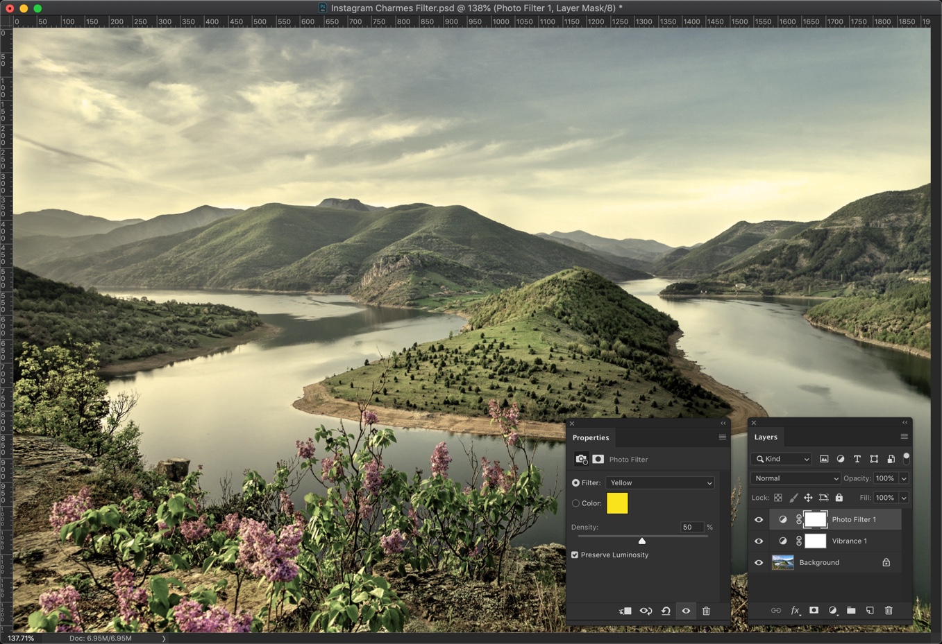
Go to Layer > New Adjustment Layer > Vibrance. Reduce the saturation to -55.
If your layer panel is not opned then press F7 to open or you can go to Window > Layers.
Step 2: Give Yellow tint
The second step in giving a retro look is to give a yellow tint. This is a very important step in creating Instagram Charmes filter in Photoshop.
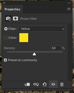
Go to Layer > New Adjustment Layer > Photo Filter. Change the Filter to Yellow and increase the denisty to 50%. Make sure that Preserve Luminosity is turned on otherwise your photo will get dark.
This will give a good looking yellow tint to your photo.
Step 3: Decrease the Contrast
The next step in creating Instagram Charmes filter in Photoshop is to reduce the contrast.
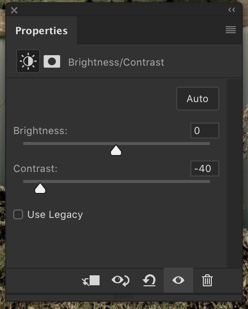
Go to Layer > New Adjustment Layer > Brightness/Contrast. Reduce the contrast to -41.
This will reduce the harsh contrast in your image.
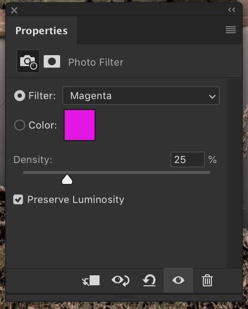
Step 4: Give Magenta Tint
The next step is to give magenta tint.
Go to Filter > New Adjustment Layer > Photo Filter. Change the filter to Magenta and increase the desity to 25%. Make sure that Preserve Luminosity is turned on otherwise your photo will get dark.
This will add a magenta tint to your image.
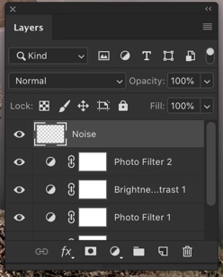
Step 5: Complete Creating Instagram Charmes Filter in Photoshop by Adding Noise.
The last thing that we need to do it to add noise.
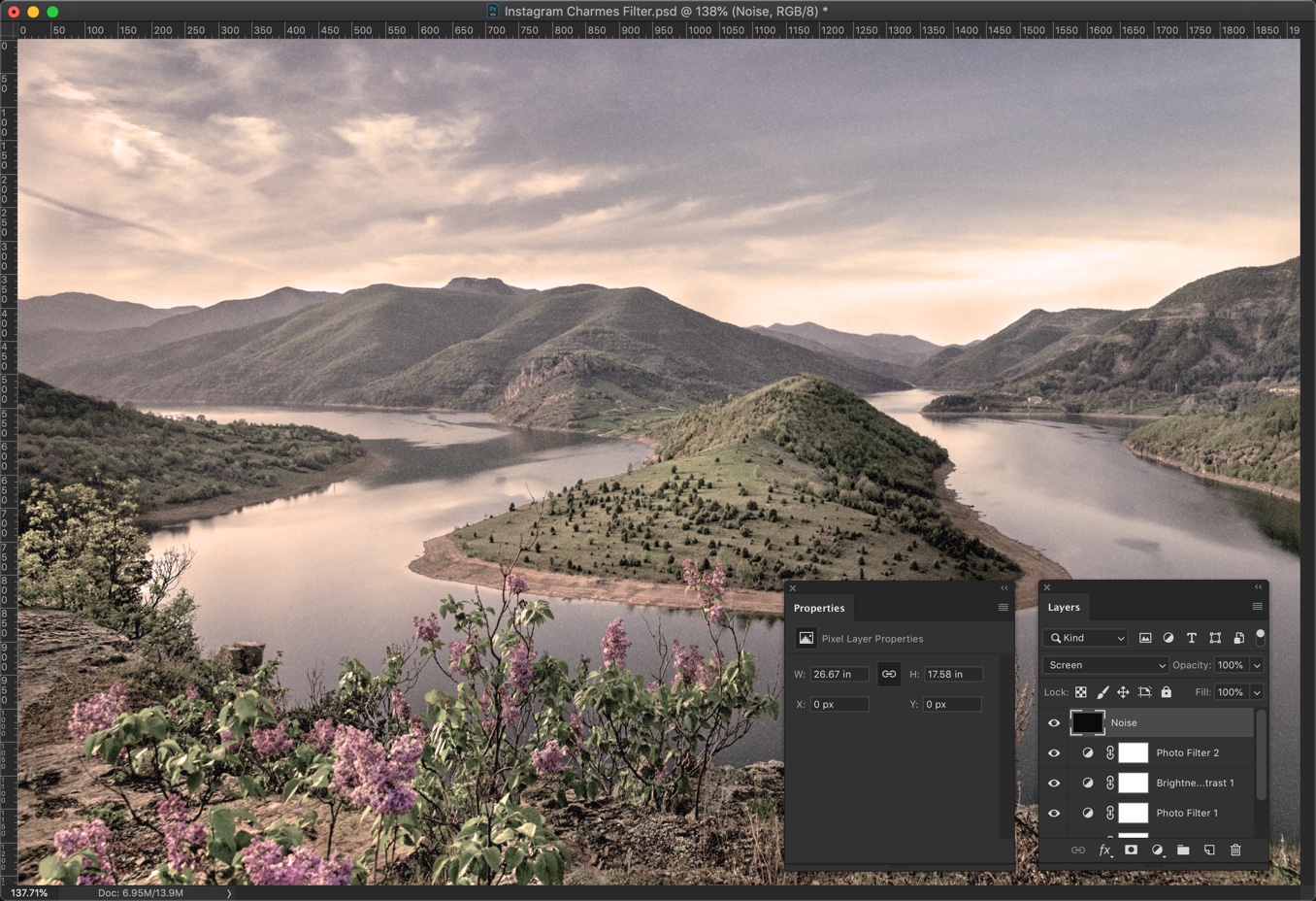
Create a new layer by pressing Cmd + Shift + N / Ctrl + Shift + N or go to Layer > New > Layer. Name that layer Noise.
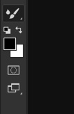
Change the foreground to black. You can also press D to make black as your foreground color.
Press Opt + Delete / Alt + Backspace to fill the newly created layer with the foreground color which is black.
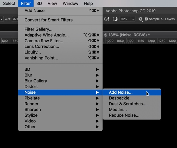
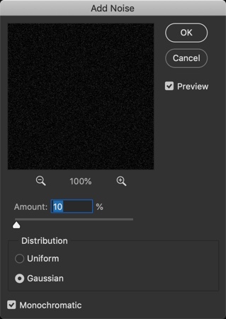
Go to Filter > Noise > Add Noise.
Change the Distribution to Gaussian and turn on Monochromatic.
The Amount depends on how big your image is. My image is 1920 by 1080 pixels and I am going to choose 10%. If your image is lesser in dimension, choose a lower value and if your image is larger in dimension then choose a bigger value.
For example, if your image is 3600 pixels wide then you may want to go with 20%.
Screen blend mode looks at each channel’s color information and multiplies the inverse of the blend and base colors. The resulting color is always a lighter color. Screening with black leaves the color unchanged. Screening with white produces white. The effect is similar to projecting multiple photographic slides on top of each other.
This is all, guys.
Here’s The Photoshop Action For Instagram Charmes Filter
If you’re interested in the Photoshop action for the Instagram Charmes filter, download it from the below link.
Photoshop is one of Adobe’s most appreciated and popular software solutions, suitable for a broad range of digital art creation and editing purposes. Its influence on the history of photography is immense, and since its invention, Photoshop has affected the way we perceive and process photographs significantly.
In February of 2019, Photoshop turned 31. Taking a look back to understand its journey so far, what can be said about its impact on photographers and their work today? Here are the 10 most essential ways in which Photoshop has changed and shaped the history of photography as we know it.
1. Ease of operation
The term “photoshopped” has become so widely spread, that it’s basically considered synonymous to the term “processed” in terms of photo editing and manipulation. And yet, photo manipulation processes were popular and explored long before Photoshop was even an idea.
However, to make even the simplest changes to your photographs, you once needed a whole set of skills, specific physical tools, and immense patience. With the arrival of digital photography and PS, altering photos became a lot quicker, easier, and cheaper to do, as photographers no longer had to make entire rooms the dedicated spaces where they would review and develop films.
2. Perception of human history
With the rising popularity of Photoshop, we became familiar with the fact that photographs can be easily altered to match reality, although not showing it. Therefore, it’s no surprise that Paperwritingpro.com specialists emphasize that Photoshop created a massive shift in the way we see current events, causing us to question our knowledge of history as well.
3. Perception of “ideal” human appearance
Hollywood stars and fashion models are real people, too. However, their (often heavily) altered faces, skin, and curves on magazine covers led us to believe that beauty equals perfection. Beauty became an unrealistic goal, and although we can’t blame Photoshop for such turn of events, this is one of the not so favorable effects of its frequent uses.
4. Highlighting the beauty of nature
There are so many exquisite places on the Earth’s surface. Thanks to Photoshop, the results of capturing stunning landscapes and rich, fantastic wildlife can be tweaked to enhance the beauty of the versatile, heavenly nature of our beautiful planet.
5. Advertising game-changer
The visual appeal of the ads created today is often a result of advanced Photoshop usage. From adding, removing, and relocating parts of photographs, graphics, and text, whatever your ad needs to shine, Photoshop can do it for you.
6. Tool for personal expression
Photographs are not merely documentation of the world that surrounds us. They are also a way an artist expresses their own, individual perception of life. With Photoshop, this vision can be changed to fit a photographer’s specific sensibility and a message they want to send through their work.
7. Imperfections are no longer final
Not all photographing conditions are ideal. Luckily, the lack of good light or a bad hair day your model is having don’t have to mean your photographs are to be thrown away for good. With a few tweaks in Photoshop, photographers can now fix issues they weren’t able to address at the time when they were taking the shots in the first place.
8. Reviving the past
Retouching old, often damaged and unclear pictures is a long, demanding process. Photoshop, however, offered a lot more control over this procedure and made it significantly simpler than it used to be in the past.
9. Creating comical and fantastical scenes
Adding, altering, and removing elements from photographs can be done with the goal of creating funny or imaginative results. The arrival of Photoshop made these processes easier, and their results mind-blowingly realistic.
Conclusion
The wide variety of options Photoshop offers designers, illustrators, and photographers around the world is what made it the tool of choice for so many creatives. When it comes to photography adjustment and manipulation, however, the significance of Photoshop is both practical and historical. Its development and use have changed the way we see the world and helped edit and adapt millions of different photographs around the globe. Yet, the most crucial influence PS has had on photography is this: It opened our minds for more and enabled the introduction of fresh perspectives and new artistic expressions.
There’s an old saying that a picture is worth a thousand words. Photoshop could then be observed as a proofreading tool that enhances the way we express our ideas through images. From private family photo albums to promotional content on social networks, people use Photoshop to improve the visual appeal and value of their photos. In this article, we will have a look at some of the most popular ways to use Photoshop, today.
1. Adding content through layers
Among the variety of tools that Photoshop has to offer, layers are perhaps one of the simplest and easiest to use, but at the same time, provide a high level of efficiency and flexibility. Layers allow you to add new content that’s autonomous in terms of editing so any changes you make won’t affect the objects outside the active layer. For the e-commerce industry, layers allow you to add a price tag to a certain image which you can change any time the price changes without editing the entire image. Simply, make the price tag as a separate layer and change it when needed.
2. Filters
Instead of manually enhancing your photos, you can use filters to make your work more interesting or improve any potential issues. Filters can help us sharpen up some blurred content but they can also stylize the photos and make them look more cartoonish or provide a 3D effect. In short, filters can make the images look more exciting, thus attract more attention.
3. Removing objects
Imaging going out to the beach with your friends and capturing a perfect selfie only to see that it was photobombed by someone or something you don’t want to share with the rest of the world. Photoshop allows people to remove these unwanted guests from their photos with ease. Simply select an object and cut it, and your troubles are gone. To cover up your tracks it’s a smart practice to use the patch tool and nobody will notice the changes you made to the background of your photo.
4. Fixing blemishes
We all want to look as beautiful as we can in our photos. One of the most popular uses for Photoshop includes removing any imperfections that might show up on our skin. There are many tools one could use in order to remove acne or blemishes. The list includes patch tool, healing brush, or spot healing brush-for minor fixes. Each tool does essentially the same thing, the use differs on the size of the area you wish to treat.
5. Create gifs
Another popular use of Photoshop includes producing GIFs that you can later upload online or share with your friends any way you like. Photoshop allows the production of GIFs in more than one way. You could add a series of images that would represent frames. You can decide how long each image will last, to make your content appear just the way you want it. Alternatively, you could import a video and choose which frames you wish to include in your gif.
6. Add textual content
Memes are a popular means of expression, nowadays. People use it for satiric, political, humanitarian, and many other purposes. Photoshop allows people to add text easily and just the way they want it in terms of font, color, size, and position. Furthermore, the combination of image and textual content has powerful marketing potential. Business owners combine graphic designers and online services like ProEssayWriting that create compelling textual content for flyers or other types of marketing materials.
Conclusion
Now that you know which are some of the most popular ways to use Photoshop you can try to learn as much as you can about each one. Who knows, perhaps this article becomes a spark that will bring light to your professional career.
This article is provided by Becky Holton. She is a journalist and blogger. She is interested in education technologies and is always ready to support informative speaking. Follow her on Twitter.
Your portfolio is a complete overview of your work as a graphic designer. Whether you are completing an internship, looking for a better job, or a freelancer seeking clients, it is your graphic design portfolio which plays a vital role to stand out behind your potential employers and clients.
No matter where your career is lying, a cool graphic design portfolio can help you crack the projects and win clients for you. It showcases your work, builds confidence, tells your story, and open doors to opportunities. Here are the pro tips to create wonderful graphic design portfolio to attract clients.
1. Decide the purpose
First of all, you should have a clear purpose to create a portfolio. Focus on the effort you would like to do more and present relevant projects for a job. Lay out your skills and strengths to polish your resume so employers can decide whether you are right for their organization.
If you are seeking clients as a freelancer, present your success stories and focus on how you have helped clients to achieve their milestones. Also, include a few testimonials. If you are just building your brand, you can easily present your own works and experiments you have done before.
2. Present your best work
After all, you may want to present your best work and keep it simple to create an attractive graphic designer portfolio. Keep your best designs ahead and be sure the portfolio doesn’t exceed 20 projects. You should select 10 projects at least. Review your final selection to ensure it represents your profession well. The key is the first project you showcase in the portfolio. It would be seen by many people and referenced in client meetings or interviews.
3. Explain how versatile you are
When it comes to picking the strongest projects, you should ensure presenting most of your work. When deciding between ranges of work vs. quality, prefer quality. Keep in mind that you are as good as poor quality work. Be sure to curate only the best things you have done. Steer clear of poor work in your portfolio, even though it is for a leading brand. Even for a smaller client, outstanding work does the job well. Clients moderator your talent, not your clients. However, it is not wrong to have big brands in your portfolio. But you should prefer quality.
4. Launch a portfolio website
Now putting your work on free platforms is not enough to serve the purpose to create your portfolio, i.e. to stand out and make an impression. These free platforms can save your workload to just another link amongst several others with the same experience. So, you should emerge as someone who is professional and serious to your work. Create your own portfolio website, build your brand and control how your work will be viewed. Invest in a portfolio site and have your own domain name. It will pay off in the long run.
5. Choose the best platform
There is no lack of website builders which make it easy to create and manage your own portfolio. This way, WordPress is the best way to go. You actually don’t need programming skills. You can pick one of the hosted builders to build any business and website. Choose a platform that can help you build the right portfolio and have a lot of options in terms of videos, images, and gallery layouts.
6. Add in your personality
Tell your story in your ‘About Me’ section. This is where you can talk about what you like, your inspirations, and your personal info and how you started off. Your ‘About Me’ page should tell the visitor about what kind of person you are. Clients usually hire the one they like better when it comes to deciding between two different people with the same experience and skills. So, you need to win that choice.
7. Add a resume
Create a page that is dedicated to your resume which tells about your experience, education, clients, and projects. So, you should make it chronological with latest events which are coming ahead. Your resume should be all about your qualifications and work. So, be genuine and add the right details. Don’t add avoidable or irrelevant information. Add the links to your resume that one can download if you are looking for a job.
8. Add your contact details
So you have created an attractive portfolio, have visitors on your site and you have done everything? If you don’t have contact information, it would be difficult for your potential employers, clients, or collaborators to get in touch with you? So, make your contact info visible on your site. Every lead you get from your site might be the big one. Be sure your phone number or email address is active.
9. Create a responsive portfolio
More than half of the browsing takes place on mobile devices. So, your portfolio site should be optimized well and responsive to mobile devices to display your work well on mobile devices. Your website should be loading faster on all devices.
10. Add blog section
On a blog section on your site, you can tell what you are up to and share your experiences behind the scenes of your life as a designer. Write about the projects going on and experiments that you gain when you are free. Stand out with your personality and let others know about you.
11. Get reviews from others
Be sure to get objective feedback from the people before you launch your portfolio site. Your people will find the gaps, flaws, and chances to improve that you might miss or ignore. They can give you constructive feedback and help you recheck your site from a new perspective.
12. Keep your portfolio up-to-date
You need to review and refresh your portfolio from time to time. It is a consistent and constant process. The review must not be all about getting a new project. Be brave to delete the old work that you feel is no longer relevant. Don’t end up with an outdated portfolio. Keep updating it by adding new works. It will keep your portfolio looking fresh as always.
This is the age of selfies. Almost every second, people are clicking selfies. No wonder “a picture is definitely worth a 1000 words” today. Images have taken social media by storm. Writers today enhance theirs in the form of visual content. Thus, images are a great way of expression in every sect of marketing. Apart from this, no segment is behind. From politics to cinema, from banking to media; images are commonplace. The demand for image editing is also on the rise. Thus, the demand for a great image-editing program like Photoshop is pretty evident.
Photoshop is the industry’s standard image editing and manipulation software program. With growing popularity, its name is now almost a verb! It is a common phraseology now that people say they have “photoshopped” an image!
1. Photoshop Brushes
Photoshop has many tools for editing the color of digital images. Photoshop Brush tool is one of them. It works like any drawing tool, where user colors the picture using brush strokes. It is simple and very useful in many ways. Photoshop brushes help to perform great photo editing tasks. Photoshop Brush tool is the most basic one. You can use it to draw lines & shapes in any color over a layer in your image document using brush strokes.
2. What Makes the Photoshop Brushes Useful?
You can use Photoshop brushes for textures & patterns to lighting. Using the Photoshop Brush tool is very easy. This tool is also very useful. This makes it a very good option for experts. Beginners can also use Photoshop. Photoshop brushes can help you add more depth to your image projects.
3. How to Install Photoshop Brushes?
Installing actions in Photoshop are easy. The process to install Photoshop brushes is also very easy. Follow the below given simple steps to install Photoshop brushes:
First, if you do not have any Photoshop brushes, go to the Creative Market.
Get a set from the vast selection available over the Creative Market.
After that, download the zip file containing Photoshop brushes
Then, extract the contents of the zip file.
This would reveal a new folder having some other files.
You will see that one of these files is a .ABR brush file.
Either drag this file straight into your Adobe Photoshop window.
Or else, go to Edit > Presets > Preset Manager.
From the dropdown menu, select Brushes.
Then, use the “Load” button to add the brushes.
Once you load the brushes into the software, hit the ‘B’ button to select the Photoshop brush tool
After that, use the drop-down menu in the top toolbar.
Choose from the different brushes available in the dropdown menu.
4. How to Use Photoshop Brushes?
Once you select a brush, it is easy to start drawing. Follow the steps given below to use Photoshop brushes:
After selecting the brush which you wish to use, you need to start clicking now.
You can use the single click of the left mouse button for one single placement of that brush stroke
Or else, you can follow these below steps:
Hold the left mouse button down.
Then drag the cursor around your screen.
This will help you create some other effects.
Sometimes, you find the brush size to be very big, or you face some other issue. So, you can use the settings in the top toolbar to control the following:
Control the brush size
Control the brush mode
Control the brush opacity
Control the brush flow
Advanced Photoshop Brush Controls
There are other advanced settings also available. Use these advanced settings of the Photoshop brush tool for advanced editing needs. Do so by opening the brush panel there on the right-hand side of the Photoshop program.
This tutorial is submitted by Mary Jones. She is the co-founder & editor-in-chief at TopMyGrades which focuses on Content Marketing Strategy for clients from the Education industry in the US, Canada & UK. Mary has conducted a series of webinars for AssignmentEssayHelp. She has extensive content editing experience and has worked with MSNBC, NewsCred & Scripted. She has also authored blogs on Lifehack.org, Wn.com, Medium.com, Minds.com and many more digital publications.
When people hire me to edit their photos, removing people in Photoshop is one of the most common requests. Almost, every second out of ten requests is to remove a person in a photo. The person could be a stranger in a vacation photo, someone’s ex, or any unwanted person. So, I decided that I should write the best tutorial on how to remove people in Photoshop.
Let’s begin. I want to tell you in advance that this is going to be a long tutorial because I will be showing you four ways to remove people in Photoshop.
1: What is Photoshop?
It quick Google search shows that Photoshop alters digital images. Be it
changing the brightness
removing the people
removing the background
adding people
removing fat
replacing the sky
or even designing a website
Photoshop can do it.
Photoshop software is owned by Adobe (NASDAQ: ADBE).
2: Why should you remove a person in Photoshop?
You’ve shot a great photo but some unwanted people in the background ruined the photo. Damn!
A child is meeting his daddy and two strangers are there in the photo. Damn! Why anyone would not want to remove them?
3: Video of all of the methods
I have created a video where I removed people using all methods that I am going to talk about in this tutorial.
4: Remove People Using Spot Healing Brush tool
Complexity: Easy-peasy
Time required: <1 minute to remove one person with in easy background
When it comes down to remove people in Photoshop, Spot Healing brush tool does a decent job as long as the background is nice and simple.
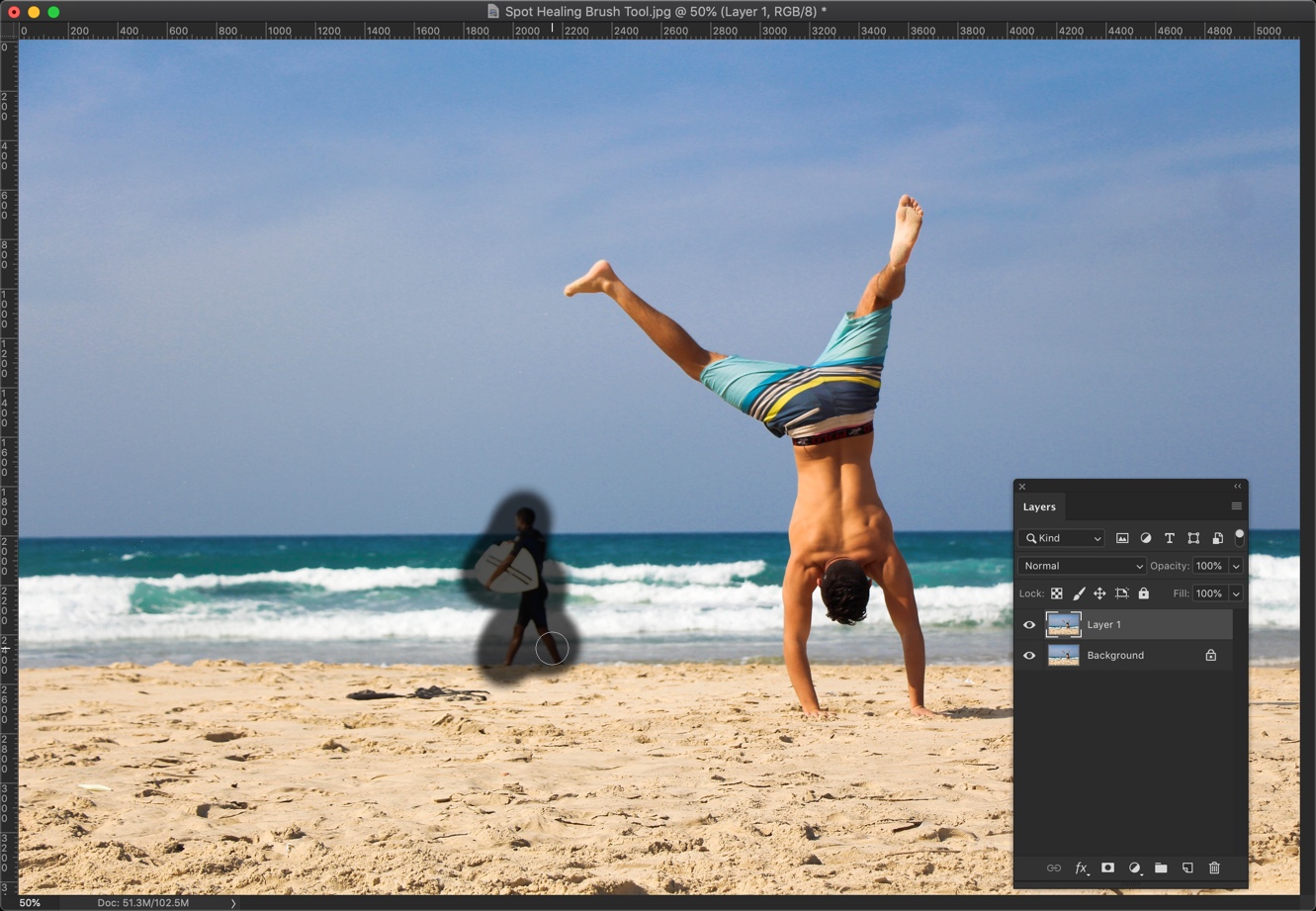
Let’s say I want to remove the person in the background that I highlighted with the Yellow color in Fig. 2.
I’ll show you how to remove the person now.
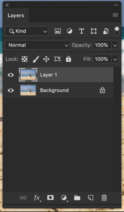
Step 1: Duplicate the layer
We want our editing to be non-destructive which means that we’re going to edit our image is such a way that our original photo should not be impacted. This helps when one messes up and want to go back to the original image.
Open the Layer panel by going to Window > Layer or press F7. Press Cmd + J/Ctrl + J to duplicate the background layer.
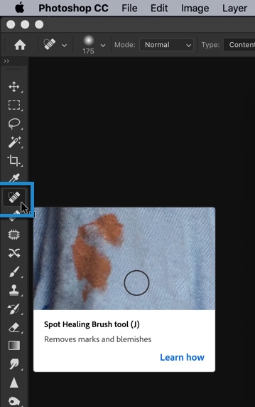
Step 2: Remove the person using Spot Healing Brush tool in Photoshop
Grab the Spot Healing Brush tool from the tool panel or press Shift + J again and again until it activates.
Brush on the person who you want to remove.
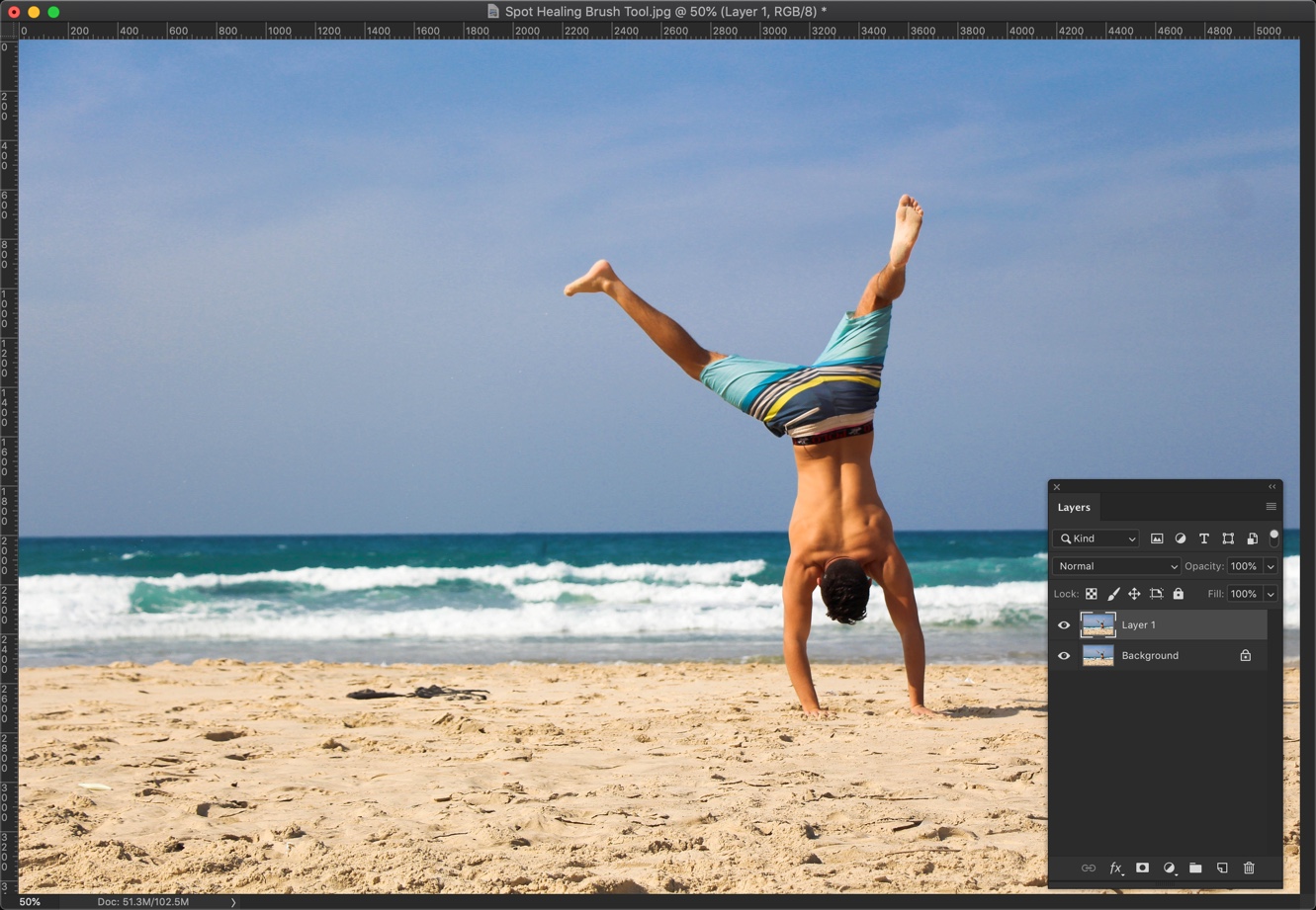
Here you go. Tell me where is that guy?
Here’s the GIF for you.
Fig. 7
If you think that the Spot Healing Brush tool did not remove the person entirely then you can brush on the unwanted person as many times as you want to completely remove him.
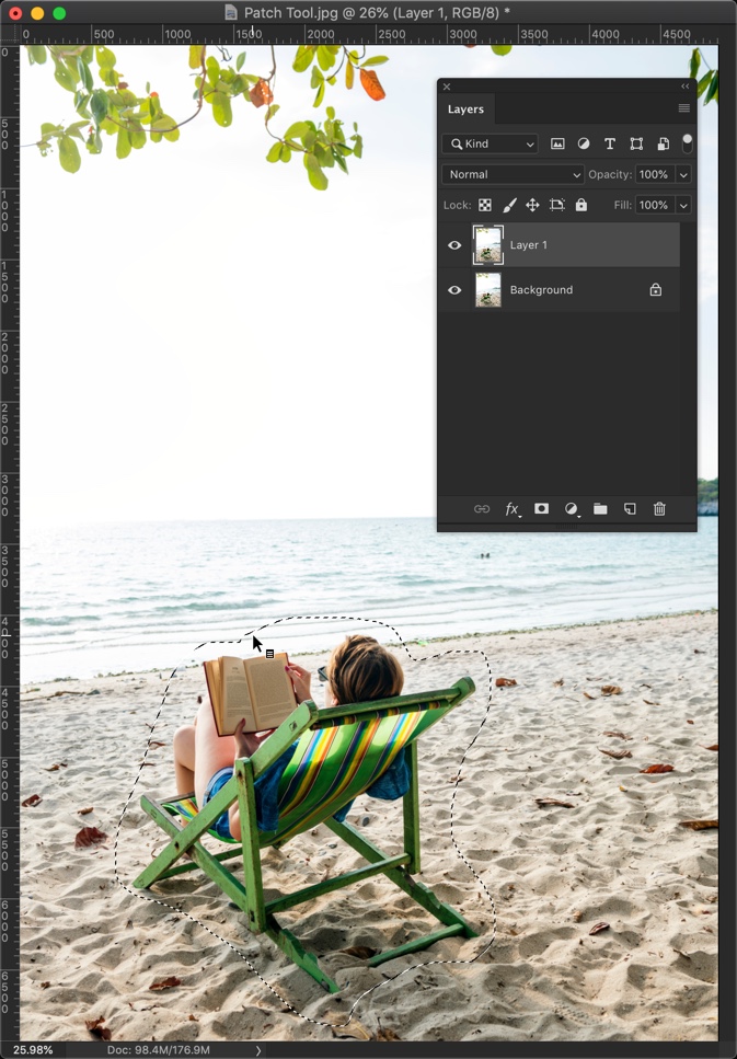
5: Remove People Using the Patch tool
Complexity: Easy-peasy
Time required: <1 minute to remove one person in an easy background
The next tool that you can use to remove people is the Patch tool. Removing people using this tool is also easy-peasy.
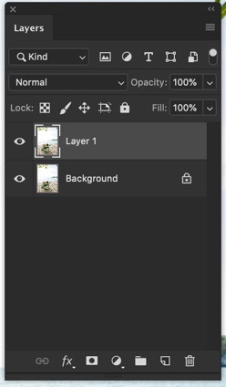
Step 1: Duplicate the layer
Duplicate the layer by pressing Cmd + J / Ctrl + J. PressShift + J again and again until it comes.
Step 2: Remove the person using the Patch tool in Photoshop
Draw a rough selection across the person you want to remove.
Now, drag the selection to the area which you want to fill in the person’s place. Here, I am going to drag the selection to the area which I want to use to fill the person’s area.
Below is the photo after my first attempt.
If doing it the first time didn’t give you the perfect result, do it multiple times. Here’s the final photo.
Here’s the GIF for you.
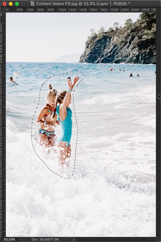
6: Remove People Using Content-Aware Fill tool
Complexity: Medium
Time required: 1-2 minutes to remove one person with an easy background
The next tool that you can use to remove people is the Content Aware Fill tool. Removing people using this tool is also easy to medium. This tool is added in Photoshop CC 2019 which was launched in the last quarter of 2018. You can skip this method if you don’t have Photoshop CC 2019.
Step 1: Duplicate the layer
Duplicate the layer by pressing Cmd + J / Ctrl + J.
Step 2: Remove the person using the Content Aware Fill tool in Photoshop
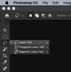
Grab the Lasso tool or press Shift + L again and again until it comes.
Roughly select the person you want to remove.
Go to Edit > Content Aware Fill. Make the settings like the ones shown in the below screenshot. The green color on the left-hand side shows the area that Photoshop will use to artificially create the background. Right side shows how the image would look like. Press OK.
Do this multiple times to remove all the unwanted people. Here’s the GIF for you.
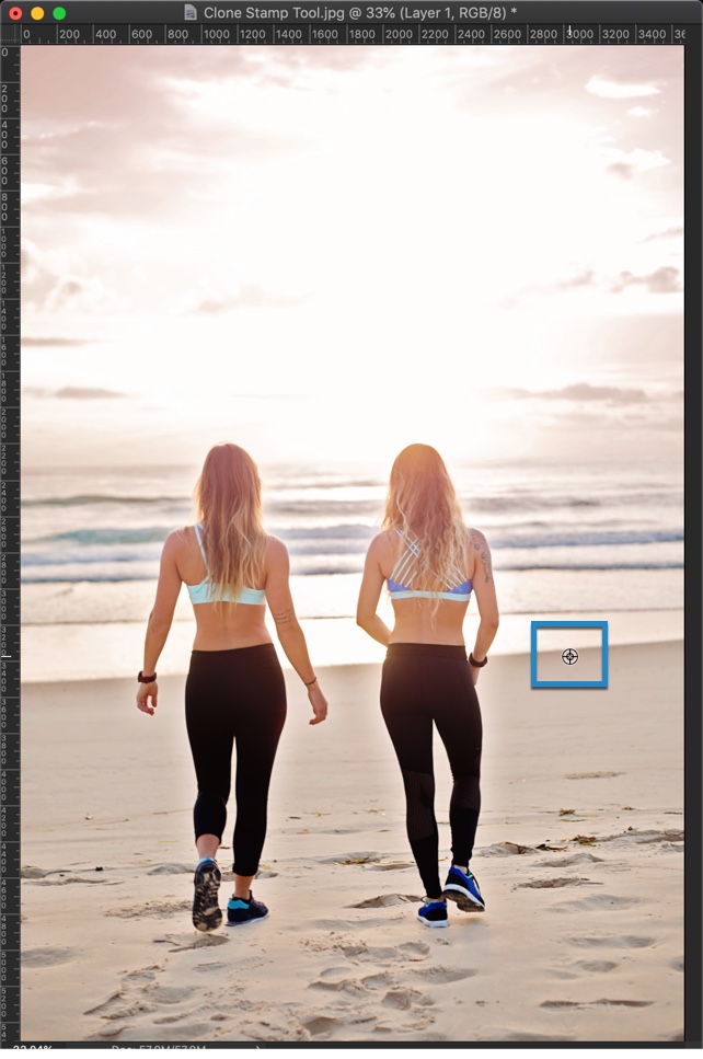
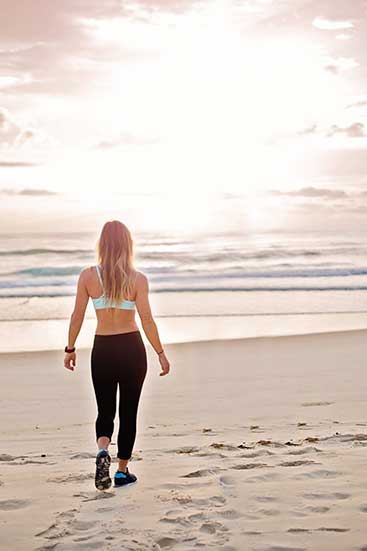
7: Remove People Using Clone Stamp tool
Complexity: Hard
Time required: 4-5 minutes to remove one person with a cluttered background
Time to use some advance tool to remove people in Photoshop. Many professionals and I use this tool to remove people in Photoshop. We’re going to use the Clone Stamp tool. This tool basically clones the pixels from area to the other.
Step 1: Create a new layer
Create a new layer by going to Layer > New > Layer or press Cmd + Shift + N / Ctrl +Shift + N.
Step 2: Remove the person using the Clone Stamp tool in Photoshop
Grab the Clone Stamp tool from the tool panel or press Shift + S again and again until it comes.
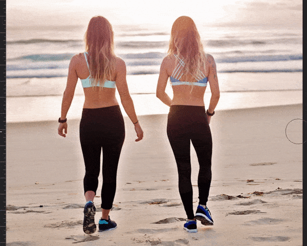
Now, we need to remove the two girls. We know that there are sea and sand in the background. We’re going to clone that sea and sand on the girls.
The Clone Stamp tool has two cursors. One is the target and another is the source. The Source shows from where the pixels are being cloned from and the target shows the area on which pixels are being cloned.
Hold down Opt / Alt to choose the target. I am going to select the sea first. As soon as you hold down the Opt / Alt key, the cursor will change. Check the below screenshot. This is how your cursor would look like.
Now, start brushing on the girl.
Change the source multiple times.
Here’s one GIF for you. Sorry that I had to increase the speed to 3 times to make the GIF shorter. Otherwise, GIF would have been of 22 MB.