You took a photo and the skin looks pale or washed out. You like the background and pose but hate the skin color. Do you know that you can fix the skin tone in Photoshop in less than a minute? Let’s see how to change skin tone color in Photoshop.
In this tutorial, I’ll be using the Color Range and blend mode to change skin tone color in Photoshop. It’ll be a short tutorial.
Brief Steps
We’ll select the skin ton using the Color Range command
We’ll fill the selected area with skin color.
We’ll use Layer Mask for some fine-tuning
Final
Initial
Step 1 – Select the skin
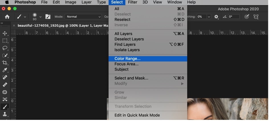
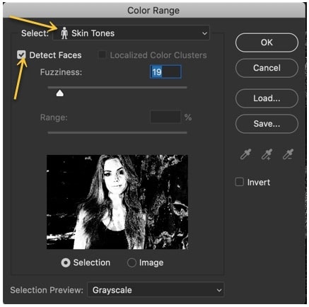
If you’re using Photoshop CS6 or newer versions, selecting a skin tone is fairly easy. We can easily do it using the Color Range command in Photoshop.
Go to Select > Color Range.
Now, choose “Skin Tones” and turn on “Detect Faces”.
Drag the Fuzziness slider to the left or right to make the selection better. You can see the selection in the preview section below in the same window. White color shows that the area that’s going to be selected and black shows the areas which are not going to be.
Press OK.
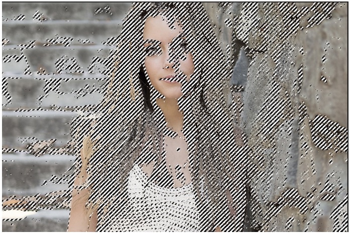
This is my selection. I know that it looks a bit weird.
Step 2: Change the skin tone in Photoshop
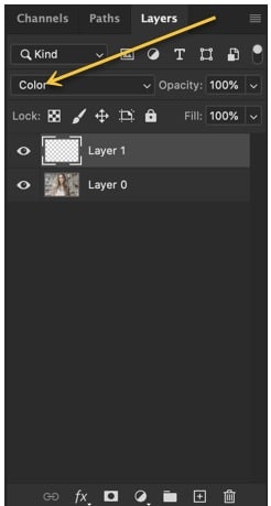
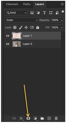
Open the layer panel by going to Window > Layers or by pressing F7.
Create a new layer by pressing Cmd + Shift + N / Ctrl + Shift + N. Change the blend mode to color.
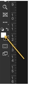
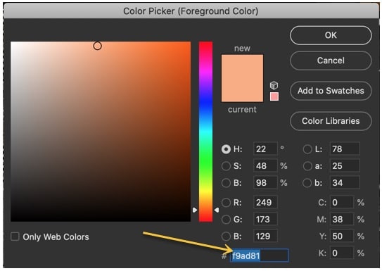
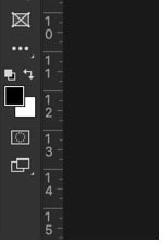
Click on the foreground color.
Choose nice skin color. I am choosing #f9ad81. Put this value in the HEX code. Press OK.
Now, this skin color is your foreground color.
Fill the selection with the foreground color by pressing Opt + Delete / Alt + Backspace. Press Cmd + D / Ctrl + D to deselect.
Here’s the photo.
Step 3 – Finetune the photo
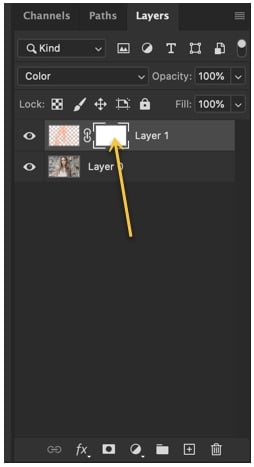
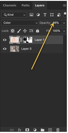
We’ll remove the area where unwanted skin tone color is filled using the Layer Mask. Click on the layer mask in the layer panel.
This will add a layer mask next to the layer which has the skin tone color.
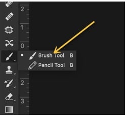
Grab the Brush Tool from the tool panel or press Shift + B again and again until it activates.
Make the foreground color black.
Now start brushing on the area from where you want to remove the skin tone color.
Now, reduce the opacity of the skin tone layer to somewhere between 50-70%.
In today’s era, most of the business is running digitally. There is a need for proper promotion through social media sites in order to reach people’s sight. The need for social media cannot be denied even if you are not doing an online business. For example, if you are going to run a boutique or a restaurant, still social media can help you in attracting most of the customers within minimum time.
A large number of populations are associated with social media worldwide so your product can get an identity to a larger area than before. People use free logo design maker to get the instant logo for their business to make it specific and unique. The website is incomplete without a logo. To make it complete and running successfully, you will need a logo.
What does a logo mean?
A logo is an identity mark of any business, product or brand by which it is known in the market. Every business has its own specific logo. The logo can be comprised of the symbol, figure, numbers, and characters with colors. The logo must be made in accordance with the product and its possible uses. The free logo design maker takes proper care while making the logo. For example, if you are going to sell a product for children, then it must be adorable and colorful rather than elegant that will suit the older people’s class.
It is not necessary that a logo must be colorful and full of different objects; it can be kept as simple as possible. The basic purpose of the logo is to hit the eyes of the viewer so that he or she feels compelled to check the whole website. If the logo is not appealing, then the viewer does not feel to open the website and check what is inside. The logo is like the cherry on the cake that is a must to do a thing.
Why need a logo?
The logo is like an identity card. There are hundreds of websites regarding the same niche, but everyone is different, and this can be identified by the specific logo. If you search for the “bubble shooter” game on the play store, you will find a large number of games with this name but different logos. It makes it really easy to find your desired one from the large list in no time.
The free logo design maker designs a logo in accordance with your instructions and preferences. With the help of a logo and slogan, you can promote your product nationally and internationally. If the logo is unique and interesting at first sight, then there are chances of a large number of viewers on your website that is really good in your favor.
Digital logo maker tools:
Are you searching for the free logo design maker which can help you in making free logo design online? Then you are at the right spot. There is a number of apps or tools for logo design online that provide this facility like tailor brands, Prepostseo logo makers, brand crow. Small SEO tools provide the best free logo maker. The best free logo maker is the one that fulfils the requirement; provide the speedy outcome of great quality all the time for free.
There are a large number of tools for making a logo; every tool has its own pros and cons. Take the wise decision by selecting and Download the Design Logos app with the maximum benefits. The logos help in making your product a brand that is tremendous in gathering the attraction of the brand conscious people. In today’s world, people are running towards brands, so why not take this point in your favor by making your company a brand with the right logo and right promotional strategy at the right time.
Benefits of the digital logo maker:
The digital logo makers have a large number of benefits for which these are preferred to use for logo making. Following are a few amazing advantages that make its use necessary:
Free to use – the best part about digital logo design makers is that these are 100 % free to use for everyone.
Business identity – the logo makers assist in getting the most appropriate and suitable logo with respect to the targeted audience, product, preferences.
Gather customer traffic – the logo made by the best free logo design makers are unique and trendy to appeal to the customers at once.
Easily accessible – the online logo maker tools are accessible 24/7 for everyone.
Creative logos design – the online logo maker tools also provide assistance in getting the most creative and unique designs. The human vision can get stuck after some time. To get out of these limited designs, the digital logo designer tools are best. These tools have hundreds or thousands of templates from various products and events that you can choose.
Least effort – the logo making from free logo design makers is far more convenient than the manual logo making. You have to put minimal or no effort in getting your desired and unique logo.
Preference over manual logo making – the annual logo making takes a lot of time and effort that’s why digital logo makers are appreciable. Along with these benefits, the logos by such tools also maintain the uniqueness.
No need to hire professionals – if you hire professionals for designing your company’s logo, then it will cost a high amount, but such digital tools are totally free to use.
Small SEO tools logo maker:
The small SEO tools website is a well-known website that provides amazing tools for achieving search engine optimization. Every website tries its best to achieve this optimization for getting a high rank, and this leads to the high number of viewers on your website. It is not only the content of the website that needs to be unique and high quality, but the logo also must be unique. For this, the free logo design maker of small SEO tools is suitable.
It provides to create the Best free logo maker which they are trendy, attractive and competitive enough as the game of competition is running everywhere; the master is the one who wins the competition. The interface of small SEO tools is user-friendly so every user can use it easily and conveniently. The person with less knowledge about computers and its operations can use this tool easily. After making a logo, you can save it for an instant; there is no need to follow large steps in getting it on your device. Following are a few amazing features:
Free to use
Multiple attempts can be made
Free to download the logo (few tools charge for downloading)
No hidden charges
No template is restricted for the free version
Premium version has lots of more stuff to enjoy
Steps of digital logo making for free:
Get internet access. It is the first and foremost step to follow as all the digital free logo design tools require internet access to operate. Then you need to register yourself on sallseotools.com that is totally free and just a requirement. Then move towards selecting a template in accordance with your niche. There are several categories ad in each category contains a large bundle of templates with the mesmerizing ideas. After selecting the template, you need to edit that.
In the editing, you can modify the color scheme, size, font, and design layout. Now move forward to alter the background details if required. Hundred plus options for the background are available on a small SEO tools website. You can preview these to check the best suitable one. Still, if you do not get satisfied with these backgrounds, you can go for your own background. The addition or subtraction of the layout is possible, too. The order of the steps can also be altered as per the requirement.
Role of colors in the logo:
The importance of the color scheme cannot be denied at all. The colors have special vibes for different people that express specific feelings. The loo of the wrong color will not be able to attract the maximum of the customers that can affect your sales. You cannot just take a risk on your business with this little mistake. It is suggested to use the free logo design maker online as it is competent and quick.
The pink and blue color is associated with the girls and boys, respectively. The restaurants prefer red, yellow or orange colors as these colors have the ability to arouse the hunger hormones. When people see logos of such colors, they will feel appetite and buy food. The colors have energies to stimulate positive or negative vibes; that’s why color scheme selection is quite an important task to do while making a logo. If you don’t care about it, then it can lead to a negative consequence.
In a nutshell:
If we get the conclusion over the above-mentioned article, we will get that the free logo design makers are best in getting the most attractive and appealing logo with minimal effort and time. The steps are quite easy to operate such digital logo maker tools that anyone can use these.
Choosing a font for your brand is part of building a brand identity. This is why, you need to know everything that is required to know about fonts, and how you should choose them.
You have to pick a brand font not just for business cards, but for logo design, and brand messaging as well.
The perfect font that brands pick, should be unique, legible, and flexible and must communicate brand personality to customers.
This article is going to talk about the factors that you need to consider to choose a font for your brand. As well as it explains the key points to keep in mind before choosing any font.
Brand Personality
Every brand has a personality, and that is something that customers relate to. When deciding the brand color scheme or logo design, a company should remember that these things matter in defining brand personality. To define a brand’s personality, think of adjectives that are relevant to your brand.
For example, your brand is exclusive, flexible, friendly or bold. These adjectives should reflect in the font you choose for your brand. If you choose a popular font, then that might give your brand an elegant and bold personality.
Understanding Fonts
Fonts are not just something you change on Microsoft Word, to make a document look better. They are much more than that, and to understand each font and what message it conveys, you need to learn about typography.
There are six basic classifications of fonts, from which you can choose; serif, sans-serif, slab serif, handwritten and decorative.
Times New Roman, a font commonly used by people, is Serif. Roboto and Open Sans are classified as Sans Serif and are a modern, minimal and clean font.
Why You Should Choose the Most Popular Fonts?
There are many brands around the world and each brand logo contains a font within it. Every brand has a different font used within its logo’s but there are few fonts that have been used by thousands of brands around the globe and few of them are very popular.
First of all, we would talk about a Slab Serif, it is bold, quirky, and confident; Courier New is a Slab Serif font. The script is another classification, which is elegant and unites, and slightly italic. As for handwritten font, it is mostly used for informal and artistic purposes. The last one is decorative; it is a stylized, distinctive and dramatic font, like Fredericks.
Arial is a sans-serif typeface and is used in many computer fonts. There are so many fonts, which belong to the Arial font family. They are used in popular operating systems like Microsoft Windows, Apple Mac, and PostScript computer printers.
This typeface was designed by Robin Nicholas in 1982; he designed it alongside with Patricia Saunders for Monotype Typography. This font was created after the creators were inspired by Helvetica.
The character widths of this font are identical, and it has many styles like italic, medium, medium italic, and bold italic. You will find the Arial font free almost everywhere, as it became a free font when Windows 3.1 was released. The reason why this font is so famous is that it is very easy to understand and looks professional.
When you look around, you will see many brands and airlines using Arial fonts, on advertisement boards. Gerry Webber is a German clothing company, and it uses Arial font as its logo.
There is a Thai cuisine in Amsterdam, called Kinnaree, which uses an Arial black font. They use the font for their window signs, as well as for the menu.
Kaldi Koffie is a Dutch coffee shop, and it has been using Arial font consistently for its logo, text, and branding. Even transportation vans use Arial typeface on the back and side of the vans.
Similarly, when UPS sends packages to customers, they use Arial font on their stickers. The tracking information and even the barcode are printed in Arial. In Holland, when people go to fill government forms, they have to use DigiD. At the top of the letter, DigiDuses Arial font, which means the government, wants to create a brand identity for them.
Basic Requirements
There are three basic requirements that brands have to meet when it comes to fonts.
Budget and Licensing
When a brand finally finds the font that it wants, it needs to think about how it will source its font. There are some libraries that offer free and open source font; Google Fonts, Font Squirrel and Font Library are such fonts.
If you want to know more about fonts, you can look at Venngage editor. This editor will tell you the fonts that brands can use. Even though these free libraries are convenient, they still offer limited fonts, like bold and italic fonts.
If brands want to get paid licensed fonts, then they can get them from Adobe Fonts, linotype, and Fonts.com. There are so many options, which brands can access when they visit these websites. Even though you have to pay an individual fee and license fee, you can still get the font of your choice. Moreover, if you want to use separate fonts for a mobile app, mobile website, and print materials, then you need to pay for three font licenses.
Flexibility of Fonts
The font you choose should be flexible because they are going to be around for a long time. Some brands change their fonts, but after many years, when they want to give their brand a new look. You need to make sure that you have the proper license for the fonts you choose, so you don’t have to suffer from embarrassment later.
You don’t only have to pick a font for your brand, but for blogs, packaging design, and external presentations. Before picking a font, make sure that you test it and see how it looks at different things.
Font Weights
The brand fonts have different weights, like light regular, semibold and even bold. Such font weights are very important for building a text hierarchy, which defines a brand’s style guide. A brand will require different font weights for header, subheadings, body, and quotes. To get a better idea of how font weights are used, it is best to read different articles and take help from them.
Legible Fonts
When picking fonts, you need to make sure that the brand fonts are legible. They should be easy to understand and must be styled in a way that every reader is able to understand it, even from a distance. The brand fonts that you use for body paragraphs, have to be more legible as compared to the headers.
Fonts to Avoid
Don’t use fonts that would remind people of their English essays, or the ones that they have to squint their eyes to understand. For example, there are digitally printed shirts available in the market, which have confusing fonts and people have to squint their eyes to understand them. If a customer is not able to read the font, then what identity is the brand setting?
Similarly, a brand should not use Times New Roman for their logo, because that is too bookish. Unless someone is advertising a book club, Times New Roman is not acceptable.
Mistakes to Avoid While Choosing a Font?
The first mistake that brands make, when they are picking a font, is that they don’t realize their own brand identity.
For example, if a brand is known for its bookish appeal, and it uses a very decorative font, then what message are they sending to the customer? Similarly, if a brand is chic and it uses Sans Serif font, then it won’t work well for the brand.
Brands have to test out their font before they put it on their website, business card, articles and logo. They can get the opinion of different customers about how they feel when they see a certain font. This can help them decide better which font they want to choose, and the one that would be more appropriate.
Sticking to A Single Font is Ideal!
Brands should limit the total number of fonts that they can use. This is because too many fonts can confuse the customer. When brands use fonts, then the customer becomes familiar with those fonts and associates them with the brand.
A customer becoming familiar with fonts is known as brand positioning. A font can be used for brand positioning and can be very helpful in establishing a brand image.
If you use multiple fonts, or three fonts in together, but they are similar then that won’t work well with the brand. Even if you want to create visual diversity, you should never use more than 3 fonts or ones that are similar in nature.
Moreover, you should use an ideal combination of font and the background of a brand. You will have to choose a color scheme for your font, so contrast it with the background of your brand.
Conclusions
Don’t use too many bright colors; if the background is bright, make sure that the font adjusts with it well. It is best to test different fonts using computer applications, so that when the printing is done and the final font is chosen, then a brand doesn’t have to suffer. Choose the right font for your brand, so that you can create a mass appeal for your customers.
iOS 13 and iPadOS have made photo editing easy for one and all. But as users of this premium brand, most of us are not aware of the nuances of photo editing.
There is a step-by-step process to edit photos in the best possible way. This article will walk you through the same. But before that, let’s understand some of the basics.
Using the In-built Photos App
Just as Android comes with Google Photos, iOS has its flagship Photos app. Many of us are guilty of not understanding the different functions and features of this app. Even though companies involved in iPhone app development have come up with other apps, the default app is still good.
It’s now possible to easily view and sort the photos and videos by days, months, and years. You’ll find that the photos are displayed as thumbnails and the important ones are larger than the rest.
The For You section shows photos related to special events and memories. You can also search for your favorite pictures using keywords.
We’ll discuss these features in more detail.
Viewing Your Photos and Videos
Viewing the photos properly is important before editing them. Viewing doesn’t mean just tapping on the photo. There’s more to it.
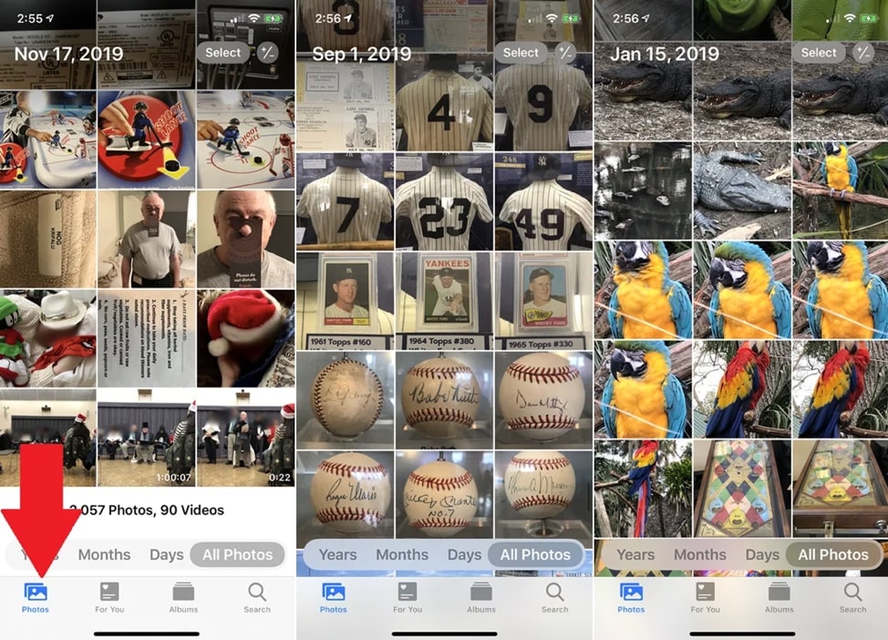
Tap the icon of Photos located on the bottom toolbar. Instead of sorting your photos by date, the app displays everything like thumbnails one row after another. You can swipe up and down the photos. The date is shown at the top and it changes based on the photos being displayed.
Adjusting thumbnail size
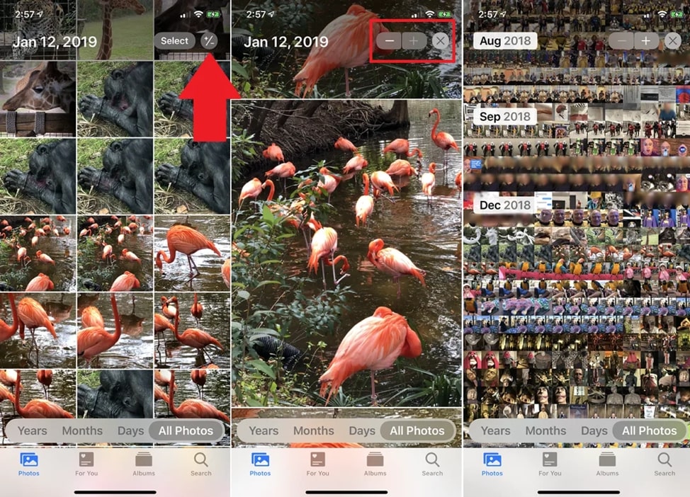
This is done by tapping the plus (+) or minus (-) symbol in the upper right. You can zoom in on your photos by tapping the plus sign whereas the minus sign will zoom out the image. Tap the X next to these symbols when the view is set the way you’d like.
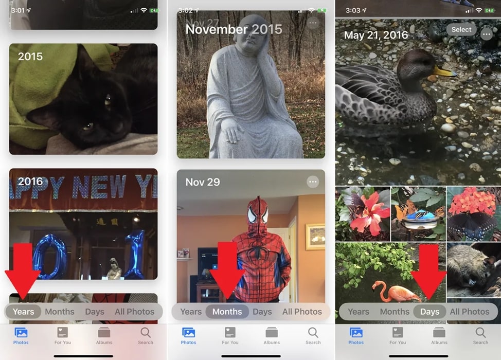
Sort Photos by Date
Tap the Years option at the bottom and swipe to switch between different years; follow the same thing for the Months and Days options. In the Days view, you will observe a large thumbnail for certain photos and smaller for others. This is done by the app automatically.
Select Photos and Videos
Selecting particular photos and videos is possible in the Days View or All Photos View. Click on the Select icon at the top and tap on each entry you want to select. You can also click on Select All in Days View to select all the photos for a given day.
Here is an alternate way to select photos and videos:
Tap the Select icon.
Drag your finger across the thumbnails you want to select.
Tap the Delete icon to remove them or the Share icon to share them via email, messaging, or another app.
View For You Page
We live in a world of personalization. The For You feature personalizes everything for you. Tap on the For You icon at the bottom navigation bar to see the featured photos and photographic memories. Tap Play after selecting a specific memory to see an automated slideshow of all the photos for that memory. This slideshow is complemented by music.
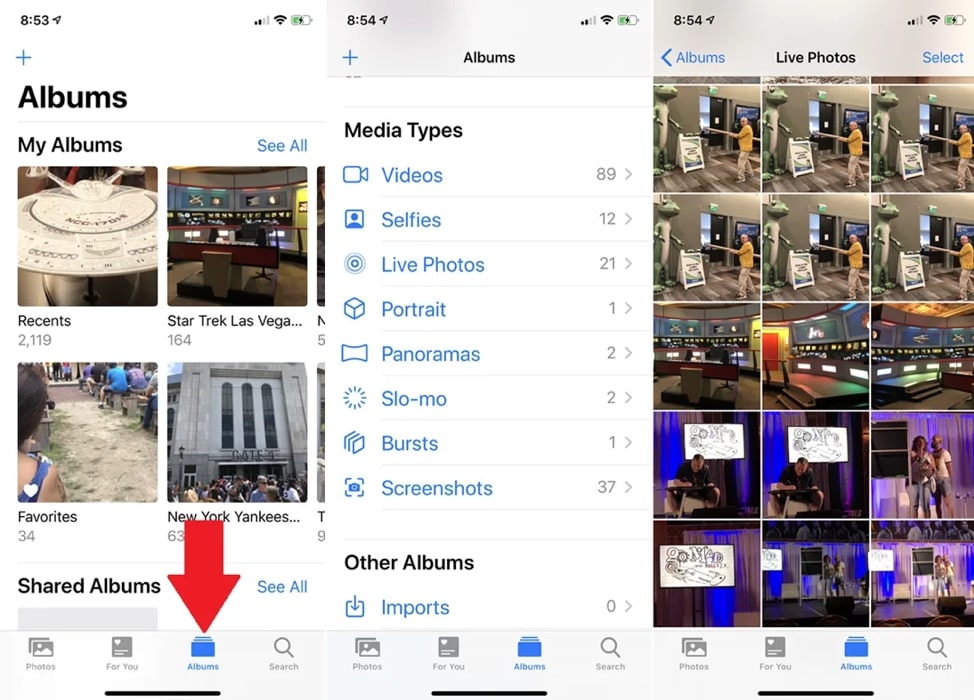
View Albums Page
This option present in the bottom navigation bar lets you see the albums of media you have created. After scrolling down the screen, you get to view different media categories such as photos in Portrait Mode, videos using Slo-mo, and much more.
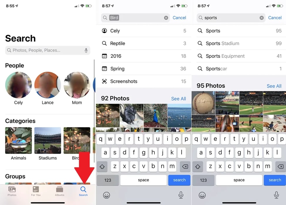
Searching for Photos and Videos
With this option, you can view photos based on specific people, categories, and groups. Tap the Search icon on the bottom navigation bar. Type a name or phrase in the search field to find relevant photos.
These were the basics of the Photos app available on iOS 13 and iPad. Now, it’s time to learn how to edit photos like a pro.
Hone Your Photos Editing Skills in an iPhone
Get started by tapping on Edit in the upper right. The Adjustment option will be selected by default. Clicking the Auto button in the center will automatically adjust your photo’s brilliance, exposure, and other attributes. You can then start adjusting other parameters at once by moving the slider bar to the right or left.
If you want to adjust each attribute separately, tap on the appropriate icon to edit exposure, highlights, brilliance, contrast, shadows, brightness, saturation, vibrancy, black point, warmth, sharpness, tint, definition, noise reduction, and vignette. When you pick an attribute, move the slider bar left or right to adjust it accordingly.
Adding Filters
You will find the Filter icon next to the Adjustment icon. Tap on it and try different options, including Dramatic, Vivid, Mono, Noir, Silvertone, and more. Adjust the slider bar to increase or decrease the intensity of each filter.
Crop Photos
You will find the Crop icon as the last option on the bottom toolbar. Drag the highlighted corners to select your desired portion of the image. Directly below the image, there are three icons with a slider bar. The first icon can tilt the image, the second one can change the vertical perspective, and the last icon will change the horizontal perspective. After selection, drag the slider bar to the left or right.
Changing the Image Orientation
Flip the image horizontally by clicking on the first icon in the top-left corner. Now tap on the second icon to rotate the image. The square icon in the top-left corner is used to change the aspect ratio of the image. You can choose a specific ratio below the image.
Tapping Done will save the changes and Cancel will undo them. Even if you change your mind later, tap on the Edit option and then on Revert to restore the photo back to its original form.
Besides editing photos, you can also crop or trim videos on your iPhone.
Summing it up
Using the features available on the iPhone, you can surprise everyone with your photo editing skills. Once you get a good hand on the basic editing skills, try using a premium app to edit photos. This will make you nothing less than a professional photographer. So grab your iPhone now and start editing right away!
Freya Jacob is a content specialist, worked formally for Brainvire.com. She is an adept content strategist with expertise in curating meaningful content. In addition, she is also an avid reader who loves to binge a variety of books and informative articles. She can amazingly convert boring content into something engaging.